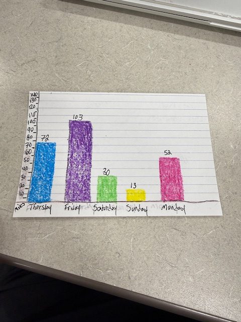
Bar chart of days I have driven since last class. Miles is on the Y-Axis and the Days of the week on the X-Axis. I also put the exact miles on top of the colored bars.
HUM 230, Spring 2026
Bar chart of days I have driven since last class. Miles is on the Y-Axis and the Days of the week on the X-Axis. I also put the exact miles on top of the colored bars.
The data set I chose was the Average hours of all employees in the St louis metro area. The creator/contributor to this data set is the Federal Reserve of st louis. This is a bank that is part of the U.S central banking system. The source of their data is the businesses they collect from. They survey businesses and log it here. They use this data to survey and track the economy by seeing if weekly hours are going up or down. They format the data with a bar graph. The data is organized in a time structure using months, years, and hours to measure the employee’s weekly hours.
They structured the data with months and hours worked per week as the main fields. Dates and values are the main fields used. The effect this has is it lets you interchange the dates and values to see specific trends in the times, and this lets employers and just about anybody see the rates clearly.
The Federal Reserve of St Louis made these choices to be able to clearly track the economy and any trends in the work environment.
They chose to use broad indicators instead of personal ones so that they can see wider trends. I think because they used wide sets of data it can account for mostly everyone, but there will definitely be some outliers that are unaccounted for such as smaller businesses where hours are going down. I would use this data to track the workplace’s economy and see if hours are going down or up, and businesses could use this to decide whether to cut hours of employees or not.
Jack Anderson
The dataset “Illinois Landcover in the Early 1800s” was likely created by environmental researchers, historians, and geographers working through universities or state organizations. These contributors study how the land looked before major urban development. The data probably comes from historical maps, written records, and ecological reconstructions rather than direct measurements, since no one was systematically recording land cover at that time.
The main reason this dataset was created is to help people understand what Illinois looked like before industrialization and large-scale farming changed the landscape. It’s often used in environmental studies, conservation planning, and education to compare past and present ecosystems. The dataset is usually presented in map form or as categorized geographic data, showing different land types like forests, prairies, wetlands, and rivers.
When looking at how the data is structured, it’s organized by land type and geographic area. This makes it easy to visualize patterns, like where prairies were dominant versus forested areas. However, the categories chosen (like “prairie” or “wetland”) can oversimplify the landscape. Nature doesn’t always fit into clean categories, so some details may be lost.
Because this dataset is based on historical interpretation, the creators had to make decisions about how to “clean” or fill in missing information. They might have combined multiple sources or estimated land types in areas without clear records. While this makes the dataset usable, it also introduces uncertainty. Not everything can be 100% accurate when reconstructing the past.
The creators’ goals mainly involve understanding how environmental change shapes the dataset to highlight natural landscapes before human impact. This could unintentionally downplay the role Indigenous people had in shaping the land, which is an important limitation to recognize.
I would use this dataset to compare how much Illinois has changed over time, especially in terms of agriculture and urbanization. One challenge is that it’s not exact; it’s more of an informed reconstruction. Overall, it’s a really valuable dataset, but it’s important to remember that it reflects both historical evidence and modern interpretation.
Ioannis Koupepides
After scanning the data set on the St. Louis, MO Monthly and Seasonal Mean Temperature set I was provided, I had to do a little digging. This data set seems to have came from the NOAA, who are responsible for collecting and analyzing climate data and environment data. After making sure that this administration is highly credible I also learned that they do these surveys of the environment to this day consistently. Though they are responsible for the data set presented the data probably comes from a long standing weather station in the St. Louis area with the proper tools and instruments to record the data.
The purpose of compiling this data set is to track the temperature trends over time and provide insight into St. Louis’s long term weather patterns. The data could be used to monitor the environment by scientists and researchers. Or to relate it to my area of interest it could be used by investors for urban planning.
The data is presented in a table format with columns and rows. When referring to structure I think this table achieves its purpose in presenting the data clearly and plainly. It shows the yearly data broken down into monthly averages and seasonal averages. The organization makes it useful to identify weather trends over the decades. However, because it only tracks averages, the data does not represent outliers like the weather phenomena we are experiencing this week (3/19). This could cause an issue and makes the data less reliable.
The methods to “clean” this data aren’t mentioned in the PDF provided, but following my NOAA statement made prior; the NOAA typically applies many procedures to ensure the consistency and quality of the data. Some effects to the data may still be present, things like weather tracking technology and station location. Another that came to mind was the slimming size of St. Louis since they began to conduct these weather surveys, I wonder if it could have gotten colder because there is less population? Surely there is less foot traffic, construction, etc…
The creator’s goals likely focused on long term averages and effects rather than short term effects. This could unintentionally downplay odd short term weather events and phenomena, especially in recent memory.
I think that the data set would be most useful to predict future weather patterns. Visualizations like charts or graphs representing the most large changes, this could also prove useful to provide insights into the growing climate change concern.
For this assignment, I compared two Wikipedia articles: one about St. Louis, Missouri, and one about Edwardsville, Illinois. These two places are close to each other, but they are pretty different in size and lifestyle. St. Louis is a big city, while Edwardsville is smaller and more of a college town.
I wanted to see how the way people write about a big city is different from how they write about a smaller town nearby.
Before using Voyant, I thought the two texts would focus on different things. I expected:
I also thought the St. Louis article would be more complex, while Edwardsville would be simpler and more focused.
I put both texts into Voyant Tools and looked at things like the word cloud and word trends. This helped me see which words showed up the most and what each text focused on.
First, the most common words were different in each text.
One big thing I noticed is how important Southern Illinois University Edwardsville is in the Edwardsville article. It comes up a lot and seems to be a big part of how the town is described.
Also, the St. Louis article covered way more topics, like transportation, history, and business. Edwardsville stayed more focused on local life and education.
My hypothesis was mostly right. The two places are described very differently, even though they are close to each other. St. Louis is shown as a big, complex city, while Edwardsville is more about community and college life.
Using Voyant made it easier to see these differences because it shows patterns in the words, not just the meaning of the text.
This activity helped me understand how different communities are described based on their size and role. It also showed me how useful tools like Voyant can be for quickly spotting patterns in writing.
Ioannis Koupepides
This dataset on average weekly hours worked by private employees in the St. Louis metropolitan area was made by Trading Economics, but the original data comes from government sources like the Federal Reserve’s FRED database and the U.S. Bureau of Labor Statistics. These organizations collect employment data through surveys and reports from businesses. The purpose of compiling this data is to help researchers, businesses, and policymakers understand labor trends and overall economic conditions. It has been used for economic research, forecasting, and news reporting. The dataset is available online in graph form and can also be downloaded as a spreadsheet.
The data itself is structured in a simple way, mainly focusing on the date and the average number of hours worked each week. This makes it useful for looking at trends over time, such as whether people are working more or fewer hours during certain months, years, and periods of time. However, because the dataset only focuses on averages, it does not show differences between industries, job types, or worker demographics. This could affect how the data is interpreted since part-time and full-time workers are included in the same average.
The creators mention that the data has been standardized and sometimes seasonally adjusted to make comparisons easier. While this helps make the data cleaner and more consistent, it may also hide unusual spikes or drops that could be important for understanding real economic changes. The goals of the organizations involved also shape the dataset. Government agencies focus on measurable indicators like hours worked because they are important for tracking employment and productivity. Trading Economics then decides how to present the data, which can influence what users focus on.
I would use this dataset to study economic trends in the St. Louis region, especially how working hours change during recessions or periods of growth. I would also look at why fewer hours are worked in certain months of the year vs others. Overall, the dataset is useful, but it should be used carefully because it simplifies complex labor patterns into one average number. It also doesn’t account for certain factors, like part-time vs full-time employees.
One thing that stood out to me in the Voyant visualization was how often the word river appeared in the St. Louis article. At first I didn’t think much of it, but it actually makes sense when you consider that St. Louis developed as a major port along the Mississippi River. The river has historically been central to the city’s economy and growth. In contrast, the Edwardsville article mentioned the word university much more often. This reflects how important Southern Illinois University Edwardsville is to the city’s identity, since the university plays a major role in the local community and economy. Overall, using Voyant helped me see patterns in the texts that I might not have noticed through close reading alone. The visualizations made it easier to identify which themes appear most frequently in descriptions of each city. At the same time, distant reading has its limits because word frequency alone does not explain the full meaning or context of the text. To fully understand how these communities are represented, distant reading works best when combined with closer analysis of specific passages. Even so, this exercise showed how digital tools like Voyant can provide a useful starting point for exploring how different places in the St. Louis region are described.
What I choose as the focus of my project is the popular graffiti spots in St. Louis. I am a big fan of art especially graffiti, growing up on the Southside of Chicago where many buildings are covered with graffiti, it made me fall in love with that particular art. Ever since then I have always loved the uniqueness of every artistic piece, though some where related to gang violence, many other pieces where just an expression of art and extremely beautiful. What is important to me is the preservation of that beautiful art and the story it conveys about the artist.
The problem that arises from my observation is the negative stereotype graffiti gets for its effect on adolescence. It is often spoken how graffiti influences adolescence to turn to a violent lifestyle to fit it, because it is often associated with gang violence. It is looked upon as vandalism and criminal instead of expression and creativeness. The Mural Mile in St. Louis is a mile long wall filled entirely with graffiti of a variety of talented artist. This type of art is a way for people to connect with others within their community and culture. Not only is this a very popular locations but there is a multiple of graffiti location all around St. Louis.
My approach for this is a story map, to present the various popular graffiti spots in St. Louis, and to analyze whether the art is a showcase of expression or violence. In addition to whether these drawings bring negative impacts or positive ones to the community and influence the young minds within.
Primary Source: A piece from the Mural Mile https://live.staticflickr.com/65535/53730949104_62b75d0d33_b.jpg
Secondary Source: Snelling, Grace. 2022. “Paint Louis celebrates 25 years of art and hip hop at the flood wall.” https://www.stlmag.com/culture/visual-arts/paint-louis-celebrates-25-years-of-art-and-hip-hop-at-the-flood-wall/
Growing up in the St. Louis area, breweries have always been a part of the city’s identity, even if I didn’t fully understand their history at first. You see references to beer everywhere around here, from historic brick buildings to local spots who brew beer and not to mention the massive Anheuser-Busch presence. What drew my attention to this topic was realizing that brewing in St. Louis doesn’t just have to be about beer, but rather immigration and culture. Even the development of the city itself! Many of the breweries were started by German immigrants from what I’ve gathered, transforming STL into one of the most important brewing centers in the united states. Learning about the mass influence something as simple as beer has on entire neighborhoods and community interested me in this topic and curious about how the industry shaped St. Louis’s history and identity.
I aim to answer how brewing influenced the economic and cultural development of St. Louis, and how the city become one of the most important brewing centers in the United States during the nineteenth century.
I want to approach the history of brewing in St. Louis through the lens of immigration and urban development. My project will examine how immigrants influenced larger brewing traditions and how technological innovation and geographic advantages helped breweries expand nationally. I will take into consideration how events such as the Prohibition dramatically changed the industry and led to a cultural decline too.
Sources I will likely use:
https://shsmo.org a primary source with image proof attached
St. Louis Brews: The History of Brewing in the Gateway City by Herbst, Roussin, Kious a book that seems very informative, a digitized version will be used
Lastly, I plan to create an interactive timeline showing brewery development in the St. Louis area from the early 1800s to today. Im considering using tools used in class to organize this timeline. It would show key events in places like Soulard and Benton to help convey that brewing helped shape St. Louis.
© 2026 Intro to Digital Humanities and Social Sciences (SP26)
Theme by Anders Noren — Up ↑