Research Bibliography
Readings:
Absolute Ethiopia Tours. 2026. “A Look at the Thriving Yet Simple Life of the Ari Tribe.” https://absoluteethiopia.com/a-look-at-the-thriving-yet-simple-life-of-the-ari-tribe/.
Adams, Jenny. 2017. “It Takes Both: Identifying Mano and Metate Types.” Desert Archaeology, Inc. November 16, 2017. https://desert.com/mano-metate/.
Arutyunyan, Lilit. n.d. “The Elements in the Cosmogenic Myths of China, India, and Ancient Greece.” (online article, no publisher listed).
Bachelard, Gaston. 1958. The Poetics of Space. Paris: Presses Universitaires de France.
Bentsen, S. E. n.d. “Using Pyrotechnology: Fire-Related Features and Activities with a Focus on the African Middle Stone Age.” (academic article, publication details not provided).
Bodel, John, and Saul M. Olyan, eds. 2012. Household and Family Religion in Antiquity. Malden, MA: Wiley-Blackwell.
Brandley, Ryan. 2025. “The Global Housing Crisis: People around the World Are Facing a Shortage of Safe, Affordable, and Available Housing.” May 19, 2025. https://storymaps.arcgis.com/stories/5eb95a1b1ea64232b62712d1bffbb858.
Caputo, Paul, Shea Lewis, and Lisa Brochu. n.d. Interpretation by Design: Graphic Design Basics for Heritage Interpreters. (publisher not specified in provided data).
Casajus, Dominique. 1983. “The Wedding Ritual among the Kel Ferwan Tuaregs.” Journal of the Anthropological Society of Oxford 14, no. 3: 227–237. https://shs.hal.science/halshs-00719886.
Chazan, Michael. n.d. “Toward a Long Prehistory of Fire.” Current Anthropology. (publication details not provided).
Christie, Jessica. 2022. “Re-reading Gendered Space at Koʻa and Household Shrines on Hawaiʻi Island and Oʻahu.” Archaeologies: Journal of the World Archaeological Congress 18, no. 2: 370–400.
Copeland, Blythe. 2024. “How Wedding Expectations Have Changed in the Past 90 Years.” BRIDES. December 4, 2024. https://www.brides.com/how-wedding-expectations-have-changed-8743616/.
Crow Canyon Archaeological Center. n.d. “Manos and Metates: Understanding Daily Lives Through Ground Stone.” https://crowcanyon.org/news/manos-and-metates-understanding-daily-lives-through-ground-stone/.
Discover Earth. 2021. “The Amazing Homes of the Korowai Tribe.” https://discoverearth.co/articles/amazing-homes-korowai-tribe/.
“Ganesha.” n.d. Amritapuri.org. https://www.amritapuri.org/3714/ganesha.aum.
Ham, Muhammad. 2020. “Syrian Refugee Women Stand in Front of Their Homes at Azraq Refugee Camp, Jordan.” PBS NewsHour. https://www.pbs.org/newshour/world/un-detects-virus-cases-in-syrian-refugeecamp-in-jordan.
Hesiod. ca. 700 BCE. Theogony and Works and Days. Translations vary.
History and Archaeology Online. n.d. “The Gods of Domestic Roman Religion.” https://historyandarchaeologyonline.com/the-gods-of-domestic-roman-religion/.
“Hogans (Housing Structures).” 2023. EBSCO Research Starters. https://www.ebsco.com/research-starters/religion-and-philosophy/hogans-housing-structures.
Kazi, Riksum. 2026. “Homelessness and Homes.” Archive: Architecture for Health. https://archiveglobal.org/homelessness-homes/.
Krol, Debra Utacia. 2018. “Have You Heard of a Navajo Hogan?” Architectural Digest. May 2, 2018. https://www.architecturaldigest.com/story/navajo-hogan-eco-friendly.
Leeds, Sam. 2025. “Beyond Roommates: What It’s Like to Live in a Communal Household.” NPR. July 3, 2025. https://www.npr.org/2024/05/01/1248216390/what-is-communal-living-and-is-it-right-for-me.
Lerner, Louise. 2019. “Ancient Urban Villa with Shrine for Ancestor Worship Discovered in Egypt.” UChicago News. January 4, 2019. https://news.uchicago.edu/story/ancient-urban-villa-shrine-ancestor-worship-discovered-egypt.
McKenna-Cress, Polly, and Janet A. Kamien. 2013. Creating Exhibitions: Collaboration in the Planning, Development, and Design of Innovative Experiences. Hoboken, NJ: John Wiley & Sons.
Merin, Gili. n.d. “Architecture Classics: The Dymaxion House / Buckminster Fuller.” ArchDaily. https://www.archdaily.com/401528/ad-classics-the-dymaxion-house-buckminster-fuller.
Metropolitan Museum of Art. n.d. “Interior Hanging (arkilla kunta).” https://www.metmuseum.org/art/collection/search/317864.
Mitchell, Russell H. 1963. “An Unfinished Metate from Panama.” American Antiquity 28, no. 3: 401–402.
Mooney, James. 1900. Myths of the Cherokee. Washington, DC: Smithsonian Institution, Bureau of American Ethnology.
Moore, Jerry D. 2012. The Prehistory of Home. Berkeley: University of California Press.
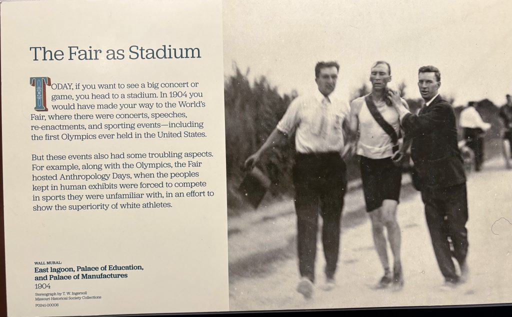
Naffziger, Chris. 2015. “The Legacy of Louis Sullivan, Part One: The Auditorium Building.” St. Louis Magazine. January 7, 2015. https://www.stlmag.com/history/the-legacy-of-louis-sullivan-part-one-the-auditorium-building/.
OECD. 2024. “OECD Affordable Housing Database – Indicator HM1.5: Residential Stock by Dwelling Type.” https://oe.cd/ahd.
Patriquin Architects. 2010. “The Row House: Origins & Transformations.” June 24, 2010. https://patriquinarchitects.com/the-row-house-origins-transformations-2/.
Schlanger, Sarah H. 1991. “On Manos, Metates, and the History of Site Occupations.” American Antiquity 56, no. 3: 460–474.
Schumacher, Mark. n.d. “Kariteimo – Christian (Madonna & Babe) Images in Early Japan.” Onmark Productions. https://www.onmarkproductions.com/html/kariteimo-kannnon-mother-mary.html.
Scott-Smith, Tom. 2024. Fragments of Home: Refugee Housing and the Politics of Shelter. Stanford, CA: Stanford University Press.
Serrell, Beverly. n.d. Exhibit Labels: An Interpretive Approach. Lanham, MD: Rowman & Littlefield.
Shimelmitz, Ron, et al. n.d. “‘Fire at Will’: The Emergence of Habitual Fire Use 350,000 Years Ago.” Journal of Human Evolution. (publication details incomplete).
Southern Illinois University Edwardsville. 2024. “SIUE Is Digging Deep to Uncover the Past.” June 16, 2024. https://www.siue.edu/news/2024/06/SIUEisDiggingDeeptoUncoverthePast.shtml.
The Telegraph. 2023. “Homeless Connect to Bridge Service Gap.” January 18, 2023. https://www.thetelegraph.com/news/article/Homeless-Connect-to-bridge-service-gap-17725755.php.
Toledo Museum of Art. n.d. “Art Minute: Fulɓe Artist, ‘Arkilla Jenngo.’” https://toledomuseum.org/collection/art-minute/art-minute-fule-artist-arkilla-jenngo-ceremonial-hanging-in-wedding-tent.
USA for UNHCR. 2021. “Refugee Camps Explained.” April 6, 2021. https://www.unrefugees.org/news/refugee-camps-explained/.
Victoria and Albert Museum. n.d. “Arkilla jenngo.” https://collections.vam.ac.uk/item/O257078/arkilla-jenngo-textile-unknown/.
Wake Forest University Lam Museum of Anthropology. 2024. “Tuareg Ehel Tent Post.” August 2024. https://lammuseum.wfu.edu/2024/08/tuareg-ehel-tent-post/.
Wildfang, Robin Lorsch. 2006. Rome’s Vestal Virgins: A Study of Rome’s Vestal Priestesses in the Late Republic and Early Empire. London: Routledge.
Wilson, Bee. 2012. Consider the Fork: A History of How We Cook and Eat. London: Penguin.
Images:
Buckminster Fuller’s Dymaxion House. n.d. Minnie Muse. Accessed April 27, 2026. https://www.minniemuse.com/articles/musings/buckminster-fullers-dymaxionhouse.
Condé Nast. 2021. “Time to Retire the Word ‘Homeless’ and Opt for ‘Houseless’ or ‘Unhoused’ Instead?” Architectural Digest. https://www.architecturaldigest.com/story/homeless-unhoused.
Discover Earth (Facebook page). 2021. “The Amazing Homes of the Korowai Tribe.” https://discoverearth.co/articles/amazing-homes-korowaitribe.
Frank, Carpenter. 2022. “File:Eskimo Building a Snow House South of Cape St. David.jpg.” Wikimedia Commons. https://commons.wikimedia.org/wiki/File:Eskimo_building_a_snow_house_south_f_Cape_St._David.jpg.
Ganesa. The Trustees of the British Museum. CC BY-NC-SA 4.0. https://www.britishmuseum.org/collection/object/A_1940-0713-0-232.
Ham, Muhammad. 2020. “Syrian Refugee Women Stand in Front of Their Homes at Azraq Refugee Camp, Jordan.” PBS NewsHour. https://www.pbs.org/newshour/world/un-detects-virus-cases-in-syrian-refugeecamp-in-jordan.
Hitchcock, Don. n.d. Dolní Věstonice photograph (dolniIMG_1893.jpg). Don’s Maps. Accessed May 4, 2026. https://donsmaps.com/images18/dolniIMG_1893.jpg.
Juma, Kelvin. “Portrait of Yellows,” from the series Daily Life Kibera. Instagram post. https://www.instagram.com/p/C2fDVUMs74o/. Accessed May 4, 2026.
“The Buddhist Goddess Hariti with Children.” n.d. Photograph. Wikimedia Commons. https://commons.wikimedia.org/wiki/File:The_Buddhist_Goddess_Hariti_with_Children_LACMA_M.78.105_(1_of_6).jpg.
“Simple Filipino Catholic Home Altar.” 2024. Photograph. Wikimedia Commons. https://commons.wikimedia.org/wiki/File:Simple_Filipino_Catholic_home_altar.jpg.
“Sepik River Post.” The Trustees of the British Museum. CC BY-NC-SA 4.0. https://www.britishmuseum.org/collection/image/1019744001.
Tara, Sino-Tibetan, probably 18th century. Gilt bronze with red coral inlay. Collection of Scripps College, Claremont, California. https://rcwg.scrippscollege.edu/blog/acquisition-essays/tara-a-powerful-feminine-force/. Accessed April 28, 2026.
“Traditional Chinese courtyard residence (siheyuan).” n.d. Photograph. Pinterest. https://i.pinimg.com/originals/3f/b5/d3/3fb5d3ee000d44f2913dbb75c3de7c96.jpg. Accessed May 4, 2026.
“Virgin of Guadalupe shrine, Los Angeles.” n.d. Photograph. Wikimedia Commons. https://commons.wikimedia.org/wiki/File:Virgin_of_Guadalupe_shrine,_Los_Angeles.jpg. Accessed April 28, 2026.