In groups of 4-5, take turns sharing about your project. You should provide some background on your project (what drew you to this topic? what do your group members need to know to understand your project?), your driving argument or narrative, the kinds of sources you’re using, your choice of technology, and how that technology fits with the content of your project. These are all works in progress, so you don’t need to have it all done! But you should talk about your progress so far, any challenges you’ve run into, and how you envision the final product.
When you’re not presenting, listen attentively to the presenters and fill out a peer review form for each one. That form will help presenters know how clearly they’re articulating their argument and identify potential challenges and ways to strengthen their project. It also lets them know where they’re doing a good job!d
Today, we’re talking about three aspects of civic technology that help to make the government more accessible and effective for its constituents: govtech (how the government makes itself available), public data (providing access to data that impacts constituents), and participatory democracy (grassroots efforts to render government more effective). In this lab, we’re going to hone in on public data.
Public data offers the means to hold governments accountable, to understand how data informs decision-making, and to examine and sometimes contest the ways data is collected. It also informs reporting — every day, we see headlines that utilize data to make an (often inflammatory or click-baity) argument. Being able to track down the source of that data allows us to engage critically and thoughtfully with the news as well as with the government.
For today’s lab, we’re digging into some data-driven headlines about the St. Louis metro. Working in groups, explore your assigned article and work through the prompts in this form. You’ll be looking for 1) the argument the article is making, 2) how the reporter is using data to support that argument, 3) the source of that data, and 4) some thoughts about whether or not the article makes good and accurate use of that data.
NB: You might have to dig a bit to find the source of the data! Some articles might not link to it at all, and others might link to aggregators. Do your best to figure out the earliest origin of that data. (E.g. if the article links to an aggregator of crime statistics, try to figure out who actually collected them — local police departments? the FBI? a private company?)
Scrollytelling is a form of interactive storytelling that pairs text with media. As you scroll through the narrative, the media automatically transforms. Media might include video, images, and clickable maps. This is a storytelling technique often used in journalism as a way to distill complex topics into easily digestible and engaging stories.
These can be really complex! Here are some fancy examples of scrollytelling that highlight how interactive scrolling can engage the reader.
But they don’t have to be complicated to be effective. The key to good scrollytelling is to think about how your text and media enhance one another. The media isn’t just illustrating the text – it’s adding meaning that the text can’t convey effectively or completely on its own.
Here’s an example using the tool we’ll be working with today: How to Cross a River
Lab Overview
For this lab, we’ll collectively build a scrolly story about the Mississippi River. Each group member will contribute at least two to three slides, including text and a functional piece of media.
You can frame your slides in any way you choose. Feeling stuck? You might consider…
The history of the river — check out the Wikipedia article or local storytelling sites like “Unseen St. Louis” to see what significant events or curious anecdotes have taken place along the river.
Crossing the river — do you hate the Poplar Street Bridge? Are you charmed by the Old Chain of Rocks Bridge? What’s the best/easiest/least frustrating way to get across it?
Experiences of the river — What personal or sensory experiences of the river do you have? Have you fished in it? Kayaked on it? Smelled it?
Depictions of the river — Where does it show up in popular culture? How do people talk about the Mississippi, here or elsewhere?
Each row in the spreadsheet is one step, and each step is a combination of one block of text and one piece of media. There are three types of step you can choose from, depending on your media type: map, image, and video, which all pair a text box with a media box, and text, which is just text that stretches across the whole page. Select your media in the ContentType column (Column A). For the next few columns, there are some small differences in the information you need depending on step type.
For maps:
Skip Column B, the FilePath column.
In Column C, the AltText column, describe what’s visible on your map and what purpose it’s serving in your narrative.
In Columns E and F, Latitude and Longitude, add the coordinates for the center of your map. The easiest way to get your coordinates is to go to your location in Google Maps and right click/command+click on it. The coordinates will be at the top of the menu that appears. Click on them to copy them. Make sure that you separate the coordinates into the two columns and delete the comma between them — latitude is the first number, and longitude is the second number.
In Column H, ZoomLevel, choose how far in you want to zoom on the map. Zoom levels range from 0 to 18, and the higher the number, the more zoomed in you’ll be. For maps, a zoom level of 4 or 5 will show a whole region of the country. A zoom level of 13 or 14 will show detail at the level of streets and buildings. You can set the zoom level for each step, so think carefully about what you’re trying to demonstrate and where you want your reader’s attention! At the bottom of this page, there’s a map where you can zoom in to the frame you want and see what the zoom level is.
For images
To use images, you’ll need to link to them from somewhere. If you have access to the GitHub repository for your story, you can upload it there. That ensures that you have a stable link that won’t break. Otherwise, check with your instructor for the best place to upload it.
In Column B, FilePath, paste the File URL for your image.
In Column C, AltText, describe your image and what purpose it’s serving in your narrative.
In Column D, ImageOrientation (optional), put vertical or horizontal, depending on the orientation of your image.
Skip Columns E and F, Latitude and Longitude.
In Column H, ZoomLevel, choose how far in you want to zoom on the image. Images don’t need as high a zoom level as maps, and your image will get grainy if you zoom in too far. Choose a zoom level of 1 if you just want it to display as is.
The built-in zoom goes toward the center of the image. If you want to zoom in on a different area or pan between sections of the image, your best bet is to crop the image yourself and add the different areas of the image in as individual steps.
Your images will take up a big chunk of the screen, so make sure you’ve got a relatively high-resolution image — ideally not less than 1200 px in either direction. Not sure how big your image is? If you’ve got it saved to your computer, right click and select Properties and go to the Details tab.
For videos
You can upload videos to your GitHub repository, but in some cases the file sizes might get too big. You can also use links from YouTube or Vimeo. If you do, you’ll need to copy the link out of the embed code. Click on Share > Embed, and then copy the URL in the code.
In Column B, FilePath, paste the URL for your video.
In Column C, AltText, describe your video and what purpose it’s serving in your narrative.
Skip Columns D, E, F, and H, ImageOrientation, Latitude, Longitude, and ZoomLevel.
Adding and customizing text
Columns G and I, TextHorizontalPercentage and Text, are the same for all media types. This is where you’ll add your narrative content to your story. You have three options here:
You can add text to an existing piece of content, in which case the text will appear to the left of the media. If you go this route, try to keep your text under about 100 words per step.
You can add text as a standalone box with no media, in which case your text will stretch across the whole width of the page. To do this, select “Text” as your content type and leave columns B through F blank. You can have longer chunks of text in this format. (This is a good way to include your references!) This step type gives you a block of text with no background color or dynamic elements.
You can also set your step type to a media step but change the TextHorizontalPercentage to 100%. This will also give you a text-only step, but it’ll still have the same background color as all your other steps, and it will dynamically widen and narrow as you scroll.
In all cases, you can format your text using HTML. Here are a few essentials.
Since you’re entering your text into a spreadsheet, you won’t be able to use the Enter key to separate your paragraphs. But no one wants to read a wall of text! In order to break your text, use two linebreak tags between your paragraphs: <br><br>
You might want to format your text. Some handy formatting tags include <b>bold</b>, <i>italics</i>, and <u>underline</u>.
You can also include links in your text: <a href=“www.example-url.com”>The text you want to show up on the page goes here</a>. This is one way to add references as you go!
If you want to do more with HTML, check out this list of basic tags.
You can use this HTML editor to format your text and generate the correct HTML. Format your content using the editor on the left side, and you’ll see your HTML appear on the right side. Before you copy it over, press the “Compress HTML” button at the bottom of the HTML window.
5. Finalize your story
Now that you’ve got the story content finished, it’s time to add some finishing touches and edit your content. First, go to the Story tab in your spreadsheet.
Ignore Column A, ScrollType.
Fill out Columns B and C, Title and Subtitle.
Column D, EndText, is what appears at the end of your scrolly story.
Column E, TextHorizontalPercentage, lets you change how wide the text box is compared to the media box in your story. By default, it’s set to 33%, or 1/3 of the width of your screen. If you’ve got a lot of text-heavy steps, you might want to increase that to give yourself a little more room. I recommend staying under 50%.
In Column F, Authors, put the author name(s).
Finally, go to your story’s link and read through it carefully.
Proofread for any errors in your text.
Make sure all your sources are cited.
Take a close look at your media items: Are they displaying properly? Do they make sense? Are they high enough resolution?
Following our discussion of emplaced storytelling, today we’re creating a biography of place. This is an opportunity for you to think about the places and communities that you’re connected to and how they’ve shaped you. We’ll be using StoryMapJS.
StoryMapJS is an easy-to-use tool for digital storytelling using spatial data. Through a simple web interface, users can create storytelling exhibits that move their audience through a series of points on the map, each including media, captions, and extended narrative. The resulting map can be embedded on almost any website.
How does it work?
For the audience, StoryMapJS is a bit like a PowerPoint, in that you click through slides, which might have a variety of content on them. That content is layered over a map, and as you move through the slides, you also move visually through space.
For the creator, the experience is likewise very simple. You enter the editor with a google account, and you’re presented with a very intuitive editing interface. As you add each slide in the order they’ll appear, you have the opportunity to add a headline, body text, an image, image credit, and a caption. You can also customize the appearance. There are a variety of built-in base maps to choose from.
The assignment
An important note: Your stories are your own, and some might be more personal than you want to share here. You’re not required to include anything you’re uncomfortable sharing. There are any number of frames you can employ here – experiences that set you on your current major or career path, favorite spots to walk, even places you imagine visiting. You’re welcome to employ whatever frame you like and to think creatively about it.
Come up with a list of 5 to 10 places that have been particularly influential for you. These can be any size – a city, a neighborhood, a park bench, or a room in your house. And they can be in anywhere – places you’ve lived, visited, where you are now at SIUE.
Write a couple of sentences describing the place and your relationship to it. What does someone who’s never been there need to know to understand this place’s importance?
Pick a picture that represents a feeling or a memory about each place and write a caption that explains the significance of the picture for someone who’s never been there. If you don’t own the picture, make sure you figure out who to credit as well.
Head over to StoryMapJS and click the green “Make a StoryMap” button. It’ll prompt you to log in with a Google account. When it gives you your list of StoryMaps (probably empty), hit New to begin.
Create your title slide. The first slide is your title slide, so it won’t have a location. Give it a headline and a brief description. You can also include an image here if you’d like
Add a new slide using the + button on the left of the page. Use the search bar on the map to find the right location. You can drag the pin if you want to be more precise. Add your text and image here as well, and then repeat for the rest of your locations.
Hit save (top menu).
Once you’ve saved, go to Share in the top right. Scroll down until you see the embed code. It’ll start with <iframe … Copy the whole embed code and create a new blog post on the course website. Add a custom HTML block, and paste the embed code in.
Publish your post with the tag “Storymap” and you’re good to go!
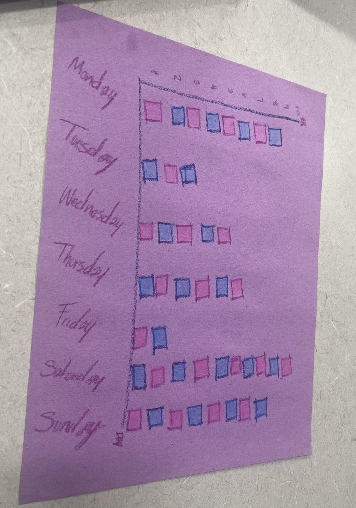
This visualization reflects my sleep schedule of the previous week. Every individual box is the number of hours I tracked that I slept, as shown it definitely varies each night.
Although we think of data viz as a fundamentally digital process, it has its roots in hands-on, physical media. There’s a lot of creativity that goes into data viz, and physical media give us lots of outlets to pursue that creative ethos! But there are other, scholarly reasons to play with hands-on data too. Having to craft each data point by hand humanizes the data. It forces us to reckon with the data both individually and in the aggregate. And it gives us a new set of possibilities and constraints in how we visualize, which can help to surface new patterns.
For this lab, we’ll do two different activities, which will take place in class over a few sessions.
March 23: Evaluating Creative Data Viz
In groups, review an existing physical data visualization project. Obviously, there are limitations to this, because we’re encountering these physical projects virtually. But try to imagine the experience of encountering this object in person – by touch and feel, by sight, by sound, by smell.
Between Monday and Wednesday, choose something to track. This could be something that your device already tracks for you, like screen time or steps. It could be something that you keep track of over the next few days (a la the Dear Data project). Or it could be something external to you that you find/collect the stats for, like temperatures or air quality. Bring at least 5 data points (but more is fine!).
March 25: Creative Data Visualization
On Wednesday, I’ll bring craft materials to class, and we’ll work on creatively, physically visualizing your data points. We’ll conclude by documenting and reflecting on your visualizations.
Palladio is a tool for visualizing and exploring data through maps, network charts, and categories. We’re going to begin by creating our own data set of immigration and migration data using the 1900 Census.
Working in a group, choose a census from this folder and add at least three lines apiece to the spreadsheet. (If you get stuck on handwriting, let me know and we can look at it together.
Together, we’ll put the data into Palladio and see what patterns emerge.
Voyant is a tool for distant reading. It helps us identify patterns within a text or set of texts (corpus). Today, we’ll use it to take a birds-eye view of how people view communities in the region. Remember that as a quantitative method, distant reading generally asks us to formulate a hypothesis about what we might find when we analyze our texts. So what similarities and differences might you expect about the texts you’ve chosen? You can compare across geography (St. Louis vs. Edwardsville, for instance) or across chronology (St. Louis in 1860 vs. St. Louis today) or some combination thereof.
Choose at least two texts to compare. You can choose from encyclopedia entries in this Google Drive folder, and/or you can use Wikipedia articles (current or older versions). The texts you choose should be about one or more locations in the St. Louis region.
Skim at least one of them and develop a hypothesis about what you might find when you compare your texts.
Input the two texts as a corpus and choose a visualization with which to test your hypothesis.
Write a blog post describing your texts, question, hypothesis, and results.
This lab will be completed in class. In groups at your tables, consider the physical artifacts in front of you. What are they like, physically? Touch them, smell them, look at them. (Please don’t lick the artifacts.) What can you learn from them in person?
How might you convey that information in a digital space? What technologies might be best suited to your artifacts? How might you enable digital users to explore the artifacts and learn new things about them?
As a group, complete the worksheet and turn it in before you leave class.
The page I decided to choose was the Cougar Cupboard. There was only one error that popped up though it is not really an error, but it was a link that contained no text. The content of this page is easy to find, and easy to access if needed. The AIM score was an 8.7 which is pretty good. The content of this page is likely needed by students in need, and who possibly lack financial stability. It is a very useful resource for the benefit of people’s needs.