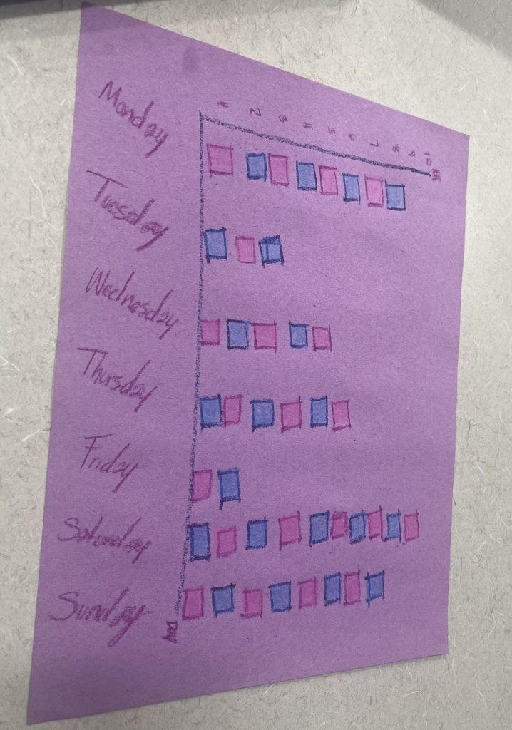
This visualization reflects my sleep schedule of the previous week. Every individual box is the number of hours I tracked that I slept, as shown it definitely varies each night.
HUM 230, Spring 2026
This visualization reflects my sleep schedule of the previous week. Every individual box is the number of hours I tracked that I slept, as shown it definitely varies each night.
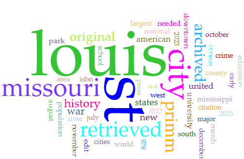
The two text that I chose were about the history of St. Louis around the 1860s discussing about the growth of the 19th century, slavery, and particular events leading up to the Civil War. The second article was about the current structure of the economy of St. Louis today. In regard to the population, governments, and culture.
When I input these articles into Voyant the most frequent words were St. Louis as expected. Though what I did not expect was for the word “St.” to be used 23 more times than the word “Louis.” The history of St. Louis article went into great details of all the major and significant conflicts leading up to the Civil War and little bit after as well. The modern era article went more into details about the preserved architecture and structure of the economy.
When considering the access to the nearest golf course, locations are few and far between, however Edwardsville, IL, has more courses than most towns.
From campus you could most quickly take a bus which results in a nine minute drive, possibly made longer by typical bus activity. In order to walk it would take 2 hours and 20 minutes on country roads like Fruit Rd.
A closer option is the Goshen Golf Range, this doesn’t have the typical amenities as a golf course however you could practice your swing there. It is only about a 16 minute drive from campus with traffic and a very do able walk. This would cost about a dollar according to the MCT website.
With golf courses it is hard to judge access by location, as they are large and require a lot of space. However in the Case of the Goshen Golf Range it is very centralized and provides a minimal yet satisfying golf experience have you no form of transport. Injustice is not present in the golf locations because they offer various different spaces for the sport at various prices with acceptable public transit access.
I think that the location of the golf courses does not pose an issue because people understand that they require a lot of land to be successful. Letting people practice at a centralized location seems more than fair and in my eyes a good move by the city of Glen Carbon.
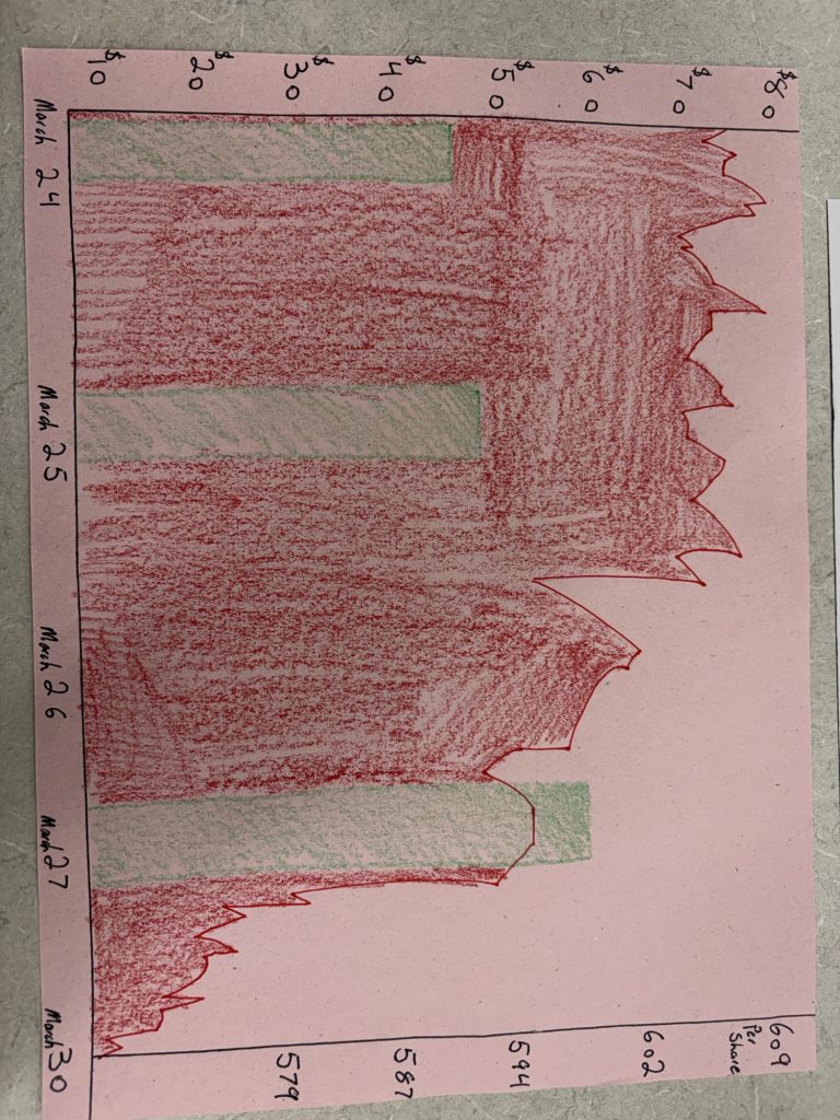
The image I created represents the amount I’ve paid for a tank of gas and the cost of a share of the SMP 500. Their contrast represents the current economic state of the country and the world.
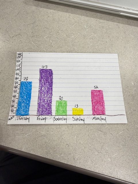
Bar chart of days I have driven since last class. Miles is on the Y-Axis and the Days of the week on the X-Axis. I also put the exact miles on top of the colored bars.
Spatial analysis is a method that uses mapping and geographic information systems (GIS) to analyze the relationships between people, places, and resources. Those relationships dictate what kind of access people have to things like grocery stores, banks, employment opportunities, green spaces, and more. Spatial analysis is a great tool for exploring concepts of spatial justice. In this lab, we’ll explore the spatial relationship between SIUE and the town of Edwardsville.
There are lots of tools we can use for spatial analysis. The most common one is ArcGIS, which is a proprietary (that is a paid) platform. We’ll be using a free tool. Those are sometimes less versatile (although you can do an awful lot with them!), but they also allow us to keep our data and our analysis regardless of whether we have access to a particular platform, and they’re often easier to use because they’re not as complex.
Understanding the Lay of the Land
Thinking About Access
Reflecting on Resources
Due as a blog post, 4/1/26
Today, we’ll carry on talking about spatial justice, looking more broadly at the St. Louis metro. To begin with, we’ll start by building a data set. Each individual should add two locations to this spreadsheet that you find culturally significant.
The data set I chose was the Average hours of all employees in the St louis metro area. The creator/contributor to this data set is the Federal Reserve of st louis. This is a bank that is part of the U.S central banking system. The source of their data is the businesses they collect from. They survey businesses and log it here. They use this data to survey and track the economy by seeing if weekly hours are going up or down. They format the data with a bar graph. The data is organized in a time structure using months, years, and hours to measure the employee’s weekly hours.
They structured the data with months and hours worked per week as the main fields. Dates and values are the main fields used. The effect this has is it lets you interchange the dates and values to see specific trends in the times, and this lets employers and just about anybody see the rates clearly.
The Federal Reserve of St Louis made these choices to be able to clearly track the economy and any trends in the work environment.
They chose to use broad indicators instead of personal ones so that they can see wider trends. I think because they used wide sets of data it can account for mostly everyone, but there will definitely be some outliers that are unaccounted for such as smaller businesses where hours are going down. I would use this data to track the workplace’s economy and see if hours are going down or up, and businesses could use this to decide whether to cut hours of employees or not.
Jack Anderson
The dataset “Illinois Landcover in the Early 1800s” was likely created by environmental researchers, historians, and geographers working through universities or state organizations. These contributors study how the land looked before major urban development. The data probably comes from historical maps, written records, and ecological reconstructions rather than direct measurements, since no one was systematically recording land cover at that time.
The main reason this dataset was created is to help people understand what Illinois looked like before industrialization and large-scale farming changed the landscape. It’s often used in environmental studies, conservation planning, and education to compare past and present ecosystems. The dataset is usually presented in map form or as categorized geographic data, showing different land types like forests, prairies, wetlands, and rivers.
When looking at how the data is structured, it’s organized by land type and geographic area. This makes it easy to visualize patterns, like where prairies were dominant versus forested areas. However, the categories chosen (like “prairie” or “wetland”) can oversimplify the landscape. Nature doesn’t always fit into clean categories, so some details may be lost.
Because this dataset is based on historical interpretation, the creators had to make decisions about how to “clean” or fill in missing information. They might have combined multiple sources or estimated land types in areas without clear records. While this makes the dataset usable, it also introduces uncertainty. Not everything can be 100% accurate when reconstructing the past.
The creators’ goals mainly involve understanding how environmental change shapes the dataset to highlight natural landscapes before human impact. This could unintentionally downplay the role Indigenous people had in shaping the land, which is an important limitation to recognize.
I would use this dataset to compare how much Illinois has changed over time, especially in terms of agriculture and urbanization. One challenge is that it’s not exact; it’s more of an informed reconstruction. Overall, it’s a really valuable dataset, but it’s important to remember that it reflects both historical evidence and modern interpretation.
Ioannis Koupepides
Although we think of data viz as a fundamentally digital process, it has its roots in hands-on, physical media. There’s a lot of creativity that goes into data viz, and physical media give us lots of outlets to pursue that creative ethos! But there are other, scholarly reasons to play with hands-on data too. Having to craft each data point by hand humanizes the data. It forces us to reckon with the data both individually and in the aggregate. And it gives us a new set of possibilities and constraints in how we visualize, which can help to surface new patterns.
For this lab, we’ll do two different activities, which will take place in class over a few sessions.
March 23: Evaluating Creative Data Viz
In groups, review an existing physical data visualization project. Obviously, there are limitations to this, because we’re encountering these physical projects virtually. But try to imagine the experience of encountering this object in person – by touch and feel, by sight, by sound, by smell.
March 23-25: Collecting Data
Between Monday and Wednesday, choose something to track. This could be something that your device already tracks for you, like screen time or steps. It could be something that you keep track of over the next few days (a la the Dear Data project). Or it could be something external to you that you find/collect the stats for, like temperatures or air quality. Bring at least 5 data points (but more is fine!).
March 25: Creative Data Visualization
On Wednesday, I’ll bring craft materials to class, and we’ll work on creatively, physically visualizing your data points. We’ll conclude by documenting and reflecting on your visualizations.
© 2026 Intro to Digital Humanities and Social Sciences (SP26)
Theme by Anders Noren — Up ↑