History 582 Exhibition Practicum

A Course Focused on Museum Exhibitions

Page 2 of 3

Bodhisattvas & Beer Pong

SLAM Arts of Asia: Chinese Galleries

As someone who has grown up visiting SLAM, I wanted to try and have a new, organic experience for this summer’s visit to Art Hill. I set out alone on Sunday, June 26 with the goal of seeing a SLAM gallery in a new light. Visiting alone was the first step in that direction, I think – visiting a museum is often a social exercise, as we’ve learned throughout our Museum Studies coursework. Of course, the St. Louis Art Museum – and Forest Park in general – were popular destinations for St. Louisans on that Sunday. Two greeters were handing out maps at the entrance. I gave them a smile and walked by – though I’m usually one to take home all program literature offered at a museum, I had the express goal of allowing my feet to lead the way. I meandered by the informational desk and turned right at the furthest entrance from the front doors, finding myself at the entryway of the Asian Arts exhibits. Two docents paced the length of the gallery, and a few guests drifted past the cases. I decided to commit to my “no-plan” plan, and set about defining the parameters of my review.

Because each regional section at SLAM is so broad, I quickly decided to focus my review on the jade/bronze/Buddhist sections of the Asian Arts exhibit. These three rooms – the Bakewell Gallery and two square “crossroads” spaces within the Asian Arts galleries – are the subjects of this review. Focusing in on this “sample size” exhibit not only allowed me to better analyze the physical space, it also provided a way for me to situate this exhibit within the wider scope of Asian Arts as a whole.

Daoist Deity, 16th century (Ming Dynasty). Bronze with gold. Informational label seen at right. St. Louis Art Museum, museum purchase (169:1919).

The overarching “big idea” for this exhibit is the tracing of Chinese cultural and religious practices from prehistoric times through the beginnings of Buddhism through three-dimensional jade, bronze, and even ceramic artifacts. Based on my experience during this visit, I felt that the exhibit did successfully communicate the “big idea” through the use of chronological organization, types of objects highlighted, and a clearly intentional use of space.

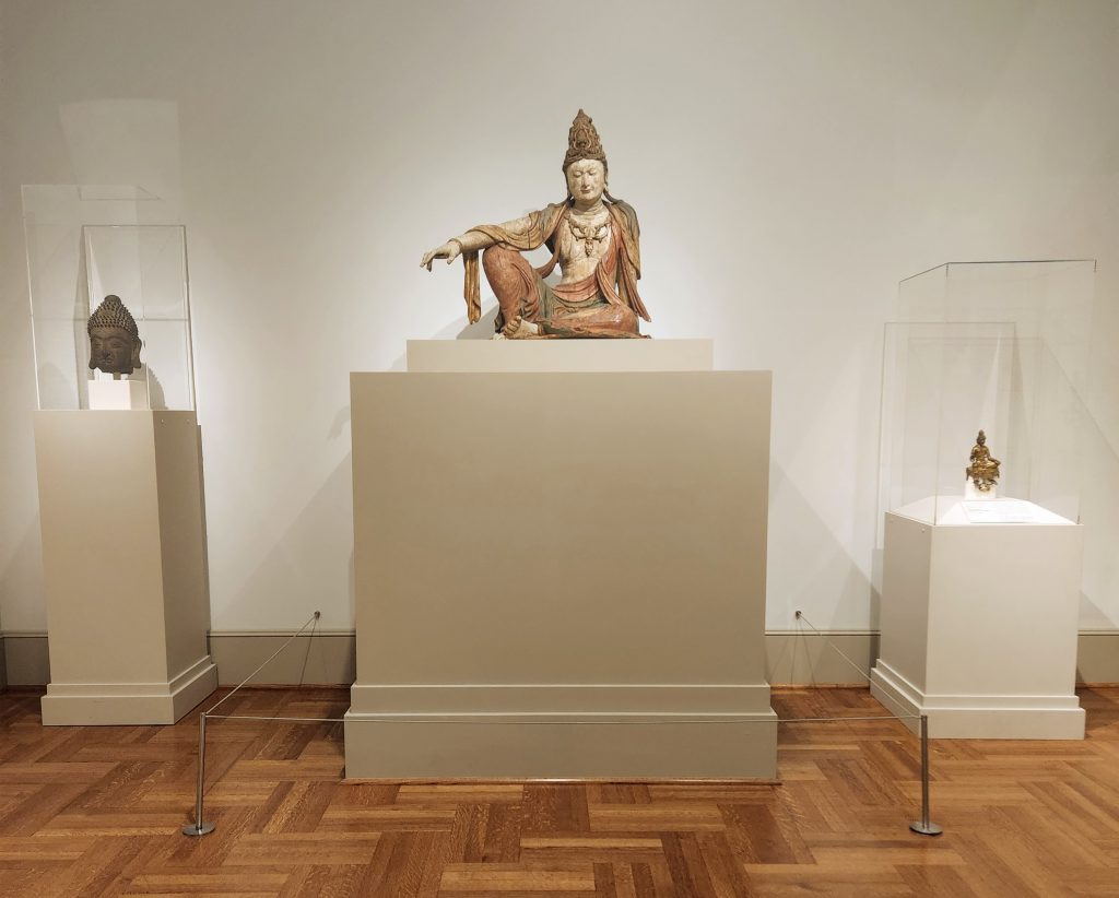
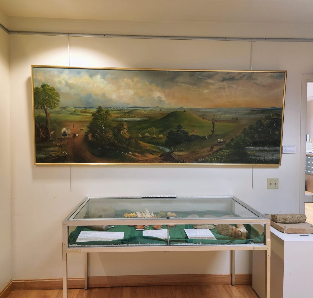
Cases of objects lined the walls of the gallery in typical SLAM style, with objects organized by material (per case) and chronologically (as one moves through the gallery), visually culminating in a large, polychrome sculpture at the end of the hall, framed by a large doorframe with crown moulding.

Bakewell Gallery, St. Louis Art Museum. Gift of Edward L. Bakewell, Jr.

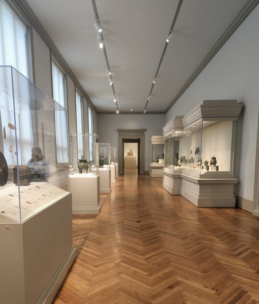
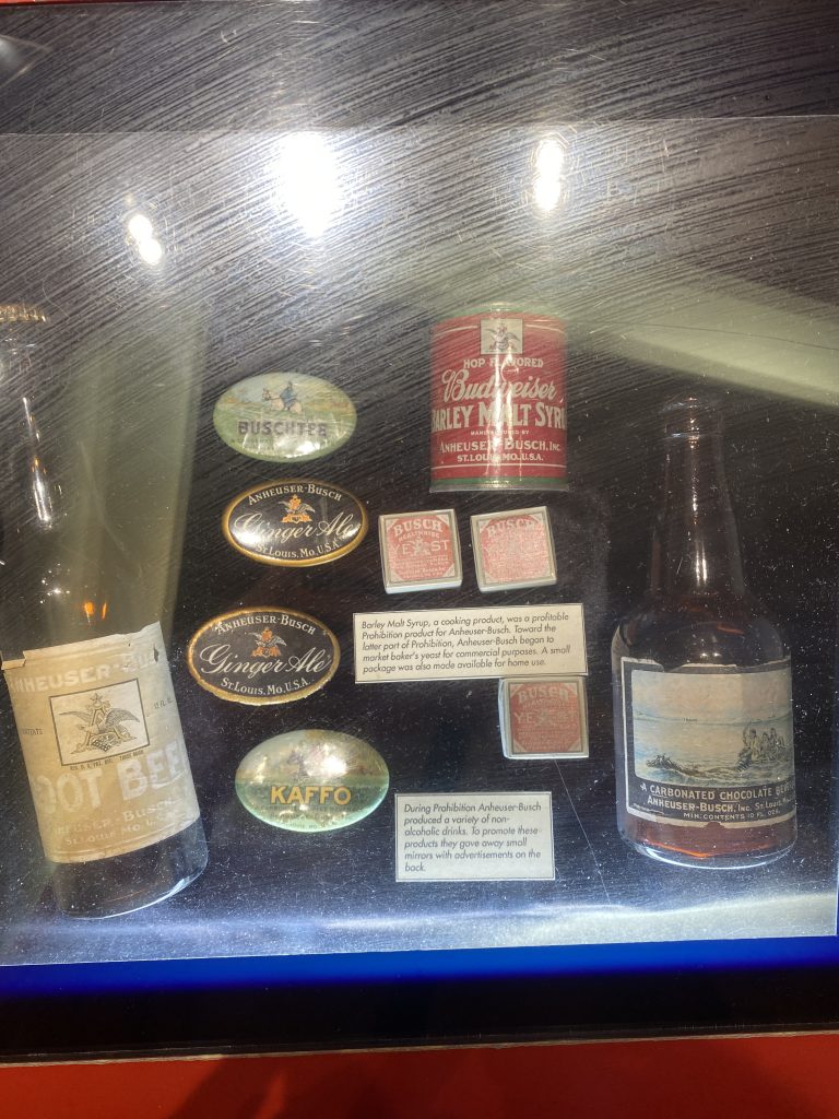
Wall-mounted panels on the left (window) side of the gallery provided context for the exhibit as a whole. Minimally descriptive labels accompanied each object. The combination of interpretive panels and basic descriptive labels worked for this exhibit. With less information accompanying each object, one is given the space to contextualize the artifacts at a slow, contemplative pace, setting the tone for the gallery overall. With so many ritual and religious artifacts on display here, the choice to allow for individual exploration and study (within the chronological framework) makes sense. The first panel at the entrance to the gallery further set the tone: “According to written records and archaeological evidence, jades were used in sacrificial offerings to gods and ancestors, in burial rites, for recording treaties between states, and in formal ceremonies at the courts of kings.”

Panel detail. Wall panels provided the historical/informational context for displayed objects.

As visitors move past the first panel and set of cases, we can learn about jade, its uses, and the beliefs tied to it from the earliest days of the region that later became a unified China. Moving chronologically, the exhibit shifts focus from the Neolithic beginnings of Chinese art into the Bronze Age, with case after case of intricately created figures, vessels, weapons, and more. Curators of this exhibit were able to display hundreds of objects within this single, long room by making use of vertical space within the large cases. Mounted via clear rods to the Plexiglass vitrines, small objects are lifted from the pedestal surface to eye-level, allowing for more label room and a more visually engaging space.

Objects mounted on a reinforced vitrine. Object label details. Photo by me.

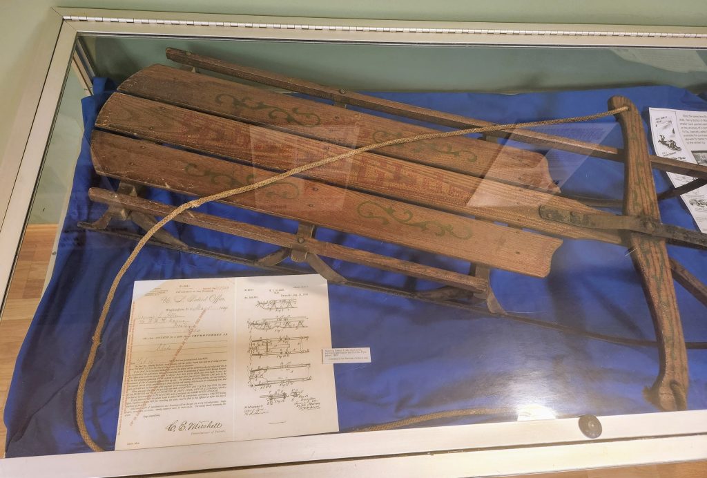
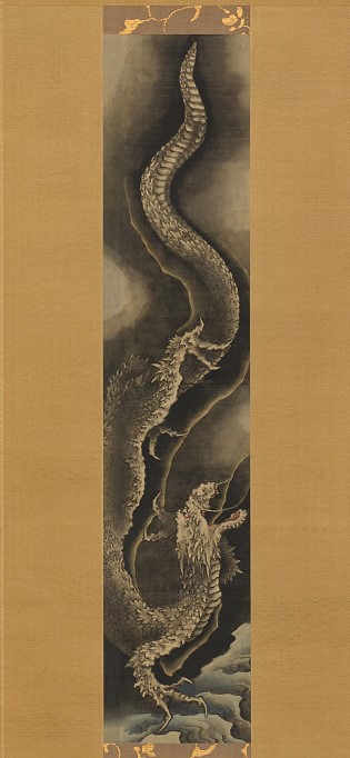
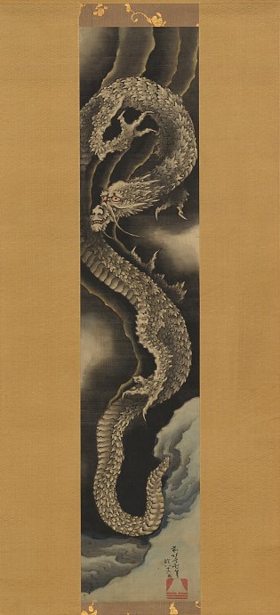
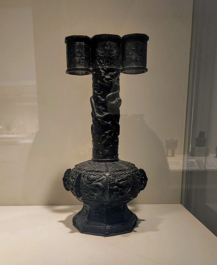
The stoic, prayerful atmosphere of the first half of the room was replaced by a feeling of movement and artistic flow as one moves closer to the doorway into the Buddhist gallery. Wine and food vessels allude to the increased opulence in Chinese courts and provide contrast between both the earlier displays of jade and the later collection of Buddhist artworks. It was here in this transitory section that I was struck with the title of this blog post, after looking at the bronze wine vessel below. An interpretive label nearby the object highlighted the unusual elongated neck and three “spouts” at the top. But what was it used for? I read on and suddenly understood the familiarity that this object was giving me – it was a drinking game!

Arrow Vase. Reminiscent of a modern game involving Solo cups and ping-pong balls, this vessel was the target of short, feathered arrows. St. Louis Art Museum, gift of Robert E. Kresko (15:2005).

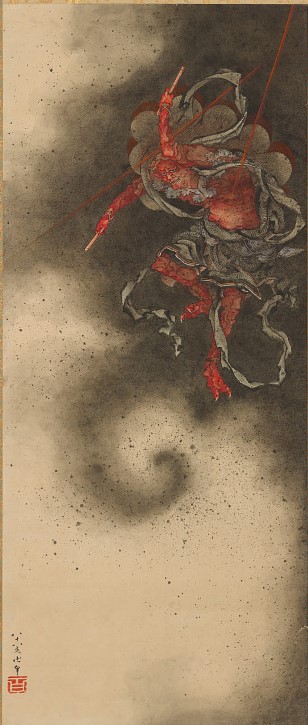
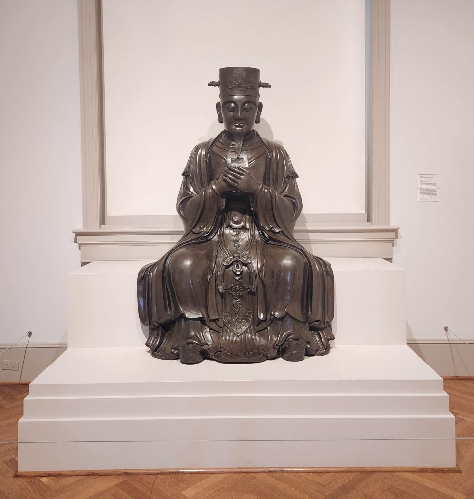
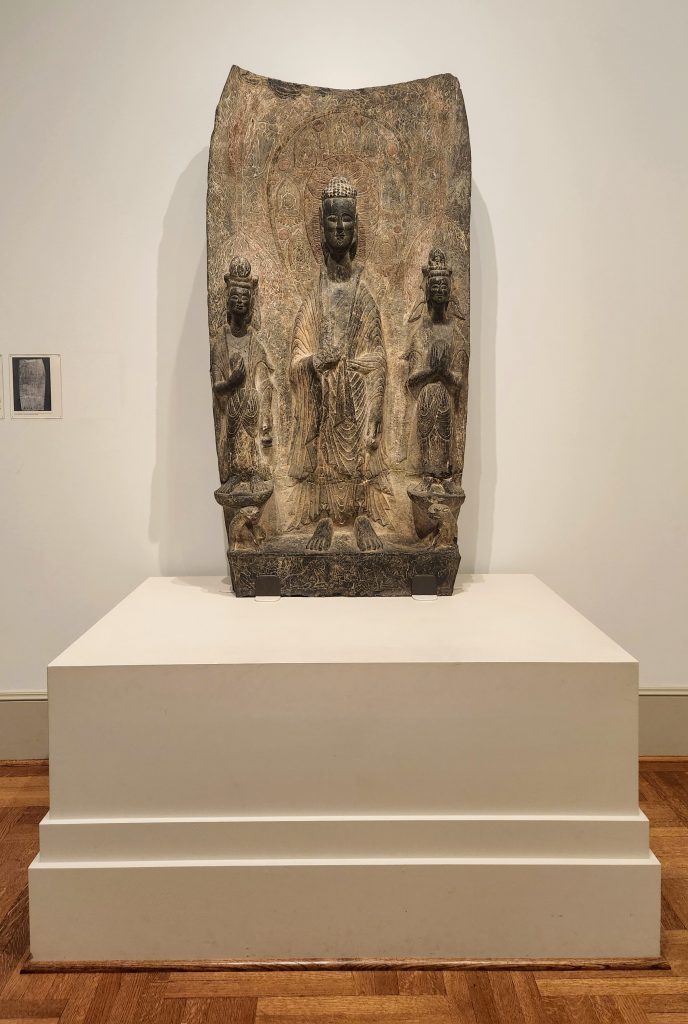
Moving past the collection of Chinese bronze work, visitors finally come to the end of this section of Asian Arts, the Buddhist sculpture gallery. Dominated by a bright polychromed statue, this square room was both a literal and figurative turning point for this exhibit. Having seen so much bronze in both small and large formats, the wood, stone, clay, and gold-plated materials of this room are a clear transition to the adjacent gallery, exhibiting Chinese ceramics. (Because I had surveyed this corner of SLAM when I first entered the gallery, I knew the ceramics rooms were presented differently than the one I had just come from. There, exhibit displays were not organized chronologically but by form and style; while intriguing and undoubtedly important, this gallery would be the end of the line for the purpose of this review.) Instead, I moved to analyze the larger statues in the Buddhist gallery as the culmination of the “progress” narrative of the jade and bronze before.

Votive Stela of Sakyamuni Buddha and Attendant Bodhisattvas, 505 AD (Northern Wei Dynasty). St. Louis Art Museum, museum purchase (38:1936).

Ultimately, the first gallery of the Asian Arts exhibit introduced here is a chronological survey of Chinese cultural practices from the Neolithic period through the rise of Buddhism in the region. I believe that the exhibit curators are successful in conveying the idea of forward progression through the objects displayed in this section. The exhibit is highly accessible, as demonstrated by wide walkways, even flooring, bright, well-oriented light, and clear signage. Additionally, all of the object labels in this section had at least some level of bilingual text. Without any knowledge of Chinese writing, I am unable to discern how much of the labels is translated; however, the inclusion of another language at all is a positive step, in my opinion. Additionally, labels here include a color photograph of the object they are describing, which is immensely helpful in areas of high density (a very well-packed case) as well as for descriptive purposes.

The only critique I have for this exhibit is the lack of directional signage…without doing a survey of the area first, it would have been difficult to discern where this exhibit ends and the next begins. Such is the case in a lot of art museums, I feel, as the objects are meant to speak for themselves in relation to those around them. I understand the choice, but for practical purposes, the blurred boundaries between sections could cause a visitor to get turned around, or to not understand the forest for the trees.

Seated Bodhisattva Avalokitesvara (Guanyin), 11th century (Northern Song Dynasty). St. Louis Art Museum, museum purchase (110:1947).

Cheers! The History of the Anheuser-Busch Brewery

Heritage, Quality, and Innovation: The Anheuser-Busch Story, Located at the Anheuser-Busch Brewery. St. Louis, MO. Permanent exhibit.

Established in 1857, The Anheuser-Busch Brewery in St. Louis, Missouri grew from a small, local company to being a worldwide distributer of beer. With buildings still standing from when they were first constructed in the 1800s, beer tasting, and tours available, visitors of the brewery have ample opportunities to learn and experience. The visitors entrance opens into a large space with tall ceilings surrounded by tinted windows. As visitors continue forward, to their right is a souvenir shop, in front of them is the guest relations and tour desk, and to their left is a small exhibit on the history of the company. Set apart from the indoor Biergarten, this exhibit seems to be marketed to those most interested in learning about Beer, or perhaps those that are waiting for their tour to begin. Regardless of the visitors’ reasons for viewing, much of the information provided is later explained during the tour, so it serves as supplemental information for those who wish to know more about their experience that day. Based upon a chronological timeline, the exhibit provides visitors with easy to understand visuals along with objects used for advertising and of beer products made by Anheuser-Busch. This exhibit is meant to show the history of the company in a concise and easily digestible manner so that viewers are inclined to also continue to consume their readily available beverages.

Anheuser Busch Brewery Tour Pictures – Daily Appetite
Inside of the guest entrance to the brewery. Image courtesy of https://dailyappetite.com/anheuser-busch-brewery-tour-pictures/.

Titled Heritage, Quality, and Innovation: The Anheuser-Busch Story, the exhibit aims to tell the story of the company and how hard work allowed for them to become a success story. According to the exhibit, “The Anheuser-Busch story is one of remarkable achievement.” Plainly stated in the first panel on the left side of the display, their story is one of values, vision, courage, and integrity. This framework is reminiscent of plaques or short stories that are often present in the lobbies or conference rooms of large businesses. Their years developing their business, period of struggle or contention, and their overcoming of obstacles to be successful are common in telling a more commercialized version of history for viewers. It prepares viewers for the tour if they have not yet attended it or provides more visuals for them to remember what they learned that day. The exhibits narrative plays to the American myth of picking oneself up by the bootstraps and their positively presented effort within a capitalistic system.

First panel presented in the exhibit. Photograph taken by Emily Eckles.

This exhibit is not set up in an enclosed space, rather it is a portion of a wall that is open to the large entrance hall one side, the indoor Biergarten on the other, and the customer service desk diagonally across from it. With a curved shape, the exhibit invites visitors to stroll through on their way to get beverages, or for them to wait for their tour to begin. Because of the nature of the brewery, it is loud inside, and voices carry because of the high ceilings. This space is set up with a plethora of chairs inviting guests to sit and look at the timeline in front of them, and it gives opportunities for those who are more interested to get closer and read from the display cases.

A portion of the exhibit is hung on a slightly curved wall, and the other portion can be found in the display case attached to the wall. Writing and explanations for the objects included are printed onto the wall or onto plaques help bring context to the Anheuser-Busch story, and the objects chosen for display. Two TV screens are included as a part of this display but were not in working condition. Some other screens were also built into cabinets and seemed to be interactive, but again were not in working condition.

This exhibit presents unique objects for viewing, and its brief coverage of Anheuser-Busch’s products during the United States’ prohibition era are especially of interest. The exhibit presented a selection of premiums, small giveaway items that advertised the company. However, this exhibit lacked attention from its proprietors. The screens for more material related to the exhibit were off or not in working conditions, the window wells that contained items on display were not only dirty, but their lack of maintenance also made it difficult to view the items with the overhead lights because of all of the smudges. This exhibit limits its own viewers to those who are able to stand, those who use mobility aides can maneuver the area, but may be unable to see portions of the exhibit due to items being placed into window well-esque spaces that viewers have to look down into. The exhibit also does not offer any auditory clips for viewers who may be blind or have poor eyesight. This exhibit also does not provide the information of the person that curated it.

Visited on June 4th, 2022, this exhibit was interesting to view before my tour of the brewery began. Its simplistic nature made the information easy to understand, and the most interesting aspect was their panel on prohibition and their response to it, and their competition against Pabst in the 1893 World’s Fair in Chicago, IL. This exhibit is not the main driver to go to visit the Anheuser-Busch brewery, it is present to give visitors something to do while they consume products of the company from the Biergarten that is located directly next to the exhibit. Visiting this exhibit is great supplemental information for viewers to think about while attending the brewery tour.

The Castle in the Corn

Fort de Chartres, source link below.

The Fort de Chartres is a state historic site under the protection of the Illinois Department of Natural Resources, Historic Preservation division. It is located about 4 miles west of Prairie du Rocher, Illinois. The Fort has been coined the “Castle in the Corn” by locals due its seemingly random placement in the middle of farm land. The large structure was home to French settlers when they first inhabited the Illinois area in the 18th century (1753-1772). The Fort served as the central government and military base.

Fort de Chartres hosts many reenactments during the year and I was a visitor during their 2022 Fort de Chartres Rendezvous on June 4. It was a hot day but that did not stop visitors from walking through the Fort as men, women and children wore colonial clothing and stayed in traditional tents. For those with Native American lineage, they wore their traditional 18th century garb and stayed in teepees. Various homemade items such as wooden kitchenware, cast iron cookware and metals were available for purchase. The Rendezvous offered cannon shootings, musket shooting and battle reenactments with a full warring marching band.

Small diorama on the right side as you enter the museum, illustrating what life inside the Fort would have looked like.

The Fort museum is located in a side building within the grounds. The hours of operation are Tuesday to Sunday from 9 am to 4:30 pm. There are stairs to gain entrance into the museum and although there are not many, there is no wheelchair accessibility. Upon entering, the museum is cozy and fairly well lit with most lighting aimed at the exhibits. The space is well utilized with objects found on the grounds and details a small history of Fort de Chartres that can be heard audibly as you approach a diorama of the Fort.

The Fort is 1 of 4 left standing, originally a wooden fort.
A brief telling of the empire that had colonized in Prairie du Rocher. An example of the label size and information. Pictures are attached to the textured wall by double sided velcro and artifacts are attached with a clear thread, most likely fishing line.

The layout of the museum was very linear. The visitor followed a curated path of artifacts found on the Fort grounds. The exhibits seemed basic but well thought out. I was not very impressed but needed to remind myself that considering the financial limitations that are available to the Fort, having a museum at all is a gift to the public. There was limited space and the museum did a great job utilizing it to create as much traffic low as possible while also informing the public on various exhibits. The museum may be limited but they tried their best in engaging with visitors as best they could. The exhibitions were directed towards visitors with limited or no knowledge of the Fort’s history.

Objects available to touch as you made your way through the museum.
Drawers were available to open to view more objects. A great way to utilize limited space and offer as many artifacts as possible.

There was a lot of information to take in as they people started to file in. It being a celebration weekend, the site was busier than usual. I felt I was not able to look or read as much as I had intended due to the feeling of being rushed by other visitors and children. There were a lot of labels, but they did a good job of balancing the artifacts, maps and dioramas and information. Many of the exhibits were of ceramic plates, cufflinks, and a few guns. It kept the visitor interested without boring them. The space being narrow and small, it was not ideal for an influx of visitors. However, I was happy to see people visit the museum instead of bypassing it for other Rendezvous activities. The museum would benefit for some updating. Not necessarily technology but with newer labels and better lighting. I do not think that the museum had intended to mislead the public in any way, but some of the artifacts seemed to be replicas. There were no signs telling that they were original, yet there were no signs saying they were not either. Being a museum studies professional, I feel this is something that the Fort museum needs to address. Their security poses a concern as well. There seemed to be no true form of security besides a locked door, which makes me wonder how authentic some of the collection truly is.

Picture source

Fort de Chartres State Historic Site

Oceanic Exhibit at SLAM

For my first exhibit review I went to the St. Louis Art Museum. This renowned institution just reinstalled their Oceanic exhibit and I was instantly drawn in. The exhibit features multiple items spread across all of the Oceanic area, which includes Australia, the microcontinent Zealandia, part of New Guinea, Melanesia, Micronesia, and Polynesia, and shows a wide array of crafted items and styles of construction. Given the exhibition style of the SLAM, there was not an express idea behind their distribution of artifacts or the exhibition. However, I got the impression that there was an idea as the exhibition was placed between the African art exhibit and the Victorian wares, which could cast the concept that the Oceanic exhibit was the bridge between traditional wooden art and modern wares that are ornate and useful.

War Canoe Sternpost, early to mid-19th century, on display at the St. Louis Art Museum Oceanic Exhibit. Photo by me.

An example of this thought process could be seen in the exhibition of a war canoe sternpost which has extremely intricate carvings, but is part of something mundane that was essential. Not only is this piece of material essential in a warring party, used for protection and ritualistic ideas, but it was also a treasured piece of art that would be properly cleaned and stored once it was done being used. In addition to this piece was a breastplate crafted from ivory and pearl shell, both extremely valuable and fragile materials.

Breastplate made of ivory and pearl shell, c. 1840-1850, on display at the St. Louis Art Museum Oceanic Exhibit. Photo by me.

This piece seemed to serve as the focal point of the exhibit as it was in a small room that was barriered on each side by large carvings that served as guardians for a communal celebration house, implying a sort of protection or celebration for the contents within. This piece would have been worn by an illustrious chief or leader and would be the most illustrious item in one’s mind, but it did not receive this treatment. Many of the items in this area were in dimly lit areas, which the pictures do not properly represent. This item stood beneath a small light and was alone in its case, similar to a distant royal who would have worn it. The breastplate could be sensitive to light, which would explain the dim setting, but in comparison to the collections flanking either side, it seems to be an afterthought, rather than a highlight.

This collection had many illustrious items, but none of them seemed to be the star of the show, nor a representation of a common theme or culture, as New Zealand and especially Māori items were the most prominent amongst the artifacts. There were a few items from New Guinea or Fiji, like the breastplate above, but for the most part, the items were from New Zealand or featured a Māori artist. A majority of these items also featured humans, both female and male, and stylized representations of them, aside from one outstanding piece that seemed more African than Oceanic, which coincides with its placement in the exhibit.

Memorial piece of a hornbill, late 19th to early 20th century, on display at the St. Louis Art Museum Oceanic Exhibit. Photo by me.

This piece is a memorial artifact that symbolizes a form of the infinite matter that surrounds us all and would be left to deteriorate in the forest after the memorial services. This piece is a stark difference compared to the rest of the exhibit as those items are based around people and practices such as hunting, celebration, and war, whereas this would be used to honor the dead. This is much closer to the African exhibit physically, as it is on the last wall before the transition, but it also features a much more African style, color scheme, and symbolism. This lends itself to the idea that this exhibit serves as a bridge between modern crafts and tools and the ancient art of Africa. This exhibit was reinstalled through the efforts of co-curators Nichole Bridges and Morton D. May, guest curator Philippe Peltier, Jacques Chirac, and Amy Clark. All of the above names besides Amy Clark, who was a research assistant, are curators or co-curators for this exhibit and others, which could mean that this exhibit had the main goal of being educational and comprehensive, as opposed to the meaning I ascertained from it all.

In terms of access and ease of understanding, the exhibit was straightforward and simple in execution. One would simply travel from the Victorian section, or the African section, to the Oceanic section and simply walk straight through it. There are benches in the center of the aisle to allow easier observation or pondering, and had very few elaborate exhibits. The lighting was sufficient but it did not have an inclusive design as the labels were not embossed with Braille, nor were the displays cordoned off for those that might need help to avoid collisions. There was no music or elaborate displays related to the items, as it was literally just a hallway and a small room decorated with white display cases surrounding items encased in glass. The text that was available was slightly small and the sections of text provided ample enough description or context to sate a viewer, if not increase their interest enough to research it more on their own.

Overall, this was an excellent exhibit that allows those with little understanding of Oceania to gain some knowledge and appreciate the craftsmanship illustrated by their people. The exhibit mainly focused on practical items or things related to everyday life, but some of the pieces had memorial qualities or war-related purpose. The gallery was accessible and even provided a place to rest, which was an improvement compared to others. This exhibit is highly recommended, especially since it is now returned after years of being gone.

Sources:

Hathaway, Matthew. “Reinstalled Galleries Present a New View of Oceanic Art at the Saint Louis Art Museum.” Saint Louis Art Museum, May 21, 2021. https://www.slam.org/press/reinstalled-galleries-present-a-new-view-of-oceanic-art-at-the-saint-louis-art-museum/.

St. Louis Art Museum Oceanic Exhibit, in person with the author, June 4, 2022.

MadCo’s Miniature Museum

Photo by Billy Woods, Edwardsville Intelligencer. See source link below.

The Madison County Historical Society is a local historical institution with a large collection of documents, photographs, three-dimensional objects, and other records related to the history of Madison County, Illinois. The Archival Library, one branch of the institution, is located within a one-story brick building next to the historic Weir House, a two-and-a-half story Federal-style home which has been used as the museum gallery since 1964. The Weir House and MCHS’s galleries have been closed to the public since early 2020 for renovations. This loss of gallery space prompted MCHS staff, most notably Jenn VanBibber, to set up a temporary exhibit space inside a conference room in the Archive for a series of rotating exhibits related to Madison County History. 

I visited this “Mini-Museum” on June 16, 2022. I was already at the MCHS Archival Library on this day completing work for my Museum Studies internship, so I decided to review Jenn’s current selection of exhibits inside the gallery – which, should be noted, is physically separated from Jenn’s office only by a 5-foot-tall temporary cubicle wall. (A great idea, in my opinion, due to the transportability, size, and ability of the wall to have lightweight panels or documents mounted to it.) Jenn VanBibber wears many hats in MCHS, but she is usually ascribed the title of curator. She also contributes a lot of work on the registrarial side, as well as overseeing my internship at MCHS this summer.

Shadow box-style exhibit installation at the Mini-Museum.

The Mini-Museum’s big idea centers around the construction of a shallow, wide survey of Madison County history from ancient times to present. Because the nature of the exhibit is rotational, the overarching idea remains broad, allowing for pieces of the exhibit to be switched out. This big-picture view allows the curator to present many different types of artifacts within the same space; it also provides the visitor with a quick outline of Madison County history, rather than going in-depth on one topic. Audience demographics can vary, but based on both my analysis of the exhibit’s foci and my time spent at the Archive, visitors seem to be limited to those who are already at MCHS for other business (volunteering, an internship, scholarly research, an event) or those seeking a specific artifact on display. As the Library’s hours are extremely limited (9a-4p Wednesday-Friday, and 1p-4p Sundays), scholarly research likely happens within those times or by appointment, severely limiting the time spent on anything besides one’s research – including the Mini-Museum.

The exhibit is contained within approximately half of the Library’s conference room. Rectangular in shape, the exhibit has only one entrance/exit, allowing for a somewhat self-directed viewing experience. Entering the space from the back left, one is first confronted with a flat case to the left and a free-standing set of panels to the right.

View of MCHS’s free-standing panel display with QR code tags attached.

 I decided to head through counter-clockwise, leading me to the ‘Spirit of Sport: Winter Edition’ mini-exhibit first. Along the left wall were cases containing several pairs of ice skates, a 1928 Hibbard Gliger sled, and pages of relevant archival documents. One of these flat cases has a metal placard designating it as property of The Bank of Edwardsville (now Busey Bank). Mounted on the wall above the flat cases are five panels of various sizes – two 8-11” panels for each flat case, and a larger pentagonal panel in the center for general information.

One of two flat cases of artifacts in the “Spirit of Sport” mini-exhibit. Three of five wall panels visible.

An additional pedestal with vitrine was dedicated to an 1890 toboggan used in Alton by, allegedly, the Lemp family and friends. In this exhibit, object labels are often typed on the same page as the supplemental information, which is often from outside sources. Sometimes, labels would be more traditionally formatted and placed, like the one from the 1890 toboggan below.

“Spirit of Sport” mini-exhibit, label detail.

Past the Winter Sports exhibit was a collection of document copies and artifacts related to Robert Wadlow, including his very large shoe in a vitrine on a tablecloth-clad pedestal. A life-size print cutout of Wadlow stands next to an oversized wooden ruler, allowing guests to, literally, measure up to the local giant.

Robert Wadlow mini-exhibit. An informational tag can be seen attached to Wadlow’s wrist, showing that this cutout is part of MCHS’s permanent collection.

Following Wadlow’s section, a television mounted within a shadow box constructed as a window further engages visitors to stop and interact as they watch the slideshow of images through the window panes. 

Next, a large mounted plat map of Madison County is hung, interestingly, over a closed and blind-covered window. Although the plat is clearly constructed from facsimile panels, I do wonder what the over-window placement might do in terms of exposure to the elements; perhaps too much moisture, or light exposure, or any other environmental factor might affect a more unstable object.

Large plat map installation with window frame seen above.

The next section of the exhibit pays homage to the ‘first farmers’ of Madison County, the  Mississippian peoples of Cahokia. Another flat case is filled with some lithics, including a mortar and pestle set as well as several chert tools. At the center, several terracotta saucers hold (modern) examples of seeds which were farmed by the Mississippians in this area. One chert hoe was attached via leather straps to a replica handle, which was labeled as such inside the case.

“First Farmers” mini-exhibit. The chert tool at bottom right is mounted on a replica handle, as the label details.

To the immediate right of the case was a pedestal, sans vitrine, displaying a metate and mano set. A large “Do Not Touch” sign was adhered to the top of the pedestal near the descriptive label.

Metate and mano display pedestal.

Above the “First Farmers” case hangs a very large oil painting. This “primitive style” landscape seems to depict the American Bottoms, with St. Louis – in its infancy – shown in the background of the several Cahokian mounds and pioneer-style settlers and their gear. Found in the attic of the Weir House in the ‘60s, the provenance of this painting is unknown (a fact gleaned from the very descriptive label mounted to the right of the painting).

Weir House oil painting above the “First Farmers” case.

Finally, a free-standing tri-fold board is placed in the center of the room. This set of panels is organized to describe the several treaties between the U.S. government (state, federal, and local) and local Native American tribes. These panels exhibited copies of historical treaty documents and maps which were contextually illustrated by relatively long, descriptive labels.

The two critiques I have for this collection of mini-exhibits are both focused on the temporary nature of the exhibit. The Robert Wadlow section was the most fleshed out, and would be a good exhibition for a visitor without much local or institutional knowledge, as it tracks Wadlow’s life in the county from beginning to end. The Winter Sports exhibit had the best panels, although the out-of-season theme and lack of more permanent and complete labels made this section feel the most temporary and overlooked. Here, very interesting objects from MCHS holdings were displayed in such a manner so that it felt, somehow, less interesting – as a museum studies student, the outside sources (advertisements, patent documents) placed within the cases stood out to me as a lack of supporting information related to the specific objects themselves, though it would have made good background information for a panel.

“Spirit of Sport” case featuring a wood-and-metal sled. Documents in this case include patent documents for the ‘Flexible Flyer’ sled, ‘Flexible Flyer’ advertisements, a 1940 photograph of snow sledders in Connecticut, and label information including a short description and accession number.

In summary, the MCHS “Mini-Museum” is a good overview of Madison County history for an audience with some basic knowledge of the area. As a local, I felt that I was already familiar with the subject matter of the exhibit, and as a result I did not read every bit of text or watch all 60 images rotate through the “Window to the Past” display. Having determined that the audience of this exhibit is most likely to be individuals with a similar amount of knowledge – that is, more expertise than a complete “blank slate” visitor – I feel that this exhibit will continue to sit quite empty. I would love to see how MCHS staff will continue to include new artifacts from the collection as the Weir House renovations march on. Until then, though – this museum feels a little bit too mini. 


Additional Information:

Madison County Historical Society: https://madcohistory.org/

Photo source, Edwardsville Intelligencer: https://www.theintelligencer.com/news/article/Madison-County-cuts-funding-to-historical-society-16770851.php

Mini-Museum press release, MCHS: https://madcohistory.org/gallery-opens/

MCHS Newsletter, Nov. 2020 (details Weir House renovation plan): https://madcohistory.org/wp-content/uploads/2021/03/2020-Nov-MCHS-News-Weir-Family-PDF.pdf

Hokusai: Mad about Painting

Hokusai: Mad about Painting

The Asian studies section of the Smithsonian Institute presents a digital exhibit of Japanese artist Katsushika Hokusai (1760-1849), which is a rendering of their physical exhibit. The physical exhibit is held in the Freer Gallery, since it was Charles Lang Freer who collected most of Hokusai’s art, realizing its potential long before other collectors. In honor of Freer’s death in 1919, the gallery is hosting a year-long exhibition of Hokusai and his artwork. The collection was curated by Frank Feltens. Generous support for this exhibit and the museum’s Japanese art program is provided by the Mitsubishi Corporation.

Methodology

Here we can see the format of the digital exhibit. Each image has a small description of what awaits the viewer and pulls them to that page. Once on the selected page the viewer is free to click on the images, video, or audio that awaits them. They may either use the back arrow in their browser or follow the arrows back to the “Hokusai: Mad about Painting” home page.

The accessibility of the site was rather easy, as I mentioned above the viewer can either use links at the top of the page to return to the home-page or may use the back arrow of their web-browser. This does, however, slow down the exhibit and ruin its flow, since it prevents the viewer from moving in a linear fashion. After each page is viewed, the viewer must return to the home-page in order to access the next page. The exhibit itself is not technically linear, the viewer may choose to go in any order they like of the six pages, but they are forced to always return to the home-page. This should be adjusted to fit the flow and style of the material being displayed.

Design

Of the seven pages that the exhibit used, only two contained many images of Hokusai’s artwork (Curator’s Choice and Object Gallery). There were three pages which all had videos of varying lengths discussing different pieces (with the video on Hokusai Talk being the longest and the most in depth of his work/the real exhibit), and one clip discussing Hokusai’s work on a podcast.

The text used throughout the exhibit was plain, thin lettered black against a white background. The exception to this rule is found in the Object Gallery where the names of the pieces are in a larger, red font with smaller, black font beneath the piece describing it. The rule of thumb on the design of this site must have been to use as little text as possible. When videos or images could suffice, words were left out of the equation. In my opinion this allows the viewer to more fully enjoy the work of Hokusai without being bogged down by too much text.

Layout of the Object Gallery section of the exhibit; notice how a few images are missing.

Many of the images do not have narrative descriptions and only use text to describe the dimensions and materials being used in the piece. When you click on any given image more metada is displayed beneath a higher definition version of the image (as seen below).

It would have been nice to see short, narrative captions inside the gallery view and then see ALL of the metadata when the viewer went to the image’s page. This is a personal preference and does not, in my opinion, weaken the structure of the exhibit, only its style in presentation.

Content

The exhibition is clearly about Katsushika Hokusai’s paintings and sketchings and the desire to shed light on his less-known, yet equally astounding, works. The exhibit talks and audio specifically seek to argue that as Hokusai aged he became more and more enraptured with painting and his desire to paint everything he saw grew until his final days. He was, as the title suggests, “Mad about Painting.” The target audience for this exhibit is primarily mature audiences who would be willing to listen to longer videos about his work and those who have the time and patience to appreciate what Hokusai was able to accomplish, even in his old age.

Hokusai was famous for his print “Great Wave off the coast of Kanagawa,” and yet this exhibit seeks to persuade the viewer that he was a much more accomplished artist than the man who created that one piece. This exhibit provides a necessary service in highlighting the life and work of a man who has been so long associated with only one piece, and wrongly so. Hokusai was a masterful painter who created the most beautiful paintings, arguably, in all of the Edo period and even into the nineteenth century. To tie this man’s great work and even his life to the existence of one piece is foolishness. Again I say, this exhibit provides a necessary service in proving, not through words, but through the very brushstrokes of Hokusai himself, that one image does not define the life of any artist.

“A Moment Alone in the Shade:” Walking the Grounds of Mount Vernon

https://virtualtour.mountvernon.org/

Mount Vernon was the plantation and estate belonging to the first President of the United States, George Washington. It is also the place where he is buried, alongside his wife Martha and 20 other Washington family members. Mount Vernon was originally named “Little Hunting Creek Plantation” and was owned by John Washington, whose son Lawrence inherited the estate upon his passing. Lawrence Washington then passed the estate down to his daughter, Mildred. Mildred’s brother, Augustine, George Washington’s father, bought the estate in 1726 and built the main portion of the plantation house. In 1740, Augustine passed the estate to his eldest son Lawrence, George Washington’s older half-brother, who renamed the plantation Mount Vernon, after English naval officer Admiral Edward Vernon. Future President George Washington only inherited the plantation after his brother Lawrence (and his two heirs, his daughter, Sarah, and his wife, Ann) passed away. George Washington is responsible for the grand additions to the plantation, including an upper and lower garden, a greenhouse, and a botanical garden.

According to their website, “Mount Vernon is owned and maintained in trust for the people of the United States by the Mount Vernon Ladies’ Association of the Union, a private, non-profit organization.” If you click the photo to the right of this text box, a new tab will open and you will be directed to the official website for Mount Vernon.

The Mount Vernon Ladies’ Association of the Union is dedicated to the preservation of Mount Vernon so that the legacy of George Washington may continue for generations to come. The virtual tour of Mount Vernon allows people from all over the United States to “walk” the grounds of George Washington’s estate. From the novice to the enthusiast to the professor, this virtual tour is designed so that everyone can take something away and learn something valuable. I would argue that tours of historic estates such as Mount Vernon are some of the most essential elements of history education. They allow the visitor to analyze a time period from a different perspective which is so incredibly important. When it comes to the colonial period, people always talk about the Founding Fathers and the Constitutional Convention and the American Revolution/Revolutionary War. Those are all incredibly large topics that help the learner look at the time period with a wide lens. Touring an estate helps the learner look at the time period through the much smaller lens of the daily life of the people who operated the estate. Mount Vernon’s tour is a wonderful resource, especially for educators. This tour of Mount Vernon has been masterfully executed in terms of making the language accessible and allowing the viewer to learn about early United States history in a new way: through examining the way in which people lived their daily lives as opposed to only looking at large events.

“Knowledge is in every country the surest basis of public happiness.”

George Washington, first annual address | friday, january 08, 1970

When discussing the history of the United States, it is difficult, if not impossible, to find a period of time that was not affected by the enslavement of human beings, racism, or both. The Founding Fathers, despite their monumental efforts towards “freeing” the Americans from British rule, were not without fault. People tend to forget that the Founding Fathers were also enslavers. The text on the tour of Mount Vernon is strictly educational/informational, but the tone does change slightly when referencing the enslaved people on the estate. The language used does draw more attention to the inequity and the subpar conditions experienced by those who were enslaved by George Washington and his wife Martha, but it is not supporting or promoting a certain angle. It’s incredibly easy to put the Founding Fathers on a pedestal because of what they did for this country, but it’s equally as important to humanize them by openly discussing their flaws and their misgivings.

This edited photo of John Trumbull’s famous painting has a red dot over the face of every Founding Father that participated in enslavement.

Above photos courtesy of Arlen Parsa [@arlenparsa on Twitter], from who these images originated.

This edited photo of the same painting has a yellow dot over the face of every Founding Father who later freed those they enslaved.

See the “To Learn More” section at the end of this post for links to articles concerning these images.

“When only one side of a story is heard and often repeated, the human mind becomes impressed with it insensibly.”

George Washington, letter to edmund pendleton | Thursday, january 22, 1795

Let’s Take A Tour

This is the West Front of the Mount Vernon estate, which serves as the beginning of the virtual tour.

The virtual tour of Mount Vernon is a panoramic, self-guided walkthrough experience. The image above is the first thing that you will see once the tour has launched. There are not any visible directions on how to navigate the site; the viewer is left to figure it out on their own. The menu in the top left corner allows you to choose what area of Mount Vernon you would like to explore. If you hover your cursor over one of the options, i.e. “Mansion,” it will expand to the right and you will have another list of options to choose from. In the bottom left corner there is a box that tells you what area of the estate you are currently viewing (i.e. “West Front,” in reference to the above image). The + (plus) and – (minus) buttons allow you to zoom in and out of the image. You can also use the ones on your keyboard. The white text box at the bottom of the screen offers the viewer a description of the area they are currently viewing. If you click on the text box, it will disappear, but if you want to view it again, all you have to do is click on the yellow box with the three (3) dots and the checkmark that is to the right of the text box. (If the box is grey, you will have to click on it to turn it yellow, then click it again to get the text box to return.) This box gives the viewer the option to show or hide the tour interface.

The box will be grey if the tour interface is being shown, meaning that the menu of areas to explore is visible, along with the VR option and estate map .
The box will be yellow if the tour interface is being hidden, meaning that the menu of areas to explore is hidden, along with the VR option and estate map.

When the tour interface is being shown, there are a few extra options that the viewer has. The left and right arrows in the bottom right corner enable the viewer to take a more guided tour of the estate, as the website will direct you to the next viewable area without you having to choose. (If you are just starting the tour, you still can choose the “previous location,” even if you haven’t viewed any other areas. The tour is on a loop.) The icon above the arrows that looks like a pair of goggles enables a VR (virtual reality) experience. It gives the illusion that you are actually walking through Mount Vernon. I do not think that this feature is incredibly necessary as the tour itself is already immersive. The blue map above the goggles opens the estate map, which is an artistic depiction of an aerial view of the estate. You can only choose to visit seven (7) sections of the estate from the map: Leadership Hall, Reception Hall, the Rare Books Suite, the Document Room, the Reading Room, and the Library Front and Rear.

The little landmark icon with the star in it gives the viewer the option to view or hide the “points of interest.” These are the white dots, arrows, and “play” icons encircled in white that are scattered across the screen. If you click on one of the arrows, you will be taken to another part of the estate. For example, if you are looking at the West Front and you click on the far left arrow, you will be taken to the “New Room.” It’s a way of helping guide the viewer to different areas of the estate without having to consistently navigate the menu.

If you click the “play” icon, a video like the one above will pop up. A lot of the videos available on the tour are people dressed in period costume.
If you click the “dot” icon, a window like the one above will pop up. These are informational tidbits about different aspects of the section you are viewing.

As the tour is panoramic, you can rotate the image on the screen in a complete circle. All you need to do is press the left or right arrow keys on your keyboard. You can also press the up and down arrow keys on your keyboard to shift the view towards the ceiling/sky or the floor/ground. The visual is always really clear, so there is little-to-no lag time when spinning around. The only problem that I could see with this is that the screen moves really fast, which can make people dizzy (me!), and it makes it almost impossible to re-center back to the original angle. Once you get the hang of it, the site is easy to navigate, but it could take a few minutes to adjust to how fast the screen moves.

The virtual tour of Mount Vernon is filled with historical artifacts and reproductions of historical artifacts that would have been present when George Washington owned the estate. These artifacts range from teacups and saucers to paintings to furniture and beyond. Different artifacts will have different stories, so the amount of text that accompanies each one will vary. Each artifact (or reproduction) and its text offers a look into what life was like on the Mount Vernon estate. When looking at an artifact and its description, the background is black and the text is white, which makes it easier to read. The virtual tour of Mount Vernon is a wonderful way to bring the colonial period to life.

This is a short video demonstration of how the tour operates. While recording, I did make sure to not rotate the screen too quickly!

To Learn More

https://www.youtube.com/user/HistoricMountVernon

The link above will redirect you to the YouTube Channel for Mount Vernon that is managed by the Mount Vernon Ladies’ Association of the Union (the same group who is responsible for the upkeep of the Mount Vernon estate). If you click one of the small icons below the link, you will be redirected to one of their three (3) social media accounts.

https://www.politifact.com/factchecks/2019/sep/10/arlen-parsa/evidence-shows-most-47-men-famous-declaration-inde/

The link above will redirect you to PolitiFact, a website managed by the Poynter Institute. The particular article linked discusses Arlen Parsa’s Twitter post regarding John Trumbull’s famous painting, “Declaration of Independence.” The tweet in question is below. (If you click on it, you will be redirected to the tweet on the Twitter website.) The staff for PolitiFact researched each of the signatories of the Declaration of Independence to determine whether or not they enslaved people. The Poynter Institute for Media Studies is a non-profit journalism and research school in Florida. A link to the spreadsheet that was used to organize their research is as follows: https://docs.google.com/spreadsheets/d/1Tq3u2XkluveKhJXAFJNfPq8uaxMnJ3ylM1cXecYrB-Q/edit#gid=0

Native Patriots

https://americanindian.si.edu/why-we-serve/

Why We Serve presented by the National Museum of the American Indian.

I found out I am not only fighting for the little bitty piece of land I talk about, [or] my immediate family.

I found out I was fighting for all the Indian people, all the people of the United States.

Samuel Tso (Navajo), United States Marine Corps

Honoring all of the men and women who served in the United States Military isn’t just strictly reserved for United States citizens; members of Native tribes from across the country have given their lives to help defend our nation. Why We Serve seeks to honor the generations of Native Americans who have served in the armed forces since the American Revolution.

Jesse T. Hummingbird (Cherokee, b. 1952), Veterans, 2016. Acrylic on canvas, 101.4 x 76 x 3.5 cm. NMAI 26/9780

Anyone seeking to learn more about the heroes who served in our nation’s armed forces while also belonging to native tribes and nations. The site, and the book for which the exhibit is named for, are all to commemorate the National Native American Veterans Memorial in Washington, D.C. The information found throughout the site is not overly complex, using simple terms and easy to follow narratives. The main focus is to showcase the pride that indigenous people have for their generations of service to the military and the country, albeit at times being ironic.

For most Americans, we have the vague idea that Indigenous people certainly served in armed conflict and in service to the United States, but what most don’t realize is that they have also fought in all combat situations, from the very start of the Revolutionary War up to the conflicts in the Middle East. Native American’s are certainly a group of people who do not get the recognition they deserve from anywhere other than their own community. This exhibit strives to showcase the deserving generations of proud Indigenous veterans.

For many of Americans, patriotic pride comes from not only love of ones nation, but of the honor and glory of past generations service to the military and defending the home front. This is also true to Native Americans. Many of Native Americans today serve in our nations armed forces, and in the past generations, played a crucial role in victory in wars such as the Navajo Code Talkers. This virtual exhibit shows the gallery of portraits and biographies of native veterans along with educating about the history of Native American military service. Its strengths show in the great amount of first and second hand accounts of service along with artwork and photographs.

Methodology

The viewer navigates the site through scrolling down pages along with clicking on links to move further onto another topic, either by continuation of time line or by topic selection. The main menu gives a nice overview of the topic layout along with links to explore more topics or to the view the gallery, or watch the video.

View the personal stories of Indigenous veterans, how their diverse experiences led them to serving in the U.S. military, and the impact that it has had on their lives and identities.

The level of ease to find your way around the site is pretty high, the layout being pretty standard, and if you do get lost, there is a handy menu bar on the right side of the screen that pulls out a site map.

The topic information pages are formatted in a linear fashion due to their subject information, but that does not mean that the viewer has to strictly stick to going to the next page to find out what happens next. I found very little areas that would need improvement, given the fact that it does come from a museum belonging to the Smithsonian Institutes, the site seems to be pretty well formatted and ease of access is exemplary.

Design and Accessibility

The whole site throughout, is filled with photographs and images of paintings and drawings, almost all done solely by Native Americans or depicting them. The main home page has a patriotic background of blue with white text and red accents around the borders of pictures or alternating blocks of red and blue. The various topic pages have other colored backgrounds of greens, reds, blues, browns and beiges.

The exhibit, like mentioned previously, has images of photographs, prints, drawings and paintings primarily done by Native Americans and belonging to the collections at the NMAI or other Smithsonian Institutes.

Grace Thorpe (Sac and Fox, 1921-2008) at work in General MacArthur’s headquarters in Tokyo, Japan, in December 1945 from the Grace Thorpe collection (NMAI.AC.085), negative box 8, item 19, NMAI

Each of the images used throughout the site are captioned with not only the subject matter, but if there is a person in the picture, it gives what tribe/nation they belong to along with what collection it comes from. Usually following the caption of the image, a short biography is listed on the page in correlation to the time period of the topic page.

Conclusion

The exhibit demonstrated the beautiful honor and importance of Indigenous veterans and the courage that they had to serve for our nation. The site is laid out for easy access with a continuous color scheme and style formatting. Along with the links available for the topic pages, it also gives links to a gallery of images, to the video mentioned above, the book that the exhibit takes its name from and other resources that are very informative.

One thing that really stood out to me that I had not known previous to reading all of this, was the fact that there was no memorial to any of the Native American veterans of any of the foreign or domestic wars. Fortunately, Congress did task the NMAI with creating a memorial, which now stands out front of the museum, giving all Americans the opportunity “to learn of the proud and courageous tradition of service of Native Americans.”

Lives Entwined: Native Americans and their Horses

Crow War Pony painting by Kennard Real Bird (Crow).

The horse is an ubiquitous element in the early history of the American West. Few may realize this versatile creature became extinct in North America about 40 million years ago but was reintroduced at the end of the 15th century by Spaniards. When it arrived native people quickly incorporated the horse into all aspects of their lives. “A Song for the Horse Nation” incorporating 112 stunning works from the Smithsonian’s National Museum of the American Indian was curated by Emil Her-Many-Horses a member of the Oglala Sioux and was based on the 2006 book “Song of the Horse Nation: Horses in Native American Culture” edited by George P. Capture Horse and Emil Her-Many-Horses (https://americanindian.si.edu/static/exhibitions/horsenation/index/html). From early artifacts through contemporary works of art, the treasures of the Smithsonian thoroughly encapsulate the significance of the horse in Native American history and culture. The meticulously curated exhibit demonstrates that the culture Native Americans created around the horse has survived and is flourishing.

“A Song for the Horse Nation” describes the epic story of the intricate relationship that developed between the native tribes of North America and the horse from the 1600s to the present. The incorporation of the horse into native culture altered almost every facet of their existence. Curator Her-Many-Horses provides a window into the lives of North America’s indigenous people that is not only a feast for the eyes but reveals how dramatically horses affected the social, economic, cultural, and spiritual aspects of native life on the Great Plains. Highlights include historical ledger drawings, beaded saddles and horse masks, hide robes, photographs and paintings, including new works by contemporary artists allowing viewers of all ages to experience the way of life of America’s first people.

The online exhibit opens with a brief introduction about how the horse has changed and influenced Native American culture, specifically for tribes in the Great Plains. From here the viewer can access the six main sections of the exhibit arranged part chronologically and topically. Section titles include: Introduction, Return of the Horse Nation, Impact of the Horse (1680-1875), Native Arts and the Horse (1840-1900), Decline and Revival (1875-Present), and the Horse Nation Lives On. At this point it might have been beneficial to incorporate a timeline with topical links.

The majority of the exhibition pieces are from the NMAI or sister branches of the Smithsonian, and are enhanced by items from private collections, universities and other museums, details can be found in the Objects List <https://americanindian.si.edu/sites/1/files/pdf/press_releases/HorseNationalDC_checklist.pdf>. Concisely detailed descriptive summaries accompany each section, and are associated with abundant and well-chosen images. Legends for each artifact, drawing, or photo include date created and individual or tribal association as well as purpose of each artifact. Artifacts characteristic of the Great Plains tribes cover the region from the Dakotas in the north, south through Texas and beyond. Harnessing the power of the horse aided the tribes in expansion of their range for hunting, trade, migration, and warfare.

Following the introduction, Sections 2-5 are divided into varying numbers of subsections describing the artifacts, photos, and drawings. Selected materials illustrate the synergy between native people and the horses that irrevocably changed their lives. Also included are sound recordings of the names for “horse” spoken by native people in their tribe’s language and a video documenting how the Nez Perce tribe, bred horses for strength, speed, and endurance. A powerful and emotional supplemental video explaining why the horse is an important relative of the people can be viewed at <https://www.youtube.com/watch?v=tlSfhP4FRMo>.

In the Lakota (Sioux) language the word for horse is Sunkakhan (“holy dog” or “mystery dog”).

The exhibit illustrates the fruitful relationship Native Americans developed with the horse that Europeans unintentionally gave them. As can be seen in the illustrations to follow the horse greatly enhanced the lives of Native Americans and aided them in their resistance to encroachment by a westward moving army and settlers. This exhibit showcases both the past and present importance of the horse to the survival of the native people and their spiritual beliefs, ceremonies, and art and is presented in an impartial and unbiased manner.

The exhibit design provides easy navigation allowing the viewer to take a quick overview at the section level or pursue a more in depth examination by delving into each unit. The font and format makes the text pleasant to read, pages are full but not cluttered. Images of art and artifacts are plentiful but additional photographs of native people with their horses would be desirable.

Examples of artifacts used for horses include bridles, bits, saddles, saddle blankets, and ceremonial regalia like horse masks. Objects used by native people in association with the horse includes spears, bows, arrows, rifles, and war shields.

“A Song for the Horse Nation” is a fine example of how the traditions of generations of Native Americans past continue to teach the important values of living in harmony with nature as they have before and after the arrival of Europeans and reintroduction of the horse. Despite the hardships and challenges native people have endured, their reunion with the horse which they consider a most important relative, stimulated tremendous cultural creativity that continues today. Anyone interested in native culture, young or old, will appreciate how deftly curator Emil Her-Many-Horses has combined the history of native horse traditions of the past with the flourishing horse culture of the 21st century.

« Older posts Newer posts »