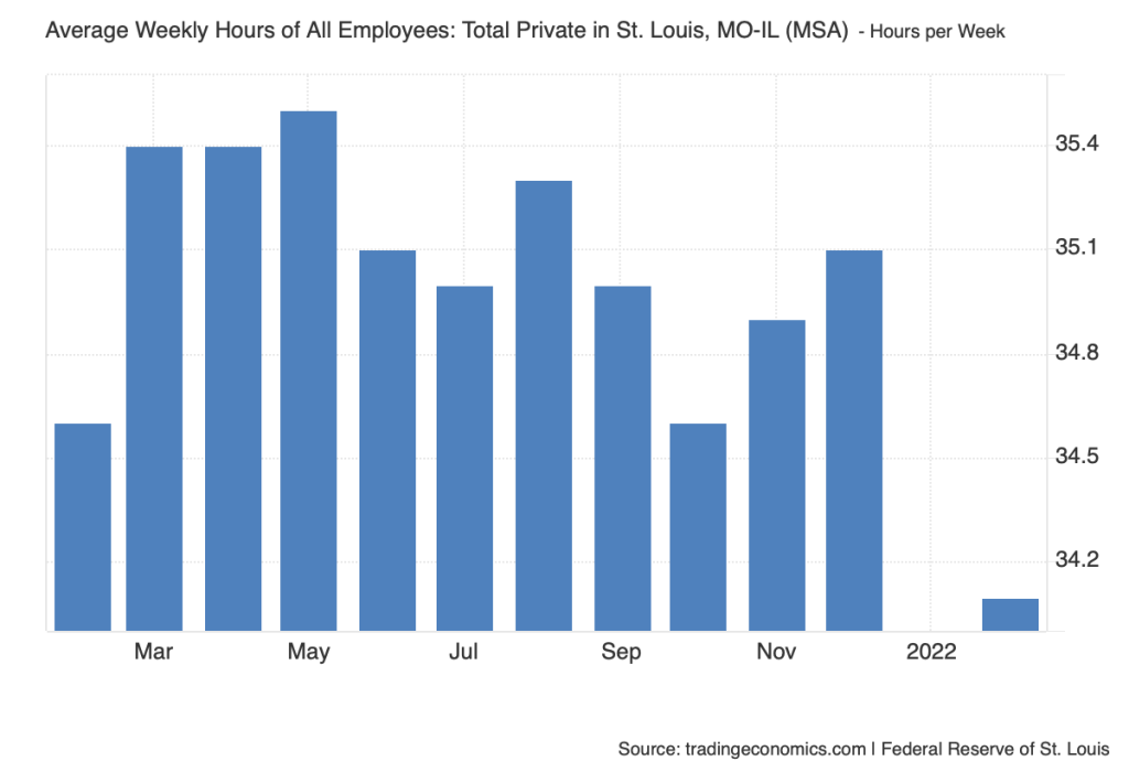
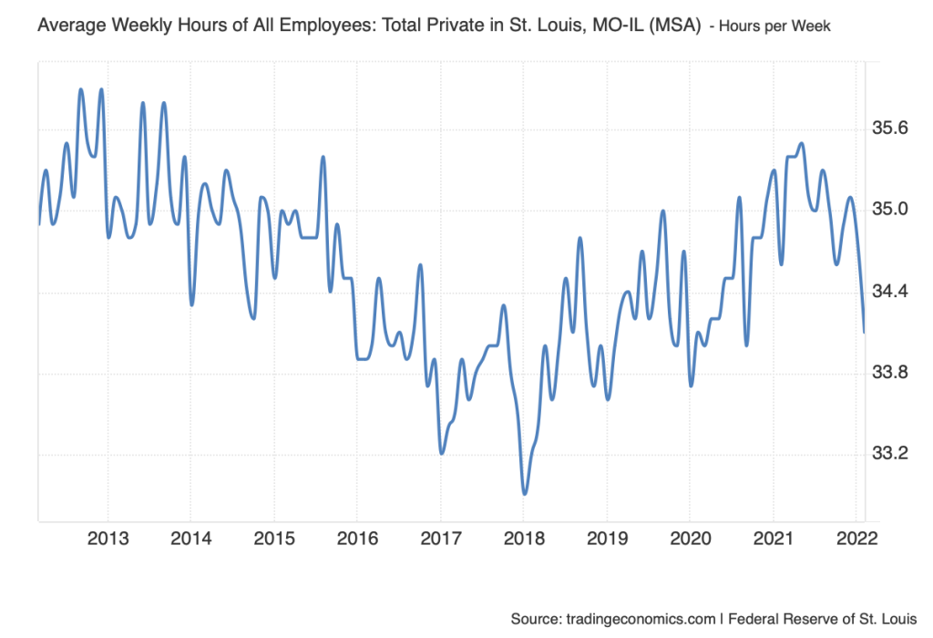
Category: Uncategorized (Page 8 of 17)

Data Set Review – Aidan Keen

Data Set Profile:

For my Data Set Review I decided to cover the average weekly hours of all employees in the STL, Metro area. Trading Economics is the only group credited with providing the data set. The primary source for this data is the United States Federal Reserve, it has been updated as recently as March of 2025. On Trading Economic’s about us page they mention wanting to provide consistent accurate economic data to people all around the world, this specific data set is just one of thousands they have created. It has been used for statistical analysis but specifically to find patterns or correlations to hours work per week based on timeline. Finally, the data is formatted in two different forms, for an individual year the average hours per week is shown as a bar graph, with a different data amount for each month. Then for a year the data is presented in a line graph.

Data Set Evaluation:

The Data set has been structured with a simple time frame to hours worked ratio. This allows for simple analyzation of the data presented, you can gather patterns easier and see a visual understanding of the increase/decrease of hours based on a per month time frame or per year. The creators do not specify their choices in gathering or cleaning up the data, rather presenting examples of why they may have created it, by showing the drastic difference between any time frame. Trading Economics advertises themselves as a website to find accurate data about all areas of the economy in any area in the world. They mention their constant fact checking of material, and use of only first hand sources, nothing third party. They also mention the site has been viewed and trusted by over 2 Billion people across the world. This makes me feel safe in trusting their sources and data that they present. I think it would be interesting to use this data to visualize the differences between work hours based on time of year or differences year to year. There is an interesting dip in hours in October of 2022 specifically in this data that interests me as to why that could be. There is also a clear dip in the entirety of the 2nd-4th quarters of 2020 for obvious reasons. But seeing it presented in this visual sense makes it much easier to see the sheer difference.

problem statement

This research examines the role of urban farming in addressing food insecurity in North St. Louis, a historically marginalized area with limited access to fresh, affordable food, by analyzing the impact of community-based farming initiatives through a socio-technological lens using GIS mapping, data visualization, and storytelling tools, while investigating challenges such as land access, funding, and policy barriers, with reference to primary sources like local urban farm initiatives and secondary sources on urban agriculture’s role in food justice and city planning, ultimately aiming to determine whether these efforts offer a viable long-term solution to food deserts and community resilience.

Data Set Review

The “Illinois Landcover in the Early 1800s” dataset was created by the Illinois Natural History Survey (INHS). The INHS is a division of the Prairie Research Institute at the University of Illinois Urbana-Champaign, dedicated to the study and preservation of the state’s biological resources.

The dataset is based on original surveys conducted by the General Land Office (GLO) between 1804 and 1843. Surveyors documented various landscape features in field notebooks and plat maps, noting details such as tree types, landscape quality, watercourses, and other notable features. These records are among the earliest detailed maps of Illinois, predating county land ownership maps and atlases.

The dataset was compiled to provide a detailed representation of Illinois’s landscape prior to extensive settlement. By digitizing historical GLO maps and notes, the INHS aimed to create a comprehensive land cover map reflecting the state’s early 1800s environment.

This dataset serves as a valuable resource for researchers, historians, and environmental scientists interested in analyzing historical land cover and ecological conditions, studying changes in vegetation and land use over time, and informing conservation and restoration projects by providing a historical baseline.

The dataset is available in Geographic Information System (GIS) formats, specifically ESRI Arc/Info, facilitating spatial analysis and mapping.

The dataset includes 42 land cover categories, such as prairies, forests, wetlands, and various landforms. These categories are based on the original terminology used by GLO surveyors. The attribute table contains items like “Land_Code” for detailed categories and “Map” for broader classifications.

The INHS digitized the original GLO maps by scanning microfilm copies, georectifying the images against USGS topographic maps, and tracing the line work using GIS software. They standardized and combined certain land cover names that varied by region or surveyor. For example, terms like “bluff” and “sand bluff” were merged.

As a scientific organization, the INHS aimed to preserve and interpret historical ecological data. Their focus on accuracy and standardization likely influenced the meticulous digitization and categorization processes, ensuring the dataset’s reliability for research purposes.

This dataset can be utilized for historical ecological research to understand pre-settlement environments, comparative studies of land use changes over time, guiding ecological restoration efforts by providing historical reference points, and educational purposes to illustrate Illinois’s natural history.

By offering a window into Illinois’s past landscapes, this dataset is instrumental in both academic research and practical conservation planning.

Data Set Review

The data set I reviewed was The Tombstone Transcription Project. The tombstone Transcription project is a lasting tribute to our ancestors. They will transcribe tombstone inscriptions and have that work archived for the future generations and made easily accessible to all. The tombstone project coordinators are Debra Crosby and Rebecca Maloney. In this project there was a poem titled The Recording Of A Cemetery by Thelma Greene Reagan. The poem highlights the importance of remembering the dead and preserving history. This ensures the that the future generation can remember and honor those who have passed.

Data set profile:

  1. Who is credited as the creator and/or contributors of this data set? Who are they? They are mentioned above.
  2. What are the sources of their data? records of tombstone inscriptions, genealogical societies, gravestones/headstones.
  3. Why did they create or compile it? They created it because many of the gravestones at cemeteries were becoming difficult to read and have already fainted making it hard to identify. This was due to time and weather.
  4. How has it been used? It has been used to identify ancestors and preserve cemetery data for the future generations. It also can be used in genealogical societies.
  5. What format is the data set in? Although I’m not sure what format this data set would fall under, I would think a database or spreadsheet.

Data set evaluation:

  1. Take a look at the data itself. How have they structured it? What fields have they chosen? What effect might that have on how it can be used? The chosen field is historical ancestors grave sites. It can be used to analyze and identify as well as genealogical purposes.
  2. Read the creators’ description of the data set. Have they described the choices they made in cleaning the data, and if so, how? What effect might those choices have on the data? N/A
  3. Consider the creators’ identities and goals in creating the data set. How might those things have shaped the data, either intentionally or inadvertently? I honestly don’t believe that their identities contributes this data set, however their goals yes. Thelma’s primary goal was to preserve gravestone inscriptions both intentionally and inadvertently.
  4. What would you use this data for? Preservation and historical purposes

Lab 10: Material Data Visualization (3/19)

Today we’re looking at creative ways of representing data. Although algorithmically generated data visualizations can of course incorporate creative elements through choices like color palette, background, and surrounding context, they’re also limited to specific, familiar forms: a pie chart, a network graph, a scatterplot. Creative data visualization allows us to play with new forms of visualization, and in so doing, move from data viz as exploration to data viz as argument or as narrative.

Today’s lab is based on the Dear Data project, in which two friends visualized data about themselves every week for a year. They each responded to a shared theme or prompt each week, but they did so individually, categorizing and visualizing their data in often radically different ways.

We’re going to visualize some of our own data. For the next 24 hours, track a piece of data about yourself. That data can be anything: how you spend your time throughout the day, what contexts you hang out with your friends, how often you call your family, or even just your steps.

Once you’ve got a set of data, try your hand at a creative data visualization. Think about what forms might make the most sense for your data — if it’s time-based, maybe you want to overlay a pie chart on a clock. Maybe you want to draw your step count on a map. Think also about what you find visually appealing and engaging. You’re not bound by the aesthetic of a particular tool! Bring it with you or take a picture to share in class on Monday.

data set review

Creator:

tradingeconomics.com, a website with over two billion users and boasts that it’s sources are “official” and span 196 countries.

Sources:

this specific data set is compiled from the united states federal reserve

Reason:

 they have a pretty significant customer base to rule out financial pursuits as their main motive, but from the website itself the following excerpt is essentially their mission statement:

 “Trading Economics has solutions for individual customers and businesses across different services and industries. Beyond being a trustworthy data source for many applications, Trading Economics has been helping companies and individuals to understand and predict trends, to identify opportunities and to stay ahead of their competition.”

How its been used: from the words on the website:

“The Trading Economics Application Programming Interface (API) provides direct access to our data. It allows clients to download millions of rows of historical data, to query our real-time economic calendar and to subscribe to updates. Providing several request methods to query our databases, with samples available in different programming languages, it is the best way to export data in XML, CSV or JSON format. The API can be used to feed a custom developed application, a public website or just off-the-shelf software like Microsoft Excel. The API subscription pricing is adjusted accordingly to the features you use, to your volume of requests and to the distribution you make.”

Format:

 they use various tables, spreadsheets and visuals like graphs, they have it available to where you can download whatever data you want into the various formats they offer and are compatible with popular applications like excel. This specific data set was a collection of bar graphs showing the averages of the work hours.

There is only one aim with this data set, and it is average weekly hours worked in saint louis Missouri. The data is structured in a bar graph so it’s not easily applicable to computer analysis unless you copy the data into a spreadsheet or pay some subscription to export it. The only writing the website provided on the data was a brief explanation on what the data is, what it provided and where it came from, so it sounds like the data is clean and relatively direct from source. Unfortunately just below the data set I found a link that said “More Illinois indicators” which is troubling due to the fact that this isn’t a source from or about Illinois but rather Missouri, which really throws into question the legitimacy of the data in my eyes. Not to say the federal reserve would be inaccurate but rather the website itself, perhaps letting a few key data points slip through the cracks unintentionally or misconstruing/misunderstanding the data themselves and therefore passing that mistake onto us. I would use this data if I were an employer for a business within Missouri, finding the average hours of work for employees means finding the average hours of work the employees are willing to work, id use this data only if I were afraid of the consequences of over/underworking my employees.

Data set review

Data set profile:

  1. The creator of this data set is University of Illinois Urbana-Champaign’s Prairie Research Institute. They are described as a “Multidisciplinary research institute charged with providing objective research, expertise, and data on the natural and cultural resources of Illinois. “
  2. It seems they don’t have a source for their work. (Or at least I can’t find it in the mound of metadata.)
  3. “The purpose of this map is to provide a georeferenced characterization of vegetation in the early stages of Euro-American settlement. One of the research uses for the surveys nationally is for presettlement vegetation. This data can be used to analyze presettlement vegetation patterns for the purpose of determining natural community potential, productivity indexes, and patterns of natural disturbance.” (A direct quote found under the “Identification_Information” tab in metadata.)
  4. The original use was to create a more complete map of Illinois using the data collected by multiple cartographers. Now it seems to be used to study patterns and inconsistencies along Illinois’ body.
  5. The data is in map form, but the index for specific definitions of abbreviations and words is in graph form.

Data set evaluation:

  1. There is two different types of data they have collected, cartography and land definitions. The cartography has been turned into an interactive map, where you can zoom in and see the topology, rivers, and biomes. The land definitions have been input into a table, where they gathered the land code value, definition, and land cover label from the original plat map. With choosing these specific fields, they may have lost some of the original data, or had to summarize a definition.
  2. There is no no direct reference to cleaning the data, they only mention how they scanned it and corrected the things that were wrong. Though, through scanning, some things could’ve been mistranslated considering these were captured from cartographer’s notebooks. However, they mention the revisions that were needed due to data being incorrect, so it gives the impression that whatever data could potentially be incorrect would be corrected.
  3. The original data was from the early 1800s. We don’t use the same language as we did in the past, so someone trying to create a data set using that would have a notable risk of misinterpretation. In todays language, we tend to cut out a lot of the fluff they would use in the past, so in that regard, descriptors and things of the like could’ve been lost.
  4. There is a huge table of abbreviations and types of land masses, which I find very interesting. I’ve heard most of the words, though there is a few that I have never heard or heard be used to describe land.

« Older posts Newer posts »