Author: Margaret Smith (Page 1 of 3)

Lab 15: Peer Review

In groups of 4-5, take turns sharing about your project. You should provide some background on your project (what drew you to this topic? what do your group members need to know to understand your project?), your driving argument or narrative, the kinds of sources you’re using, your choice of technology, and how that technology fits with the content of your project. These are all works in progress, so you don’t need to have it all done! But you should talk about your progress so far, any challenges you’ve run into, and how you envision the final product.

When you’re not presenting, listen attentively to the presenters and fill out a peer review form for each one. That form will help presenters know how clearly they’re articulating their argument and identify potential challenges and ways to strengthen their project. It also lets them know where they’re doing a good job!d

Peer review form

Lab 14: Follow the Data (4/16)

On Monday, we talked about three aspects of civic technology that help to make the government more accessible and effective for its constituents: govtech (how the government makes itself available), public data (providing access to data that impacts constituents), and participatory democracy (grassroots efforts to render government more effective). Today we’re going to hone in on public data.

Public data offers the means to hold governments accountable, to understand how data informs decision-making, and to examine and sometimes contest the ways data is collected. It also informs reporting — every day, we see headlines that utilize data to make an (often inflammatory or click-baity) argument. Being able to track down the source of that data allows us to engage critically and thoughtfully with the news as well as with the government.

For today’s lab, we’re digging into some data-driven headlines about the St. Louis metro. Working in groups, explore your assigned article and work through the prompts in this form. You’ll be looking for 1) the argument the article is making, 2) how the reporter is using data to support that argument, 3) the source of that data, and 4) some thoughts about whether or not the article makes good and accurate use of that data.

NB: You might have to dig a bit to find the source of the data! Some articles might not link to it at all, and others might link to aggregators. Do your best to figure out the earliest origin of that data. (E.g. if the article links to an aggregator of crime statistics, try to figure out who actually collected them — local police departments? the FBI? a private company?)

Lab 15 form

Articles:

Lab 13: Interactive Fiction with Twine

After playing through a couple of text-based games for Monday, we’re going to try our hand at game design. On Monday, we discussed games as texts, as something for us to study like we would a piece of literature or a historical moment. (Is that a buzzkill? Maybe. But when you start digging into a game, sometimes you discover whole new layers that you didn’t realize were there! So it can also make the game a much richer experience.)

Games can be all kinds of things — not just entertaining, but instructive, exploratory, philosophical, and more. A good game has at its heart a problem, a question, or a story, something that drives the player to keep going.

Today’s lab is split into two. First, we’ll spend some time brainstorming and storyboarding. This is your opportunity to think through what your game will do in the big picture: what is its story? What’s the problem that the player’s trying to solve? What world are you immersing them in, and how can you convey that? You’ll use this Google Form to flesh out the answers to those questions.

In the second part of the lab, we’ll take those initial thoughts and start putting them into Twine, a tool for building text-based games. Twine games are built with a series of passages, which you link together to create pathways through your story that the player can choose from (or be guided through, or move through randomly depending on your game’s logic). Here are your goals for today’s lab:

  1. Head over to Twine and start your story by clicking on the “New” button and giving it a title.
  2. Create at least three “passages” in your story, again using the “New” button, and add a little content to each of them.
  3. Link each passage to another, either in the form of a player choice or in a guided format, where the player only has one link to click. (You should have at least one choice represented in your passages.) Your passages don’t have to be sequential.
    • You create links in Twine with double brackets. So [[Test page]] would generate a link to a passage called “Test page.”
    • You can format text using the built-in editor, but you can also use HTML and CSS if you’d like.
  4. At the end of class, export your draft story by going to Build >> “Export as Twee” and upload it to WordPress as a media item. (You can send it to me in an email if you want to make sure it goes through.)

Lab 11: Spatial Analysis and Spatial Justice (3/26)

Spatial analysis is a method that uses mapping and geographic information systems (GIS) to analyze the relationships between people, places, and resources. Those relationships dictate what kind of access people have to things like grocery stores, banks, employment opportunities, green spaces, and more. Spatial analysis is a great tool for exploring concepts of spatial justice. In this lab, we’ll explore the spatial relationship between SIUE and the town of Edwardsville.

There are lots of tools we can use for spatial analysis. The most common one is ArcGIS, which is a proprietary (that is a paid) platform. We’ll be using a free tool. Those are sometimes less versatile (although you can do an awful lot with them!), but they also allow us to keep our data and our analysis regardless of whether we have access to a particular platform, and they’re often easier to use because they’re not as complex.

Understanding the Lay of the Land

  1. Go to https://mymaps.google.com and sign in. Hit the Create a New Map button.
  2. Navigate to Edwardsville. Using the push pin button, drop a pin onto the university and label it.
  3. Use the search bar to search for a particular kind of amenity – for instance, restaurants, grocery stores, or parks.
  4. Use the + button to add the results to your map.
  5. Make some observations: what does the distribution of those pins look like? Where are they clustered? Are they in proximity to the university? Are they distributed evenly throughout the area? Are they all grouped in one spot?
  6. Make sure you share your map with all group members before the end of class!

Thinking About Access

  1. Pick the closest pin to the university and grab its name or coordinates. Head over to Google Maps (the regular kind) and get the directions from the university to that place.
  2. Look at a few modes of transportation. How long would it take to drive there? Bike there? Take public transit there?
  3. What would it cost to get there? Think about gas, parking, transit fares, exertion, and other costs that might crop up.
  4. Now go back to your original map and look through the pins you added. Which one would you most like to go to? That is, which one would best serve your needs?
  5. Do the same thing for that location, mapping out directions and analyzing costs.

Reflecting on Resources

  1. What are the implications of your analysis? Is this an example of good access to resources, or are there challenges here? Is this an issue of spatial injustice?
  2. Reflect a little on your spatial analysis lab. What observations did you make? Have the things you noticed impacted how you experience SIUE and/or Edwardsville? How do you think they might impact others’ experiences, whether they’re students, faculty/staff, or community members? What do you think has caused the patterns you identified? If there’s an element of spatial injustice in what you observed, how might it be addressed?

Lab 10: Material Data Visualization (3/19)

Today we’re looking at creative ways of representing data. Although algorithmically generated data visualizations can of course incorporate creative elements through choices like color palette, background, and surrounding context, they’re also limited to specific, familiar forms: a pie chart, a network graph, a scatterplot. Creative data visualization allows us to play with new forms of visualization, and in so doing, move from data viz as exploration to data viz as argument or as narrative.

Today’s lab is based on the Dear Data project, in which two friends visualized data about themselves every week for a year. They each responded to a shared theme or prompt each week, but they did so individually, categorizing and visualizing their data in often radically different ways.

We’re going to visualize some of our own data. For the next 24 hours, track a piece of data about yourself. That data can be anything: how you spend your time throughout the day, what contexts you hang out with your friends, how often you call your family, or even just your steps.

Once you’ve got a set of data, try your hand at a creative data visualization. Think about what forms might make the most sense for your data — if it’s time-based, maybe you want to overlay a pie chart on a clock. Maybe you want to draw your step count on a map. Think also about what you find visually appealing and engaging. You’re not bound by the aesthetic of a particular tool! Bring it with you or take a picture to share in class on Monday.

Labs 8 and 9: Literary Data with Voyant and Palladio (3/5/25)

Voyant

Voyant is a tool for distant reading. It helps us identify patterns within a text or set of texts (corpus). Today, we’ll use it to take a birds-eye view of how people view communities in the region. Remember that as a quantitative method, distant reading generally asks us to formulate a hypothesis about what we might find when we analyze our texts. So what similarities and differences might you expect about the texts you’ve chosen? You can compare across geography (St. Louis vs. Edwardsville, for instance) or across chronology (St. Louis in 1860 vs. St. Louis today) or some combination thereof.

  1. Choose at least two texts to compare. You can choose from encyclopedia entries in this Google Drive folder, and/or you can use Wikipedia articles (current or older versions).
  2. Skim at least one of them and develop a hypothesis about what you might find when you compare your texts.
  3. Input the two texts as a corpus and choose a visualization with which to test your hypothesis.
  4. Write a blog post describing your texts, question, hypothesis, and results.

Palladio

Palladio is a tool for visualizing and exploring data through maps, network charts, and categories. We’re going to begin by creating our own data set of immigration and migration data using the 1900 Census.

  1. Working in a group, choose a census from this folder and add at least three lines apiece to the spreadsheet. (If you get stuck on handwriting, let me know and we can look at it together.
  2. Together, we’ll put the data into Palladio and see what patterns emerge.

Lab 7: Text Editing with the Recovery Hub Edition Framework (3/3)

Although we often think of corrections to a text when we imagine editing, literary editions serve lots of functions (and very rarely is correction one of them!). Literary editions layer different kinds of information about a text through annotations, including background on the period or place, context from the author’s life and other works, and variants across different editions of the text. In this way, they help to make the text more approachable and help the reader engage with the text more deeply.

In a printed edition, you’ll often encounter these annotations as footnotes. In digital form, they come in lots of shapes and sizes: links to other pages, pop-ups, and digital footnotes that link back and forth between text and annotation.

Today, we’re using the Recovery Hub Digital Edition Template to annotate Frederick Douglass’s speech on the Dred Scott decision. You read this speech last week and made note of areas where further clarification and background might help people understand the text better. Today, we’ll put that into action.

The Recovery Hub’s template is designed to make the process of creating a digital edition simpler. Although there’s lots of code involved, you don’t have to write it! Instead, you can use their existing code and lightly customize it to suit your text. Today, you don’t have to interact with the code at all! But if you’re interested — maybe you want to try your hand at digitizing your family’s recipes, like we talked about last week? — you can find the template on GitHub.

Instructions

I’ve set up the project for us by creating a repository for our code and cloning the template. Here are your tasks:

  1. Head over to this Google doc, which contains the speech. Leave a comment on the section of text you’d like to annotate with your proposed annotation and your name. This could be a single word, a phrase, or a sentence.
  2. We’ll discuss the annotations together and see what themes emerge.
  3. Once you’ve got a sense of the kinds of annotations people have proposed, go back and fill out your annotation. Here are a few points to touch on:
    • Why this annotation? What about the text you selected seemed like it needed further engagement?
    • Explain the term, concept, or other content.
    • Link to at least one external resource.
Lab 4: GPT-4 Forecasting Challenge (2/17/25)

Today we’re revisiting the lab that got cancelled last Wednesday, and we’re keeping it simple: We’re going to do Nicholas Carlini’s GPT-4 Forecasting Challenge. Work through the prompts and rank what you think the probability is of ChatGPT correctly answering the given question.

When you’re done, post your results here with the tag “Forecasting” and write a couple sentences reflecting on how it went. Did the model do better or worse than you predicted? What was your strategy for prediction (50-50, or did you have assumptions about what kinds of tasks it would be better at?)?

Lab 3: Web Accessibility (1/27)

Web accessibility guidelines help us to ensure that our content meets at least a minimum threshold for accessibility. While it’s a long way off from universal design (designing to make sure our projects are maximally accessible for a maximal audience), it’s an important first step.

There are a variety of tools for evaluating accessibility. Tools like Funkify allow you to simulate various disabilities to get a sense of how design impacts usability. That’s useful to a point, although it’s always better (and necessary!) to talk to actual people whose lived experiences are a much better guide.

Today, we’ll use WAVE, the web accessibility evaluation tool.

  1. Choose a page on the SIUE website to evaluate, and run it through the checker at https://wave.webaim.org/.
  2. In a blog post (with the tag “Accessibility”), answer the following questions. Bullet points are fine!
    • What accessibility issues crop up for the page you chose?
    • Who is most likely to need the content on the page?
    • How might the accessibility issues impede people’s access to the content? Who might be most impacted?
    • Name one or two ways that the accessibility of the site could be improved – the smaller and easier, the better!

Dr. Smith’s Introduction (Lab 1)

Hello! I’m Dr. Meg Smith. I’m a digital humanist and a historian of medieval and early modern Ireland. As a digital humanist, I’m interested in questions related to critical data studies — where our data comes from and where it goes. In my historical research, I study how medieval Irish people contested English rule through the legal system, the landscape, and their interactions with other people. (Those two research agendas are connected: In the bigger picture, I look at how people challenge the categories that are imposed on them, which makes encoding them in data sets very complicated!)

At SIUE, I direct the IRIS Center, which is our digital humanities research center. IRIS is a great resource for this class — we offer office hours and project consultations, workshops and events, and equipment you can use or check out. The IRIS Center is in Peck 2226, and you can email iriscenter@siue.edu for a tour or to access any of our resources.

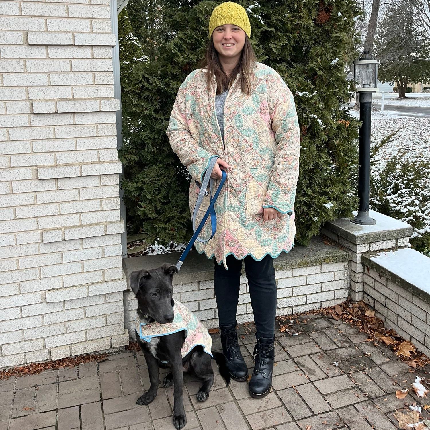
In my spare time, I do a lot of making. Sometimes that’s digital making — building a website or a data visualization. Sometimes it’s physical making — making a quilt, a dress, or an embroidery. And sometimes, it’s both! I’m currently working on a data quilt that tracks my modes of transportation during 2024. I also do a lot of cycling, hiking, and walking my dog (Ada Lovelace, named for the woman who arguably invented the computer).

Me and Ada, wearing the matching quilt coats I made for us this Christmas
« Older posts