History 582 Exhibition Practicum

A Course Focused on Museum Exhibitions

Page 3 of 3

A People At War

An exhibit dedicated to the contributions of Americans during World War II

https://www.archives.gov/exhibits/a_people_at_war/a_people_at_war.html
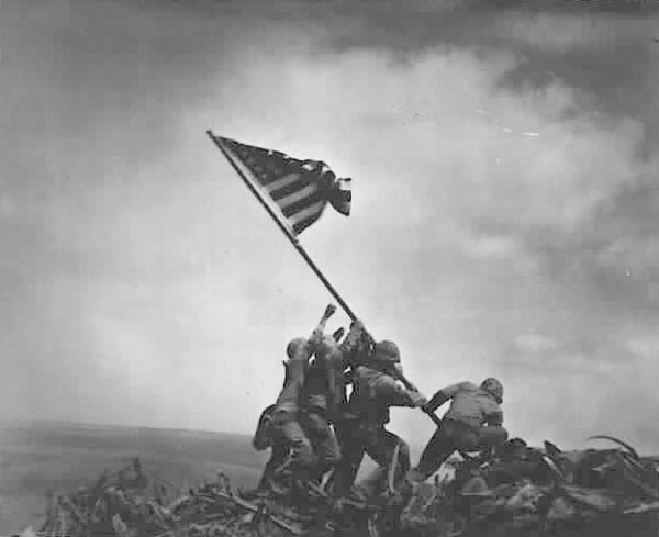
Marines raising US Flag over Iwo Jima
The flag raising of Iwo Jima is the first image used in the exhibit, and sets the tone for the rest of the material

Content

This exhibit highlights the contributions of the thousands of Americans, both military and civilian, who served their country during World War II.

A People at war, introduction
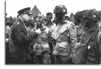
The big idea of this exhibit is clearly and powerfully stated in the quote written above. This exhibit was made to highlight the contributions of American citizens during World War II (WWII). The main objective is not to focus on the heroes, the generals, or even the majority of people who served; but to highlight those whom history has all too often forgotten. While the exhibit does mention a few “big names,” such as General Eisenhower, the power of the exhibit lies in speaking for those whose voice has been lost.

The target audience, I would argue, is the American people in general. The writing is not overly complex, nor is there too much of it. The simplicity of the exhibit makes me think that anyone who knows how to click a mouse could access and appreciate what has been written here. I do think, however, that the American people are the target audience, because the entire exhibit is dedicated only to the contributions made by Americans in WWII.

While the writing is very brief throughout this exhibit, I do think a slight bias is clear. Of the twenty-five pages that make up this exhibit, nine are dedicated to racial or gender minorities who served in the war and nine more are dedicated to people/groups who greatly contributed but are seldom ever talked about when one learns about WWII.

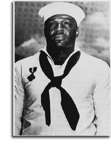
Brigadier General  Benjamin O. Davis
General Benjamin O. Davis was the first African-American general officer in the United States military

The highlight of subaltern Americans who contributed to WWII has something new for everyone I think. Whether one learns about how Japanese-American soldiers only fought in the European theatre, or how the bombing of Pearl Harbor had been predicted as early as the 1920s; there is something new for everyone. This constant return and refocusing on subaltern history allows us as Americans and as Historians to greater respect and appreciate the sacrifices made by all those who fought under the stars and stripes.

Because of the “big idea” and how the exhibit goes about capturing it, I cannot help but argue how important its contribution is and should be for us. There were people and groups in this exhibit that I had never heard of, and yet without some of them the War could have had much different outcomes. For example, one section titled “Women Who Served” discussed the vital importance that female pilots had during the War; despite their forced status as non-combatants. The female pilots were largely responsible for transporting aircraft, soldiers, equipment, and scouting during WWII; without whose contributions the Allies surely would have suffered.
The exhibit approaches the topic of American contributions through three main methods. The earliest sections are dedicated to acknowledging those Americans who were racially different from the white Americans. The section “New Roles” is dedicated, in order: to General Benjamin O. Davis, the first black general in the United States military, the 99th Pursuit Squadron which was the first all black squadron to graduate from Tuskegee Field, the Navajo Codetalkers who were employed to keep secrets from the Japanese, and the 442md Infantry Regiment which was made up entirely of Japanese-Americans who fought in Europe.

The second approach to those Americans who greatly contributed to WWII highlights the women who served as non-combatants. The section titled “Women Who Served” highlights the Women’s Auxiliary Ferrying Squadron (WAFS) and First Lt. Annie G. Fox who was on duty during the bombing of Pearl Harbor and was awarded the Purple Heart.
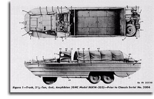
Dukw
DUKW (pronounced duck) is the amphibious truck pictured above which, although silly-looking, was actually used to ferry men and supplies from land to water and vice versa.

The final approach to the big idea is more traditional in that the exhibit dedicates the remaining pages to “The War in the Pacific,” “The War in Europe,” “Science Pitches In,” and “The War is Over.” In each of these sections the exhibit discusses a mixture of well-known information (such as the production and use of the atomic bombs) and unique, less well-known information (such as the production and use of the DUKW). The exhibit does, however, end on a page titled “Surrender” which very briefly discusses the surrender of the Japanese on board the U.S.S Missouri. This abrupt ending feels awkward and not in stride with how the exhibit began.

Methodology
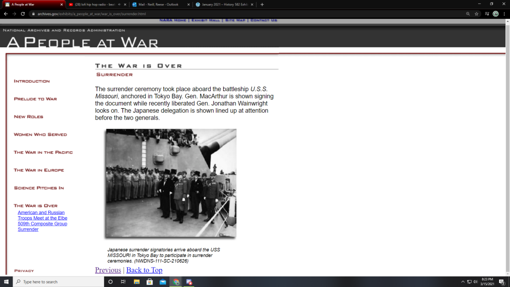
The website is accessed exclusively through use of hyperlinks along the left-hand side of the page. There are eight primary links which appear in red, and, when clicked, display individual title page links in blue. While this makes moving around the site rather simple, it does feel somewhat lacking in creativity.

Because of the use of hyperlinks along the side of the page the viewer is free to move about the exhibit as they wish. Clearly an order is suggested by the organization of the links, but no such is order is mandated by the website. My only qualm with the functionality of the site is that there is no “next” button which takes the viewer from one red topic to the next. Within one main topic, say “New Roles,” all the blue links and their pages can progress linearly with a “next” button at the bottom of the page. However, when you reach the final page in “New Roles” you must manually click on another red link to progress.

Design and Accessibility

Of all the digital exhibits I have viewed thus far, this is the least engaging. There was limited text and even more limited visual stimulation. Each page did have at least one picture, to be fair, but there were no videos or “Tell me More” links. A select few primary documents were scanned and could be viewed, but otherwise the visual elements of the exhibit were painfully limited to small images.

The images themselves were well selected and did enhance the message of the exhibit, it is a shame that there were not more of them. The captions were explanatory of the images and did not offer much aside from that. It would have been very impactful to have a video or audio interview with someone who served during WWII in this exhibit. Hearing or seeing someone talk about these experiences would remind the viewer that they were not so long ago, and that the things discussed in this exhibit were real; they happened because of and to real people.

The color scheme and font is nothing to write home about. The pages of the exhibit remain on a white background and the body text is standard black color. The title of the pages is larger and possibly bold, it’s hard to tell based on the font, with the red subtitle beneath it. The main title of the exhibit, “A People at War” remains at the top of the page in white letters against a grey background. All of this font is easy to read and no colors clash or seem out of place.

The flaws of the design are fairly evident, however. The text and images only account for 1/3 of the screen, leaving far too much blank space. This makes the text and images appear small and rather insignificant. In addition, the lack of color or background imagery feels cold and distant, discouraging the reader from making the connection between the real people who this exhibit is dedicated to.

Final Thoughts

While the exhibit lacked flair and decoration, it did follow it’s big idea and did so well. This project could easily be expanded and follows an attractive pattern of new and unique history. It was refreshing to learn something new about this largely dissected time period, and yet was reassuring to see familiar names and events being talked about. The presentation of information in this exhibit is powerful, even if the design was lacking.
“The Museum of the World:” An Anthropological Adventure

Link to the British Museum website
https://www.britishmuseum.org/
Link to the Virtual Exhibit
https://britishmuseum.withgoogle.com/

The British Museum, located in London, England has one of the most comprehensive collections in the world due to how expansive the British Empire was. Founded in 1753, the British Museum has amassed a collection of approximately eight million pieces (artifacts) through centuries of colonialism and acquisition. The Museum of the World is an interactive exhibit experience that allows the visitor to travel through time and traverse the globe without rebuilding a DeLorean à la Doc Brown and Marty McFly. The British Museum has partnered with the Google Cultural Institute to bring us this exhibit using “the most advanced WebGL (Web Graphics Library) technology available.”

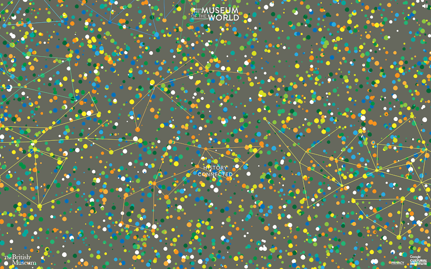
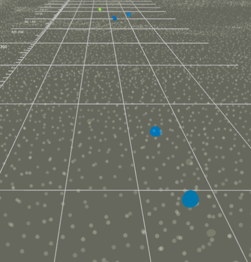
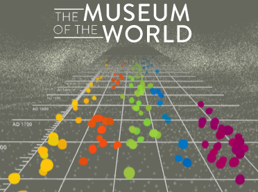
As the website loads, the screen transforms from a slate grey with a few colorful spots, to having countless colorful spots (as seen on the right), symbolizing the emergence of civilizations and, ultimately, more anthropological artifacts.
The Museum of the World exhibit can also be reached through the Google Art and Culture website:
https://experiments.withgoogle.com/the-museum-of-the-world

The British Museum and Prompting Discussion

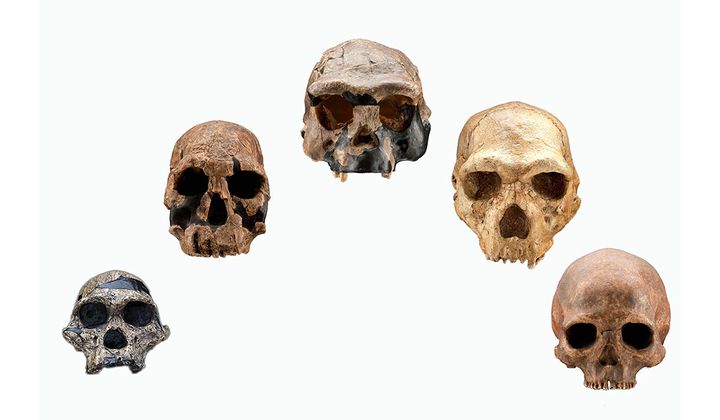
The Museum of the World is dedicated to introducing the public to some of the most fascinating objects from prehistory to the present day, spanning from the year 2,000,000 BC to 2000 AD. The British Museum website states that the institution is “driven by an insatiable curiosity for the world, a deep belief in objects as reliable witnesses and documents of human history, sound research, as well as the desire to expand and share knowledge.” This exhibit contains approximately 320 different artifacts discovered across the globe in Africa, the Americas, Asia, Europe, and Oceania.

This video from the American Museum of Natural History visually displays the growth of human population through time.

Get the Conversation Going

Communication is KEY!

This exhibit is incredibly accessible online, engaging, and exceptionally informative, so the target audience could really be comprised of anyone interested in prehistoric anthropological history. Though, this exhibit could be a wonderful teaching tool if used as an introduction to world history or anthropology. The content is relayed in a way that is strictly educational, thereby imparting no bias upon the reader. It utilizes an anthropological approach when discussing the artifacts and teaching the visitor about them. I argue that this is one of the main reasons this exhibit is so important. By talking about the artifacts in an anthropological way, the reader is not only learning about the objects themselves, they are learning how to talk about the objects, which opens a channel for communication that enhances societal understanding and brings people together.

“Talking is always a good idea. There’s no harm in keeping lines of communication open.”

Brian reynolds myers, american journalist & associate professor of international studies

How To Speak Anthropology: A New Language

Anthropology is defined as “the study of human societies and cultures and their development.” When discussing historical artifacts in an anthropological manner, a lot of focus will be placed on where the object was found, what it is made of, and what its potential purpose was based on the societies & cultures that occupied (or controlled) the area.

Visitors to this exhibition are going to see objects that they have never seen before and learn about those objects in a way that they might be unfamiliar with. The Museum of the World exhibit challenges the visitor to think in a new way and to understand the function of an object relative to its placement on the globe. This is exactly what makes this exhibit so important. When it comes to museum exhibits that display prehistorical objects and objects dated back through the BC, the visitors develop a new way of understanding the history of humans. New experiences, be they physical, emotional, or intellectual, are vital to the advancement of society’s shared knowledge.

Taking It Back in Time Like Huey Lewis

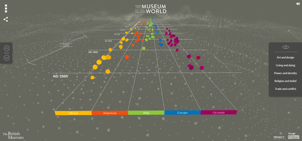
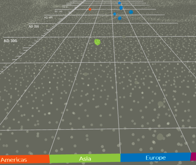
A screenshot of what the exhibit screen looks like when you first see it.

The virtual tour of this exhibition is unlike any other that I have seen before. It’s set up like a timeline that you can scroll through. You can either use the disc on the mouse, the touchpad on your keyboard, or the two arrows located on the far left side of the screen (as well as the up and down arrows on your keyboard). You can move backwards along the timeline (towards 2,000,000 BC) by rotating the disc on your mouse or dragging your fingers on the touchpad in a downward motion. You can move forwards along the timeline (towards AD 2000) by rotating the disc on your mouse or dragging your fingers on the touchpad in an upward motion. While you can use the two arrows on the far left side of the screen, the website is set up so the timeline is incredibly responsive to motion, which means the screen will shift the entire time your cursor is moving. I found this to be rather frustrating, but use whatever method works best for you. (If you have a touchscreen computer, just dragging your fingers along the screen works really well.)
Once you get the hang of moving along the timeline and manipulating the screen, the exhibit is incredibly easy to navigate. It is a self-guided exploration of the linear timeline of the history of human stuff. The timeline is divided into five (5) different categories (listed from left to right): Africa, Americas, Asia, Europe, Oceania. You can explore the timeline by looking at all of the sections together, or combing through them one-by-one.

Geographical AreaColorNumber of Artifacts
AfricaYellow58
AmericasOrange31
AsiaGreen114
EuropeBlue87
OceaniaPurple30
A list of the different geographical sections you can view, along with their respective colors and an approximate number of how many artifacts each section contains (give or take a few).

If you’d like, you can also view the artifacts according to five (5) specific themes: Art and Design, Living and Dying, Power and Identity, Religion and Belief, Trade and Conflict. You can choose those themes on the far right side of the screen. If you click “Power and Identity,” the artifacts that you can choose from will reduce and you will only see artifacts that relate to that theme. In order to reset the timeline to full visibility (where all the artifacts are available for viewing), all you have to do is click the little eyeball shape above the list of themes.

This is what a portion of the timeline will look like if you click “Power and Identity.”
This is what the same portion of the timeline will look like if you click “Trade and Conflict.”

The virtual tour of the timeline works well and accomplishes what it needs to accomplish, but it does take a minute or two to get used to it and figure out the different “settings” you can create. As this is a setup that I was unfamiliar with, it took me a while to understand how it functioned. There are only two things that I would suggest improvements for: The first being how sensitive the background of the timeline is, and the second being the spacing between artifacts (those colored dots that I will mention in the next section).

Let’s Talk Design

This is a short video of what The Museum of the World exploratory timeline looks like just moving through it without looking at any of the artifacts. The layout is really unique to a virtual tour, yet it may seem familiar if you’ve played a bit of Guitar Hero in your day. Each colored dot (yellow, orange, green, blue, and purple) represents a different artifact. The dots are all separated by the geographical area in which they were found, which is also designated by color. As you can see in the video, there are certain points on the timeline where there are several colored dots in one spot, which does make it difficult to pick a specific one (as they are all close together).

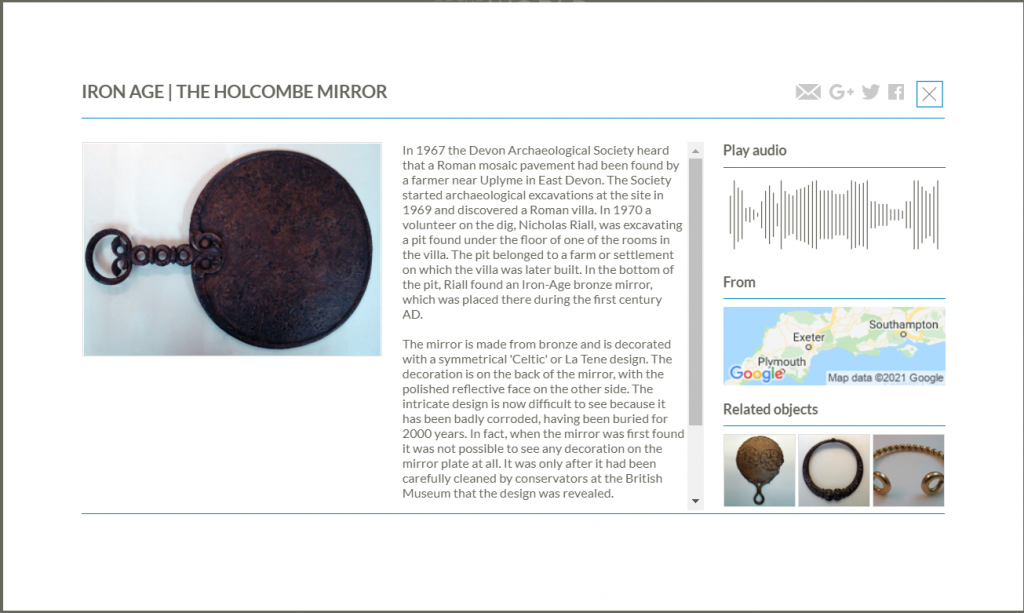
An example of an artifact shown in the exhibit.

The exhibit does show various kind of artifacts, from tools to artwork to metalwork to items used for the dead (coffins & urns). If you click on one of the colored dots, a small preview of the item will pop up with the option to “Find Out More.” Once you click that, a small screen will pop up that looks like the one above. If you click on the image of the artifact, it will expand so you can get a better look at it, but you cannot manipulate the image to see it at a different angle. Next to the image is a description. The information available varies based on the artifact. For example, the information for the Holcombe Mirror (the artifact above) is more detailed than the information for the Bronze Belt Hook (the green dot between 200 and 300 BC). Each artifact has an audio clip where you can hear a curator from the British Museum talk about the artifact. The audio clip gives you different (more) information than the text box does, but this is a problem when it comes to accessibility. There is not a transcript of the audio clip, so if you can’t hear the audio clip, you’re missing out on interesting bits of information. In addition, you can also see where the artifact was found on a map. As this exhibition was made in partnership with Google, the map available is a Google satellite map. Underneath the map, you can be directed to artifacts that are related to the one you are currently looking at.

This is a short video of everything stated in the above paragraph regarding viewing the artifacts in the exhibit.

That’s All, Folks!

Overall, I think that this kind of exhibition/highlight reel of artifacts is really cool! It is a different format than most people are probably used to, which is what makes it stand apart. I do not think that this type of exhibit would work for every institution (i.e. a museum dedicated to the Civil War), but I think this type of format could be used as an extra feature on the website for various institutions. I have always found that putting things on a timeline better helps spatial comprehension, making it easier to process the information presented.

If you would like to go on different tours of the British Museum using Google Street View, click the link that follows: https://artsandculture.google.com/partner/the-british-museum

Baseball and It’s Regalia

Dressed to the Nines: A History of the Baseball Uniform
http://exhibits.baseballhalloffame.org/dressed_to_the_nines/index.htm

When thinking about one of America’s favorite pastimes, and when attending a game in the stadium or watching it at home, many fans of baseball wear their teams jersey to show pride and support .

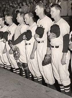
Ted Williams (second from right) wearing his pants noticeably lower than his Boston Red Sox teammates, 1948

The main idea of this online virtual exhibit is to educate along with entertain the public who enjoys baseball or wants to know more about America’s favorite pastime and the uniforms that the players wore and how they changed over the years. Many of those who visit this virtual exhibit would be anyone interested in the sport, especially those who visit either in person or online, the National Baseball Hall of Fame, which is the host of this exhibit.

With this exhibit, viewers are able to learn more about the history of the different parts of a baseball players uniform and the background on how they were shaped and manufactured. While many a fan can tell you the main parts of the uniform, with this exhibit, we are shown the history of certain aspects. For example, when learning about the patches and armbands, we are provided a partial list for all memorial markings donned by major league clubs along with a list of commemorative patches worn by major league clubs from 1907 through the 1970s.

While viewing the exhibit, the viewer is able to learn the history of the multiple parts of the baseball uniform, from the numbers to the shoes and stockings, a timeline of baseball uniform history and a database of all uniforms worn by American, National and Federal League franchise teams.

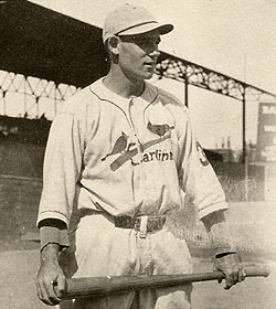
Ray Blades of the St. Louis Cardinals, 1923

As an integral part of baseball history and fandom, baseball uniforms have changed throughout the years, with input from both the public and inside sources. The changing of uniforms, in some instances, shows the changing of a franchises history.

The main portion of the site is divided up into three main subjects, Parts of the Uniform, Timeline and Uniform Database. In the portion of the online exhibit dedicated to the parts of the uniform, the viewer is shown a diagram of a baseball uniform which each part labelled. Through clicking on the links associated with each part, you are able to learn more about the history of the uniform parts through scrolling through pages. The timeline portion of the site is a linear format through scrolling up and down, while it is also broken down into twenty year chunks. And the final portion, the Uniform Database, is formatted like any other database. By entering the league, city, and range of years, you are able to view a list of results linked to the different uniform variations from throughout the franchise history.

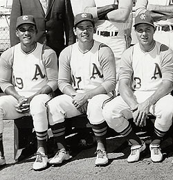
Bert Campaneris, Ken Suarez and Mike Hershberger of the Kansas City Athletics wearing white shoes, 1967

The site is very easy to navigate, with a header and footer that shows the main sections of the site navigation. It is a very basic site map, that even those with minimum skills should be able to navigate around.

There are a few minor improvements that could be made to the functionality of the site itself. For example, when finishing one of the sections, a next button might work or have larger icons for the section tabs for ease of navigation.

The site itself is full of photographs, along with a diagram of the parts of a baseball uniform, newspaper clippings and advertisements, and a linear timeline that has photos attached to it. In the uniform database, certain franchises might just display the diagram of the uniform for a certain year, where as in some instances, you are also given a photographic example from the time period of a player wearing the uniform.

Many of the artifacts that are featured on the virtual exhibit are photographic images or graphic images of baseball players and uniforms. According to the credits page on the site, the uncredited images are from the collection of the National Baseball Hall of Fame and Museum and the additional, as credited in site, are courtesy of the New York Times, Philadelphia Phillies, Library of Congress, Chicago Historical Society, and Topps Company, Inc. Most of the information and the graphics used for the uniform database are courtesy of Marc Okkonen, the author of Baseball Uniforms of the 20th Century.

Almost every single image in the virtual exhibit is captioned with a small descriptor of who and sometimes what is shown in the image, giving a name and year. Depending on what page you are looking at, the ratio of text to images is relatively heavy on the text with the images being supplemental to the information. Throughout the whole site, the background is a dark blue background with white Times New Roman font with bold headings on certain pages.

West Point and Army USMA, 1802-1918

West Point in the Making of America, 1802-1918 | Smithsonian Institution (si.edu)

What does the Mexican-American War and World War I have in common? The history of West Point military academy will provide the answer. “West Point in the Making of America, 1802-1918” curated by Barton Hacker and Margaret Vining with the support of staff and several departments of the National Museum of American History of the Smithsonian Institution describes the history of the United States’ earliest and most renowned of the five federal academies and the first engineering school in the U.S. West Point’s education of great military leaders has helped secure the United States’ position as a world power.

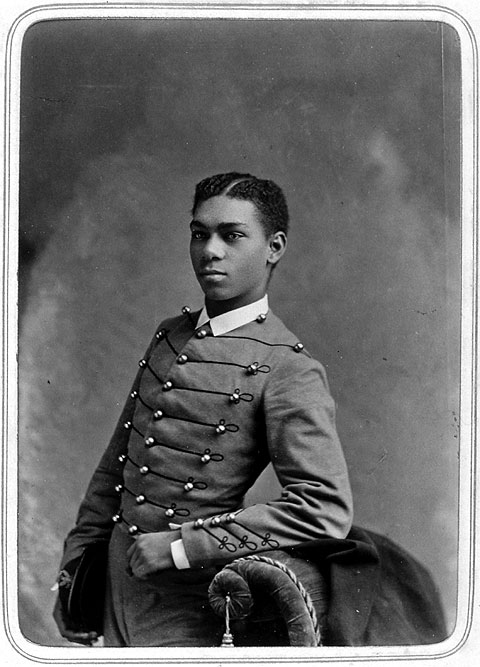
This historically important, highly informative, and well-curated exhibit provides thorough coverage of West Point’s early history concentrating on turbulent times in America’s past from West Point’s founding through World War I. The exhibit provides something of interest for all ages and includes a thorough bibliography for the subject matter. It highlights men of broadly varying backgrounds including one African-American, who graduated and went on to serve in the army in a variety of capacities. Special attention is given to high ranking officers and generals.

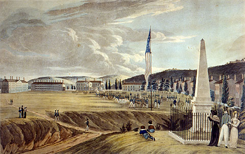
West Point in 1828 painted by George Catlin

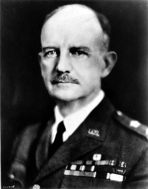
Located on a bluff overlooking the Hudson River in West Point, N. Y., West Point and Army USMA is just 50 miles north of New York City. The idea for the military academy was first proposed in 1783 by George Washington but it was initially opposed due to being considered “incompatible with democratic institutions, fearing the creation of a military aristocracy” too much like that of Great Britain. It wasn’t until two decades later, on March 16, 1802, that the United States Military Academy officially opened; Washington having died in 1799 did not see his objective come to fruition. It resides today on its original site. Enrollment at West Point was always highly selective. It was here that many of the most famous (and infamous) and well-respected military commanders began their careers. The honor roll includes Ulysses S. Grant, William T. Sherman, Robert E. Lee, “Stonewall” Jackson, George A. Custer, John J. Pershing, P. G. T. Beauregard, George B. McClellan, George Crook, Oliver Otis Howard, future president Dwight D. Eisenhower and Douglas MacArthur.

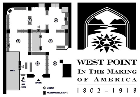
Exhibition floor plan
The floor plan of the exhibition at National Museum of American History, Behring Center

(1) Introduction, with a brief history of West Point through WWI
(2) The Antebellum Army, 1802–1860
(3) The Civil War and Reconstruction, 1861–1870
(4) An Army for the Nation, 1866–1913
(5) World War I, 1914–1918
(6) Epilogue, on West Point in the 20th century

The design of this virtual exhibit on the early history of West Point provides easy navigation and is organized in a linear/chronological manner though the viewer can dip in and sample sections as they desire. The exhibit is divided into six sections: “Introduction; 1802-1860 The Antebellum Army; 1861-1870 Civil War and Reconstruction; 1866-1914 An Army for the Nation; 1914-1918- America in the Great War; and Epilogue”. Each of these sections highlights their respective time period, the military crises, and the achievements of the graduates including science, education, engineering, and other fields. The exhibit’s epilogue provides a window for examining the Army’s role in the 19th and early 20th centuries; building America’s federal army, exploring unknown territories, and fighting wars to protect citizens and to preserve the Union.

Exploration Map
Interactive Map
West Point graduates carried out important boundary surveys of the United States in preparation of routes for railroads, explored new territories, and mapped the growing country.

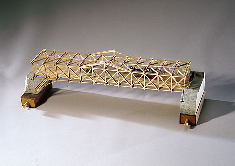
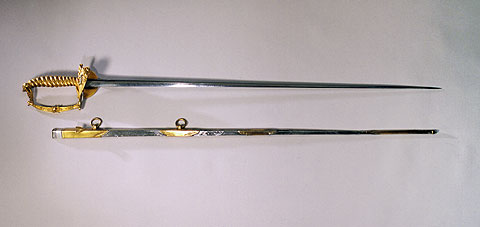
There is more to the exhibit than meets the eye. Visitors can click on most any aspect of the exhibit and reveal a plethora of information including maps of famous battles, paintings and portraits, models of architectural designs, audio and video recordings, photographs, and a broad range of artifacts used by soldiers. The exhibit paints a picture spanning the lives of young cadets to the graduates who would lead the nation and a military academy that greatly shaped American history.

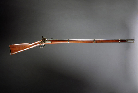
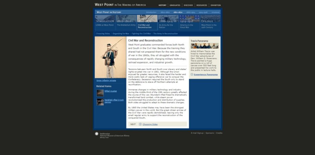
The exhibit’s written content adequately provides an appealing narrative and piques the interest of the observers. In the section tilted “1861-1870: Civil War and Reconstruction”, visitors can access links that discuss weaponry used during the Civil War by both the Union and Confederate armies. For example, the 1863 rifled musket radically increased the range of accuracy and made traditional infantry attacks obsolete.

1863 rifled musket used by Union and Confederate armies.

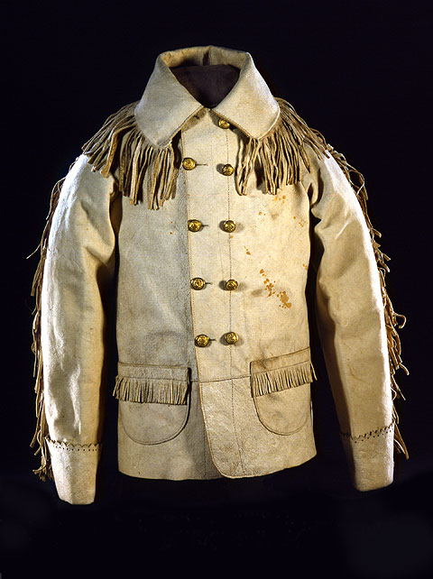
Users are able to read about the lives of Civil War soldiers who attended West Point. The biographies of West Point graduates incorporates links to personal artifacts and their correspondence. Linked to the brief biography of George A. Custer, visitors will see his role at the last stand at the Battle of Little Big Horn and view personal belongings like the buckskin coat he often wore and his laundry dampener. Artifacts displayed are from the Smithsonian and borrowed from other institutions.

Custer’s buckskin coat that he wore during his campaign in the West including the Battle of Little Big Horn (1876). It was donated to the Smithsonian by his wife, Libbie.

The other five sections of the exhibit continues to highlight major battles and scientific innovations involving West Point graduates, helping visitors understand why the battles were fought: for independence, to restore the Union, or acquire new territory. The exhibit excels in bringing to light the personal history of lesser known soldiers like engineer Robert Parker Parrot otherwise overshadowed by graduates like Robert E. Lee and Ulysses S. Grant. Clearly West Point’s history has been predominantly based on the lives of educated white men. During the period covered by the exhibit few men of color were enrolled and the first women were not accepted until 1980. Even today though men of color and women have made inroads at West Point the percentage enrolled does not remotely reflect the racial makeup of the United States.

The shortcoming of the exhibit are few. As an online exhibit, legibility of the narrative is important and could have been much enhanced using a larger font in text sections.

The image on the left demonstrates the kind of page layout the exhibit uses as well as how the exhibit is organized. Note that the design of the exhibit uses a mostly dark blue background which obscures some text and the font is small and difficult to read. It would be helpful if entire pages could be magnified or zoomed. West Point in the Making of America (si.edu)

Though the exhibit provides ample examples of artifacts, the captions accompanying them could have been fleshed out with additional information.

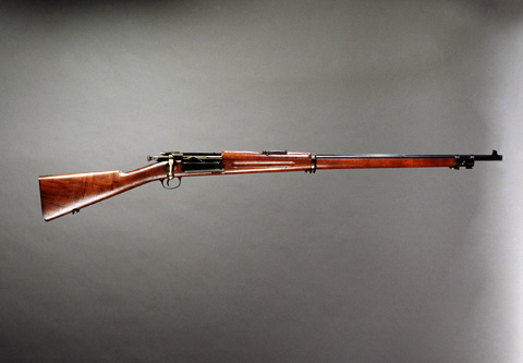
“Most regular troops carried the Krag-Jorgensen, a Danish model adopted by the U.S. Army as its first magazine rifle.” West Point in the Making of America (si.edu)

The exhibit glorifies the accomplishments of soldiers like Ronald Slidell Mackenzie in battle (section titled “1866-1914: An Army for the Nation”) and the virtues of exploration and expansion/Manifest Destiny on the future economic development of the nation. However, it fails in describing the consequences of these battles on indigenous peoples, their land, and the environment.

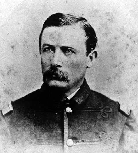
Ranald Slidell Mackenzie (1840-1889) was one of the many generals West Point dispatched to the West. The exhibit focuses more on his successful campaigns against native tribes.

West Point’s early military leaders and engineers laid the foundation for America’s military prowess by laying out the history and illustrating the way the United States created an army to defend the country both at home and abroad. West Point’s curriculum shaped a brotherhood of young men; creating military officers who would lead a young nation to victory in the Mexican-American War, Civil War, Spanish-American War, the Indian Wars, westward exploration and expansion, and World War I, but neglected to discuss the consequences of these battles on Native Americans. The general public as well as scholars will find learning about West Point and its role in American history rewarding and eye-opening.
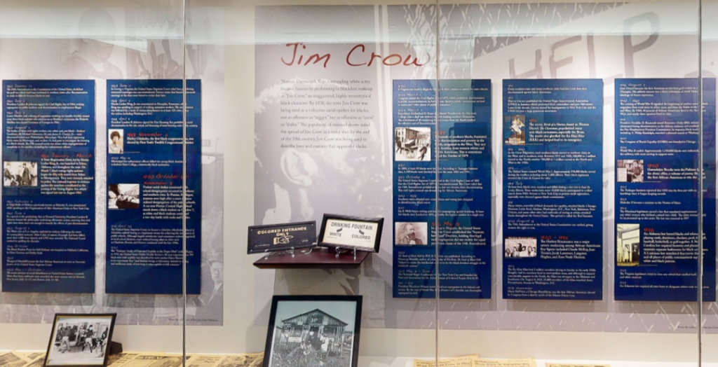
“Understanding Jim Crow:” The Functionality of Racist Memorabilia

https://my.matterport.com/show/?m=X9ou6MvycZU&help=1

Ferris State University in Big Rapids, Michigan has a museum exhibition entitled “The Jim Crow Museum of Racist Memorabilia” that is now online for people of all ages in all locations to explore and enjoy. This exhibition, curated by Dr. David Pilgrim, is dedicated to the display of historical items from the era of Jim Crow to “teach tolerance and promote social justice” within this volatile socio-political climate.

Dr. David Pilgrim, the creator and curator of The Jim Crow Museum of Racist Memorabilia, on how he established this institution and its broader implications within our society.

The mission of the exhibition is to “use objects of intolerance to teach tolerance and promote social justice.” This exhibition contains over 10,000 pieces that envelope the visitor in the history, samplings of which are placed in traveling exhibitions such as “Hateful Things,” which has also been made available for online viewing. The fact that this exhibit is incredibly accessible online, engaging, and exceptionally informative demonstrates that the target audience is actually quite broad! This exhibit is geared towards anyone who wants to learn about the Jim Crow Era and the impact that it had on American society, as one of their mission objectives is to “serve as an educational resource.” Moreover, they allow the visitor to visualize what life was like under Jim Crow segregation by surrounding them with historical items, not allowing them to escape their presence until the end of the exhibition, which is rather metaphorical.

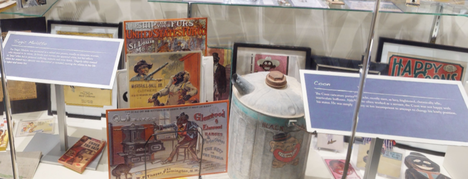
When addressing topics like racism in America, it can be quite difficult to have a conversation that is completely devoid of bias, whether it be “good” or “bad.” In the case of this exhibition, I believe the bias towards social justice and antiracism is absolutely necessary, or else it would defeat the purpose of it.

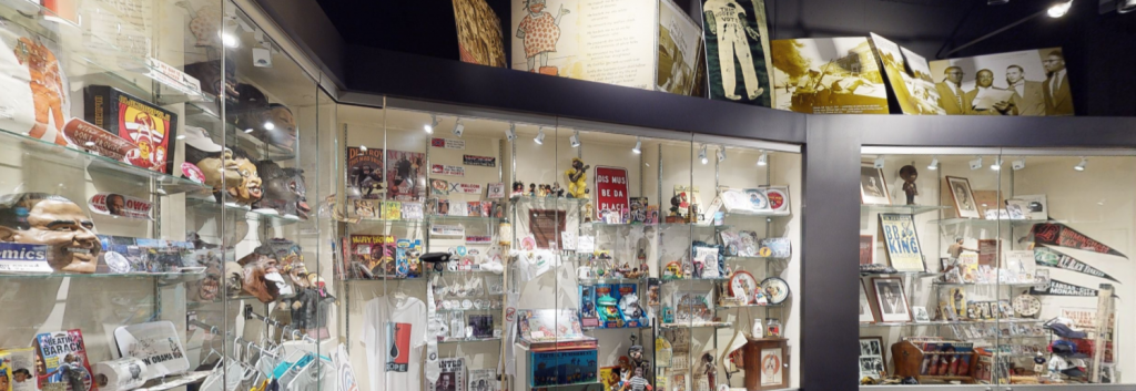
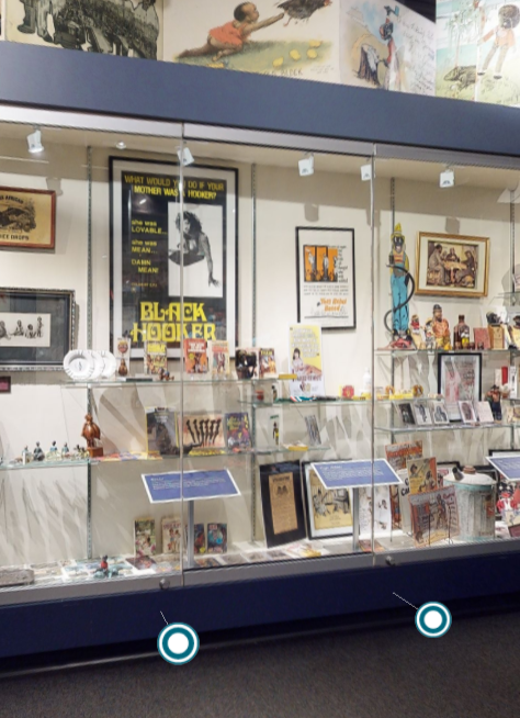
This is just a small fraction of all the items visible on the virtual tour of this museum exhibition.

The exhibit is so expansive and so full of artifacts that it sheds more light on just how encapsulating Jim Crow was, how it was present in every aspect of life. Everyone sees the signs on the bathrooms and above the water fountains in their high school textbook, but due to the sheer number of artifacts, the viewer may see things they have never seen before (or that evoke memories if they were alive during this time period). It is a thought-provoking, emotional experience to “walk” through the exhibit and see these things.

Segregation was made illegal in 1964 and Black people were given the right to vote in 1965. As a society, we must realize and remember that we are not so far removed from the era of Jim Crow. Black people still face heavy oppression, systemic and regional racism, disenfranchisement, and disproportionate amounts of violence. We have to do better and we must make great strides to be better. This is why this exhibition is so important – in order to transform our future, we must examine the pitfalls and failures of our past.

I argue that we need more museum exhibitions like this one that force people to confront past narratives that might make them uncomfortable. It is my belief that if you are studying history and there is not a single point along the timeline that makes you angry or uncomfortable, you need to take a look inward, take a swim in Lake You, and think about your privilege.

Our ignorance of history causes us to slander our own times.”

Gustave flaubert, novelist

Let’s Take A Tour

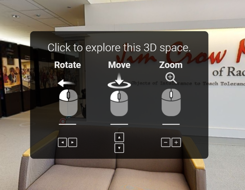
The virtual tour of this exhibition offers the visitor a panoramic, self-guided walkthrough. When you first visit the link for the exhibit, you are given directions on how to tour the exhibit – the up and down arrows on your keyboard will move you forwards and backwards, the left and right arrows will rotate you either left or right, and the plus and minus keys will enable you to zoom in or out. You do have the option to scroll through, but it is a little clunkier that way. It is much easier to just use the keyboard; it is much smoother in terms of visuals, as everything is less blurry when you move.

Instructions on how to operate the virtual tour

Once you get the hang of using the arrows on your keyboard, the exhibition is incredibly easy to navigate. Although, it is also rather easy to get turned around/”lost.” To remedy this, there is a “play” button in the bottom left corner that will take you back to the beginning of the virtual tour that you can pause any time and start maneuvering on your own again. There is also an option to view the “dollhouse,” which is a 3-D layout of the exhibition that you can click into if you lose your place. The exhibit is self-directed, but you can use the aforementioned layout maps if you would like to follow a set path, as there are some areas in which you can choose the direction you go, like a fork in the road. The virtual tour works well and accomplishes what it needs to accomplish, but it does take a minute or two to get used to it if you are unfamiliar with this type of online exhibit.


This video is a tour of The Jim Crow Museum of Racist Memorabilia hosted by its curator, Dr. David Pilgrim. It is not a tour of the entire exhibit. In this video, Dr. Pilgrim discusses some of the major themes that occur throughout the exhibit.

Let’s Talk Design

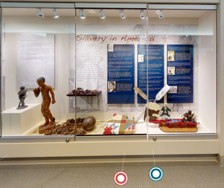
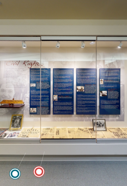
This is the second display that you will see once you begin the virtual tour. As you can see, there are a handful of objects and text behind them . If you click on the red “target,” a timeline of slavery in America will pop up that you can expand to full screen and check out. If you click on the blue “target,” a video will pop up that you can expand to full screen. This video is a narration of all the text behind the artifacts (since you cannot read the text if you zoom in – it gets really blurry).

If one does want to utilize the red timeline pop-ups, one does have to start at the beginning of the exhibit, as each pop-up is a different section of the timeline. (This is only seen in the first few displays.) The blue narration targets are specific to each display and are seen throughout the entire exhibition. This is incredibly helpful, as the text always adds something special to the exhibit. As you proceed through the exhibit, the number of artifacts in each display increases and the amount of text decreases, but there is still a small amount of text in each display to tie everything together and elaborate on the theme of the display. The hallway leading into the main hall (as mentioned below) is well-captioned and every bit of text supplied is absolutely necessary in telling the story of Jim Crow in America.

The hallway display has a light paint color and a light carpet color.
The main hall display has a dark paint color and a darker carpet color.

The first part of the exhibit takes you down a hallway, then you move through a set of double doors into the main hall of the exhibit. The wall color changes from a light beige/white to a navy blue and the carpeting changes from a light beige to a grey, which allows the more colorful artifacts to pop and have more attention drawn to them, as the lighting plays off of the darker wall and flooring. The text is either displayed on a white, blue, or red background, and is always a contrasting color and in a large enough size so that it is easy to read (in person).

Thousands of the artifacts that are on display at The Jim Crow Museum of Racist Memorabilia were donated by Dr. David Pilgrim in the 1990s. The exhibit uses a variety of different artifacts that include but are not limited to the following: photographs, signage, dolls and statues, Halloween masks, and children’s toys.

“I wanted to create an actual racism facility to have people focused on this specific topic, in terms of our history.” – Dr. David Pilgrim

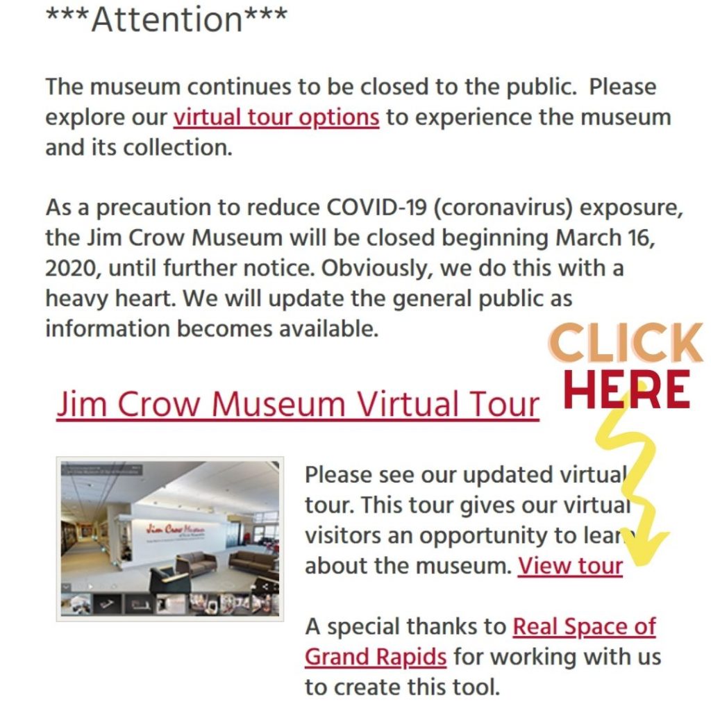
If you’re visiting the exhibit through the Ferris State University website, the virtual tour could be a little tricky to find if you do not know what you are looking for. Once you make it to the website for The Jim Crow Museum of Racist Memorabilia, the tour is very easy to find.

If you wanted to schedule a virtual tour with a guide, you would click the red text that says “virtual tour options.”

Overall, I think that this exhibit is incredible. The sheer number of artifacts that it contains is its greatest strength and its greatest weakness. It allows for people to see items that they may have never seen or heard of before, thereby drawing attention to how Jim Crow racism was applied to every aspect of society. There are over 10,000 artifacts just in this exhibition that overwhelm the viewer as they enter the main hall, which mirrors how overwhelming Jim Crow racism was and how it enveloped every single person, no matter their race. Although, this does have its disadvantages. It is absolutely impossible to see all of the items in a single viewing. There is simply too much information to be processed at one time. An improvement that I would suggest would be to decrease the number of artifacts on display and increase the number of traveling exhibits to draw more attention to this museum exhibition. Although, since this collection of artifacts is the brainchild of Dr. David Pilgrim, I am reticent to say anything negative (though I could not say anything more negative than I already have).

To Learn More

If you would like to learn more about Dr. David Pilgrim and his collection of Jim Crow artifacts, you can check out his books Understanding Jim Crow: Using Racist Memorabilia to Teach Tolerance and Promote Social Justice and Watermelons, Nooses, and Straight Razors: Stories from the Jim Crow Museum

Below I have linked another article and video, as well as a pdf version of an interview with Dr. David Pilgrim, if you would like to check them out!

Interview-with-Dr.-David-Pilgrim

Caravans of Gold, Fragments in Time

Art, Culture, and Exchange Across Medieval Saharan Africa

Caravans of Gold, Fragments in Time: Art, Culture, and Exchange across Medieval Saharan Africa
https://africa.si.edu/exhibitions/current-exhibitions/caravans-of-gold-fragments-in-time-art-culture-and-exchange-across-medieval-saharan-africa/

The Caravans of Gold, Fragments in Time exhibit was organized and curated by Kathleen Bickford Berzock from the Block Museum of Art, Northwestern University. The exhibit was made possible by two major grants provided by the National Endowment for the Humanities: Exploring the Human Endeavor and Northwestern University’s Buffett Institute for Global Studies.

The overall objective of the Caravans of Gold exhibit, is to intentionally place Northern Africa at the center of the world. In regards to trade, international governments, and religion; Northern Africa truly was the appropriate center of the medieval world. It is through video lectures and interviews that the viewer is transported into this Africa-centered model of the medieval world.


Catlan Atlas: This atlas of the time clearly marks northern Africa as a vital, significant trade network

The target audience for this exhibit seems to be high-school students and older. While there are not necessarily any complicated terms or names, an elementary understanding of how history has been told makes this exhibit come to life. The heavy use of videos and images, while keeping the text to a minimum, keeps the guest engaged and allows them plenty of places to stop and take in what they’ve heard/seen. One of the unique aspects of this exhibit is the clear bias that permeates the entire project. While bias is most often associated with negativity or unprofessionalism, I believe it is absolutely necessary in this exhibit. By slanting the evidence and the story of the world in a manner that places North Africa at the center, we arrive at a whole new understanding of the medieval world.

It is my argument that this exhibit is vital to the future education of all students of history. Not only does this story re-center the medieval world in a more accurate manner, but it does so in a more approachable way than strict lecturing. The use of video and images supported by text allows the guest to experience more opportunities to soak in the message. The exhibit does not dissect the importance of North African culture, trade, and political power. Rather, it interweaves them based on material evidence which has been discovered and presented.

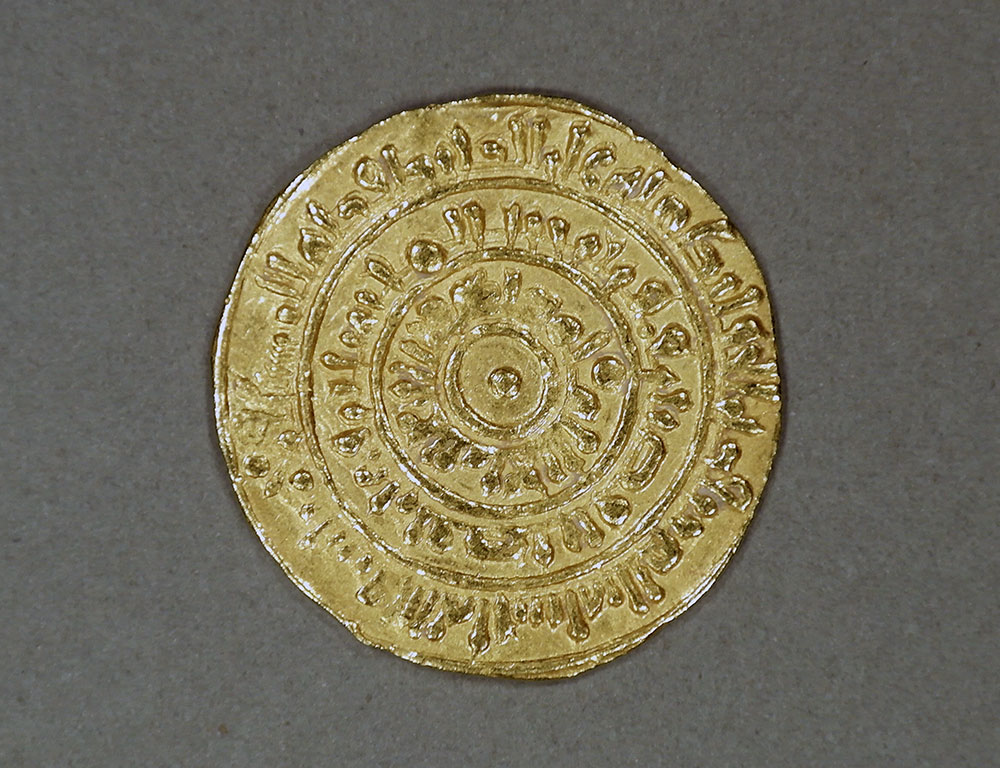
Dinar of al-Mustansir Billah, created in 1068/69 C.E.

The above coin above, for example, can be found in one page of the exhibit which discusses the value of African salt and gold in the medieval world. In West Sudan salt was used akin to the currency of the day due to its value. West Africa also claimed some of the purest gold mines in the known world at the time, making it a desirable trade partner for most of Europe. At the bottom of this same section in the exhibit we find a video interview of an African salt merchant who still sells the same goods as his forefathers. This powerful combination of imagery and video really grants the viewer a more stimulating teacher than most traditional museum exhibits.

The exhibit itself is set up with one home page and nine other pages, each with images and videos for the viewer to peruse at their pace. The last two pages are “Teachers Guide” and “Virtual First Look” which again call attention to the exhibit’s desire to educate and enrapture their audience. The Virtual First Look is an actual video walkthrough of the exhibit which allows the viewer to walk through the physical exhibit set up. This reinforces the drive of the exhibit to make the data feel legitimate and approachable to all their viewers.

The exhibit features all kinds of items, from gold coins and pieces of gold-inlayed text, to camel saddles and pottery. All of the images are two dimensional however, and do not allow the viewer a proper size understanding. With each image comes a helpful caption stating what the item is, the date it was created (or a guess), who the creator was (if that’s known), and who/where it was found.

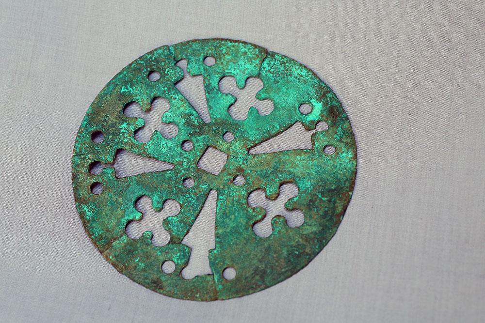
Unidentified artist – Excavated at the site of Gao Ancien, Gao Region, Mali – Openwork disk
10th to 14th century C.E. – Copper alloy – Direction nationale du patrimoine culturel, Bamako, Mali

I do not think there is anything new about the artifacts themselves, but rather in how they are being presented. While North Africa tends to play a minor role in the medieval world, this exhibit forces the viewer to place it at the center. African gold, rugs, and pottery are removed from our limited definition of “exotic,” and become the norm. This vantage point is what allows the artifacts to speak more clearly to the viewer. They say, “we are not exotic, side-characters in a Eurocentric history. We are our own main characters in an Africa-centric history.” This seemingly radical new vantage points makes the western viewer uncomfortable at being confronted with a world in which Europe is not at the forefront. It is this discomfort and this self-reflection that makes the work that this exhibit does vital to the education of all people. As historians, I believe we can understand and appreciate the work exhibits such as these do in rewriting the history of the world in accordance to material fact, and not through repeating traditional Eurocentric methods.

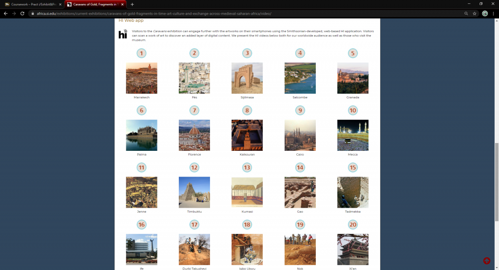
A very cool, interactive map with 20 key sites connected to the exhibit (each image is a video).

Despite being virtual, this exhibit does an excellent job in making the viewer feel an attachment and a depth in regards to the objects and the stories around them. Through copious amounts of images and videos, the viewer is more apt to fall in love and feel a deep connection with the goal of the exhibit and those who created it. With this being said, I felt that one weakness of the exhibit was the lack of text. Many images and videos will appeal to people with limited time or shorter attention spans, but deeper knowledge of the materials and concepts could have been displayed through more text. I believe that their amount of text was appropriate, given that their audience is anyone on the internet, yet leaves the academics hungry for more. Perhaps that was the point of limiting the text and allowing the artifacts to speak for themselves!

The HIST582 Exhibition Practicum WordPress Blog: A Site for Digital Exhibition Reviews

Digital Exhibit Review

Write a critical review of  a  digital/virtual  exhibit based on the guidelines below and post it on the class WordPress  blog.  Your  blog post   review should be  approximately 800 words and should  be written in essay form.    Be sure to include the following information (not necessarily in this exact order) 

  • A distinct title for your essay/blogpost
  • The main site venue (institution or organization presenting/supporting the exhibit) 
  • The title of the exhibit, the site URL and the date(s) of your visit within your review.
  • Use 3 -5 images to illustrate the exhibit you are reviewing.
  • share links to your exhibit.
  • Who is/are the exhibit curator(s)?
  • Is there a bibliography? 

Your review should cover all of the following areas:

Content

  • Identify the big idea. (Big Idea = a single sentence—with a subject, an action, and a consequence—that tells what the exhibition is about.) 
  • Who is/are the target audience(s)? 
  • Your review essay should have a specific, original and clearly stated thesis of your own in which you make an argument about how and why the exhibit contributes to our understanding of its topic. 
  • Write an analysis of the exhibit that explains what it is about, the different approaches to the topic or theme (for example, economic, social, political, gender differences) and explain what those are; consider the time period being addressed by the exhibit (if appropriate) 
  • Is there a bias or slant in interpretation of the story? In other words, does the exhibit offer a particular point of view?  
  • What types of new knowledge or experiences can a viewer discover or have? 
  • Why was this topic considered important for an exhibit? 
  • Be sure to write a brief conclusion in which you synthesize your argument and reflect on the exhibit’s strengths and weaknesses (successes and need for improvements). 

Methodology:

  • Describe how a viewer navigates around the site (scrolling, links, menus, site maps, etc.) 
  • What is the level of ease to find your way around the site? 
  • Does the exhibit function primarily in a linear fashion or can the viewer be more self-directed? 
  • Evaluate how well the site functions. What improvements could be made? 

Design and accessibility :

  • Describe the visual elements of the exhibit (Photographs? Drawings? Diagrams? Maps?) 
  • What types of artifacts are featured? What kinds of sources were used? 
  • Are the images well captioned and/or and helpful in telling the story? Explain.  
  • Describe the relative amount of text versus images 
  • Describe the color theme, font type and sizes 
  • How legible/accessible is the site? 

Some ideas for your essay/post:

  •  This is an online space, how can you make the post more digitally active?
  • Consider comparing the exhibit to another one that you have engaged with – use images or links.
  • Consider including multimedia especially as it relates to the exhibit you are reviewing (video, social media)
Newer posts »