A Course Focused on Museum Exhibitions

Category: Uncategorized (Page 1 of 3)

Documenting the Pandemic: Collecting Moments-2020 in Nebraska

Outside of the Nebraska History Museum. Photo courtesy of the Lincoln Journal Star.

Over Spring Break, I had the opportunity to visit the Nebraska History Museum for the first time in many years. Growing up in Lincoln, Nebraska, I spent a lot of my summers exploring the Nebraska History Museum. However, since as long as I can remember, the museum has always struggled in getting visitors and producing quality exhibits. Most of my encounters at the museum consisted of hearing about exciting titles of exhibits in the newspaper only to discover that the actual exhibit never met expectations.

The Nebraska History Museum is located across from the state capital building in downtown Lincoln, Nebraska. Consisting of three floors, the first floor is dedicated to permanent exhibits, the second floor is for traveling and temporary exhibits and the third and final floor is used for community engagement.

On my most recent visit, I encountered a temporary exhibit titled “Collecting Moments- 2020 Nebraska. Located on the second floor, the exhibit is placed in a hallway between the restrooms, a more permanent exhibit and digital learning class rooms. The names of the curators are not included on the exhibit nor is there a bibliography present. Both the bibliographical and curatorial information was also not present on the museum’s website.

Though the Nebraska History Museum has historically struggled in engaging their audience in the exhibits by the Nebraska State Historical Society, the museum’s new temporary exhibit, “Collecting Moments- 2020 in Nebraska” successfully incorporates recent history into the lives of Nebraskans as well as demonstrates a promising step forward in the meaning making process for museum goers at the institution. By using different modes of materials and media from the 2022 Covid-19 pandemic, the Nebraska Historical Society is able to effectively communicate the controversies and protests surrounding the pandemic.

Floor Plan of the Second Floor. The exhibit “Collecting Moments- 2020 Nebraska” is indicated by the number 4 on the map. Photo by Olivia Perez

As indicated by the map above, the traffic flow of the exhibit occurs naturally when the viewers move from the large exhibit next to it (number 3 on the map) and the digital class rooms.

Photo of exhibit “Collecting Moments”. Photo by Olivia Perez

“Collecting Moments- 2020 in Nebraska ” is an exhibit presented by the Nebraska Historical society that displays collected photos materials of Nebraskans and their experiences during the 2019-2022 Covid-19 Pandemic. As part of a continuing initiative to encourage Nebraskans to collect pieces of recent history, the exhibit frames the history of the pandemic as way to view history as something that occurs every day and effects every one of us. The exhibit is indicated by a blue wall. This blue wall is noted by the exhibit to be the Panetone color of the year for 2022, Classic Blue, and is supposed to represent the “enduring spirit of Americans in times of uncertainty (like the pandemic years). At the front of the exhibit the first plaques describe how the pandemic affected people of all races, religions, and genders within Nebraska. Below the plaque is an empty staging box that lists the ways in which the audience and collect and donate materials for the Museum’s ongoing mission to document the pandemic. The digital monitors on the wall play a constant slide show of photographs depicting iconic images of the pandemic in Nebraska. Some of these photos include images of anti-masking protests, BLM protests, and support rallies for healthcare workers.

In the middle of the wall a large quilt made of masks by the Nebraska Quilting Association and sits as the focal point of the entire exhibit. Flanked by two glass cases, the case on the left held signs that individuals showed their loved ones in hospital quarantine and bottles of hand sanitizer that were made by local distilleries. The case on the right held BLM protest signs, pieces of rubber bullets, sandbags, pepper spray and broken tear gas canisters.

Mask Quilt created by the Nebraska Quilting Association to commemorate the Covid-19 Pandemic. Photo by Olivia Perez.

Overall, I was really impressed that the museum even attempted to display an exhibit dedicated to the pandemic and incorporated contemporary historical practices into the display. Many individuals in Nebraska rejected the idea of Covid-19 during the pandemic and engaged in a significant amount of racial and political violence from 2019-2022. By framing the pandemic as something that reached every Nebraskan, the exhibit curators were able to reach an audience of people that would normally be apprehensive to discussing the pandemic. In addition, the exhibit detailed iconic shared memories that Nebraskans would remember (such as socially distanced popular annual sports events in Nebraska). This only added to the feeling of engagement among the audience members. The exhibit discusses multiple facets of the pandemic. Ranging from economic crisis to commenting on the large loss of life during the pandemic, the exhibits touches on the economic, political and racial aspects of the period. Visually, though the exhibit was only a section of a hallway, the blue wall and the striking image of the full size quilt drew my attention almost immediately. The exhibit was very easy to navigate from left to right. The amount of text was appropriate for the amount of objects and did not take away from the experience. Rather the text aided in explaining why such items were chosen and how the viewer could contribute to the growing collection of pandemic artifacts.

The display case left of the mask quilt containing items indicative of the Covid-19 pandemic. Items include: homemade signs that families showed to their loved ones in quarantine, bottles of hand sanitizer made by local distilleries, puzzles, vaccine cards and tickets to the annual opening season college football game known as the “Shrine Bowl” . The pandemic was the first time in Nebraska history that the Shrine Bowl was canceled. Photo by Olivia Perez

Collectively the Nebraska History Museum succeeds in capturing the viewer’s attention through the presentation of iconic images and materials that were symbolic of the Covid-19 pandemic. More importantly, the exhibit encourages the viewers to engage in the meaning making process by asking museum goers to collect and donate items that they deem to be symbolic of the pandemic. By including the local community in document such history, the institution establishes a better sense of shared authority with the communities that the museum represents.

However, despite the exhibit’s strong ability to connect the audience to historical documentation of real world events, the placement and overall tone of the exhibit alludes to the difficulty in discussing the pandemic in a conservative state. The exhibit itself is placed almost as an after thought next to a doll house (that is part of another exhibit) and the restrooms. While the museum’s volume level was relatively quiet throughout, the placement of the exhibit near the busy restrooms took away from the experience and my partner and I found it very distracting. It is definitely possible for viewers to entirely miss the exhibit if they do not walk all the way around the second floor.

Photo of Exhibit in relation to the hallway where it is located (Thomas in the back for scale). Photo by Olivia Perez.

There is also bias present in the exhibit as well. The language used on the signage does not take a stance with the political protests or the anti-mask movement that was prominent in the state at the time. Facts about the racial violence and attacks that occurred in the state were also not mentioned. In a way it seems as though the museum held back on the presentation of facts on the exhibit in order to garner local support for the exhibit. As Mexican-American woman and native Nebraskan, I also would have liked to see more information on the political climate during covid and representation of the vibrant Mexican-American community in Nebraska to be included.

What is a Masterclass in Exhibit Design?

For this review, I decided to shy away from the smaller, more local exhibits and shift my focus to the nationally recognized St. Louis Art Museum, with the goal of examining exhibit design from the perspective of a large institution, that has access to more resources and capabilities. Ultimately, I decided to conduct my examination on the Ancient American Arts exhibit on the lower floor of the museum.

I visited the art museum on Sunday, March 24th, and upon entry, decided to ask the guides for some of their favorite exhibits. They were extremely friendly and helpful in pointing out their favorites on the lower level, mentioning the Ancient American exhibit, and giving me a map to explore the museum.

As I walked down to the lower level, I was immediately confused as to which direction I should go to reach the exhibit. The rooms of various exhibits are numbered on the map, but in person, those numbers are very lightly labeled on the inside of doorways and are easily missed if don’t look for them. However, I soon realized that the room numbers were not necessary to find the exhibit. As I neared the end of the Oceanic Art exhibit, I had noticed that the paint on the walls had shifted to a deep blue, and after a quick glance at the museum map, I was pleasantly surprised to find that the wall paint corresponded with the map color of the exhibit.

This color coding allowed each exhibit to sharply contrast the other connecting exhibits, making it nearly impossible to not realize when you had moved from one regional exhibit to the next.

Notice the deep blue on the walls of the exhibit area. (Photograph taken by Alexander Gerstenecker, 3/24/2024)

The Ancient American Art exhibit was split into four distinct rooms, two smaller, square shaped rooms (Rooms 111 & 112), and two longer rectangular rooms that ran parallel to one another (Rooms 113 & 114).

The map of the St. Louis Art Museum’s lower level, organizing the exhibits by color, with light orange being the Oceanic Art exhibit, Orange being the African Art Exhibit, and Blue being the Ancient American Art exhibit. (Photograph taken by Alexander Gerstenecker, 3/24/2024)

While there is no “entrance” to the exhibit, the information that you will see changes depending on whether you enter from the Oceanic Art exhibit to the south , or from the Islamic Art exhibit to the East.

If you enter into room 113 coming from the Islamic Art exhibit, you are immediately met with the art of North America, including the Mississippian culture, American Southwest culture group, and the Mesoamerican culture group. This theme expands heavily into the parallel room (114) that delves even deeper into Mesoamerican culture, likely due to the abundance of artifacts from this region.

Interior of room 114, showcasing the sheer volume of Mesoamerican artifacts on display. (Photographed by Alexander Gerstenecker 3/24/2024)

Even though I have a bachelors degree in anthropology, I never felt like this exhibit was more accessible to me because I have that prior knowledge. Since the exhibit was ethnographic and not fine-art, it was filled with informational maps along the walls of each room. Each of these maps provided just enough summary information to indoctrinate visitors into the history of these regions. Preventing confusion, but also creating artificial barriers between sub-regions in the exhibit, allowing anyone to identify where one section ends and another begins.

Close up image of the informational posters shown throughout the Ancient American Arts exhibit, this one specifically pertaining to the Mississippian culture and location. (Photograph taken by Alexander Gerstenecker 3/24/2024)

However, not every informational poster was placed in the most ideal position. For example, in room 111, I was immediately met with many display cases, and hidden behind, along the back wall was the informational poster, notifying visitors that this room was dedicated to the Andes mountain region. While it is a minor complaint, I do think that relocating a few of these posters would easily allow visitors to visually organize the exhibit space based on region.

Which brings me to the most prominent aspect of the exhibit, the spacing. This is where I believe the exhibit really shines, all of the display cases are so well positioned that the room never felt cramped and I never felt overwhelmed with information. There is also a consistent alternation between multi-artifact display cases and single-artifact display cases. With every multi-artifact display being positioned in either the middle of the room, allowing for a 4-sided display, or being positioned along the wall of a room, giving multiple visitors plenty of space to examine comfortably without encroaching on anyone else.

Each part of the exhibit felt as if it had a distinct purpose, the color palette identified the exhibit, the spacing provided a comfortable experience, and even the bordering art (non-Ancient American) added to the experience. Along the long wall of room 113 there are multiple windows facing this massive artwork, titled, “The Stone Sea” by Andy Goldsworthy. Which expertly adds to the atmosphere of the room, while viewing Olmec stonework, you can look up and see these massive stone archways peering through shaded windows. Allowing the visitor to feel encapsulated in the deep blue walls, giving more shadowed presence to the stone arches. Almost transporting visitors into the ruins of an ancient city, providing this feeling of inquisitiveness yet also calming.

One of the windows in room 113, showing a portion of “The Stone Sea” through shaded windows. (Photograph taken by Alexander Gerstenecker, 3/24/2024)

Heritage in Progress

The Glen Carbon Heritage Museum is coordinated by Samantha Doolin, and focuses on preserving the local history, artifacts, and records of the village of Glen Carbon, their mission statement reading “The Glen Carbon Heritage Museum exists to collect, preserve, display, and interpret the Village’s historical artifacts and communicate the diverse heritage of the Village of Glen Carbon. The museum seeks to be a cultural and educational community-centered place for visitors of all ages to remember, discover, and learn”.

Taken From Google Images, March 21rst, 2024

The museum was undergoing renovations and rearrangements on the date of my visit, March 21st, 2024, but was still open to the public. As such the exhibits were not in their standard configurations, so I will be restricting myself to discussing the most complete section that was available during my visit. The roughly 20×25 foot room houses a number of different exhibit sections, each focused on a different set of objects. As it currently stands the exhibit space follows an open floor format that encourages interactions with specific objects of interest rather than attempting to create a set path to be followed. I feel that with this museums focus on engaging younger audiences that this is a very wise approach to take, as it allows for a more freeform and interactive experience overall.

Glen Carbon Heritage Museum Mrach 21, 2024
Glen Carbon Heritage Musuem March 21, 2024

The two most prevalent of these sets are a collection of precolonial artifacts consisting of several dozen stone tools and hundreds of arrowheads, and a large display of coal mining equipment and other items including ledgers, photographs, lunch pails and letters detailing the industry that established the village of Glen Carbon. Pictured below are sections of these exhibits, as the displays were both too large to fit in a single shot, and the overall size of the collection too extensive to include in its entirety. I feel as though were these exhibits broken up into smaller sections or distinct displays the sheer volume would be a bit less overwhelming, but with the museum being in such a transitional phase, I was personally more than happy to see these objects on display as they were. From the brief conversation I was able to have with Mrs. Doolin, It seems as though there was not much empty space to go around.

Glen Carbon Heritage Museum, Durham and Shashek Collections, Pt. 1, March 21, 2024
Durham & Shashek, Pt. 2
Glen Carbon Heritage Museum, Coal Mining Display, Pt. 1, March 21, 2024
Coal Mining Display, Pt. 2
Coal Mining Display, Pt. 3

Also on display were examples of St. Louis Brick Company brick designs and surviving pieces, as well as a small exhibit on early firefighting equipment and a local fireman’s uniform that had been donated to the museum. These sections were smaller and somewhat out of place, but still proved to be quite interesting. I especially found it fascinating that the uniform was used by John “Jack” Koch, who served the Glen Carbon Fire Department for fifty years and retired in 1962. For me personally these sorts of objects and factoids are why I enjoy smaller local history museums. They are one of the few places that can follow the full life of an object, from creation, use, and retirement, as this is a resource that cannot be over stated from a research perspective. And yet researchers are only a small part of the audience that this museum seeks to attract.

Glen Carbon Heritage Museum, St. Louis Brick Co. Display, Pt. 1, March 21, 2024
St. Louis Brick Co., Pt. 2
Glen Carbon Heritage Museum, First
Responders Display, Pt.1, March 21, 2024
First Responders Display, Pt.2 (uniform of
John “Jack” Koch)

The museum places a great deal of importance on engaging children and their families, having a scavenger hunt built into the different displays, as well as a number of tactile sections meant to be handled and interacted with directly whenever possible. This, combined with the freeform layout of the room, allows individuals of all ages to interact and connect with the displays at their own pace and in their own ways, which I feel is deeply important to fulfilling the spirit of the museum’s mission. Every label seemed to be constructed to allow for further exploration on an individual level, mostly containing little more than a description and date range, while there were select objects that were expounded upon further to provide context, as well as a number of freestanding text displays for those more immediately curious.

Coal Mining Display, Pt. 4
Durham & Shashek, Pt. 3
Durham & Shashek, Pt.4

While it is currently in state of extreme transition and near constant change, I still found my most recent visit to the Glen Carbon Heritage Museum to be immensely enjoyable and informative. The displays of stone tools and mining equipment may be a bit overfull, but that in its own way points to the prevalence and importance of these aspects of local history. Glen Carbon is an area that knows its roots, in no small part due to its museum. Samantha Doolin has put in incredible amounts of work, and continues to do so. I feel as though once the museum has found a place for everything, and gains the time to steady itself and reorient from a storage point of view, it will be a resource for accessible and informative local history that is hard to beat, as even in the state it is in now it is hard to match.

Art and Architecture: The Louis Sullivan Architectural Ornament Collection at Lovejoy Library

The Louis Sullivan Architectural Ornament Collection at Lovejoy Library uses pieces of building ornaments to aid in our understanding of Sullivan’s stylistic periods. Effectively using space, size and local context, the exhibit is able to clearly communicate to the audience the story of Sullivan’s works and his connection Edwardsville, Illinois. However, though the exhibit succeeds in educating the visitors on the styles of Sullivan, the over all narrative of Sullivan’s story would benefit from the inclusion of how race and class impacted his life. On February 8th, I chose to visit the Louis H. Sullivan exhibit located in Lovejoy library at Southern Illinois University Edwardsville. Detailing the life and creative periods of a well-known designer of architectural ornaments, Louis Sullivan, the exhibit uses pieces of building ornaments from 1880 to 1923 to chronologically illustrate the evolution of Sullivan’s work. Starting with Sullivan attending architecture school and finishing with the preservation of Sullivan’s pieces by students and other individuals in the 1950s, the main purpose of the entire exhibit is to demonstrate the importance of creative architecture and the preservation of historical building materials.

Photo taken by Olivia Perez

Upon entering the exhibit, we are immediately presented with a long hallway and a large wall of text organized into a chronological timeline of both Sullivan’s life and the preservation efforts taken well after Sullivan’s death in the 1950s. It should also be noted that the images of a large building and pieces of building material at the end of the hallway drew me into the exhibit. In addition, a large plaque that breaks up Sullivan’s styles into artistic periods is placed at the entrance of the exhibit. The area is well lit and almost feels as though the visitor is invited in to the exhibit as the hallway leads into larger room filled with large pieces of Sullivan’s work.

Panel at the entrance of the exhibit presenting an overview of Sullivan’s work and how the creators of the exhibit categorized the different styles for the display. Photo taken by Olivia Perez
First Panel of the timeline of Sullivan’s life and his different periods of style. Photo taken by Olivia Perez
Opposite wall of the main hallway. Photo taken by Olivia Perez

After following the long corridor, the visitors are led to a square enclosed space. Various stone pieces from Sullivan’s building projects line the walls and an elevator assembly designed by Sullivan sits as the focal point of the room. The viewer’s attention is immediately drawn to the larger items hanging from the wall and the elevator car at the center of the room. The natural flow of the exhibit indicated that the guests were to follow the plaques along the right side of the wall. However, the exhibit also did not present itself as only linear, rather the guests also have option of walking through the exhibit in whatever order they choose to do so. The big idea of the exhibit was continued throughout with the use of information on the plaques provided. Each of the plaques corresponds to a decorative piece on display. On it, the signs provide details about where the piece came from, who owned the building and how the piece represents changes in Sullivan’s artistic style. After walking along side the hanging ornaments on the wall, we are presented with a white wall with three posters and an ornament . The end of the exhibit is indicated by the open area of the seating in the library.

Main exhibition area of the Sullivan collection. Photo taken by Olivia Perez

The exhibit of the Louis Sullivan collection at SIUE does an excellent job in telling the story of the evolution of Sullivan’s architectural style and integrates how such information connects to Edwardsville and the college itself. The signage seen at the front of the exhibit serves as an overview of the display and clearly outlines the transitions in design by Sullivan. The author breaks down the changes in design through periods for the purpose of the exhibit. By grouping the designs into distinct groups, the message of the exhibit and general understanding of the differences in decoration was clearly communicated to the guests. In addition to the periodization of Sullivan’s pieces, the timeline placed in the long hallway also effectively engaged the audience. Rather than placing a text heavy timeline at the center of the exhibit, the guests can slowly make their way down the hallway and focus on the information provided. As result of the placement of the wall of text, the information does not have to compete for attention with the larger pieces of the display.

Another excellent use of space can be seen in the main area of the display. It is clear that the curators of the exhibit wanted to take advantage of the space they were given and as a result, were able to hang large ornaments from the wall and place other artifacts in order to create a natural flow of traffic. The placement of the elevator assembly in center of the room was a great strategic move made by the curators to emulate the feeling of actually experiencing a standing building designed by Sullivan. The curators also chose to display stained glass pieces with functionality in mind by hanging them on the windows of the library. Because of the insightful use of space, the guest is given a better since of size and functionality of the ornaments as well as gain a better understanding of how such pieces were seen with the buildings they belonged to.

Photo of wall with hanging ornaments and indicator map. Photo taken by Olivia Perez

In the context of the narrative presented, the signs succeeded in communicating basic information common in architectural and art history, the explicit changes in style throughout Sullivan’s career and the story of how such pieces were saved from demolition. Based on the text heavy signs and the use of architectural terms throughout the intended audience seems to focus more on adults rather than children. Though the museum exhibit in Lovejoy Library succeeds in telling the brief story of the evolution of Sullivan’s work and uses the space given to its advantage, the organization of the signs and artifacts and the overall narrative content could be improved. The signs do not correspond to the ornaments displayed throughout the exhibit. I had great difficulty finding the pieces on the map provided and what object were hanging on the wall. In addition to the placement of the artifacts, there was also a wall of diagrams that seemed to be ignored on the other side of the exhibit. Due to the white wall, white frame and white documents presented on the wall, this wall of framed images could be easily ignored by visitors.

Wall at the end of the exhibit. Photo taken by Olivia Perez

In terms of historical narrative, the entire display would benefit from examining Sullivan’s architectural influence and its relations with race and class. During the period that Sullivan made most of his works, decorative homes and ornamental fixtures were characteristic of the white, upper-class patrons that Sullivan served. The exhibit itself does not confront this information. In fact, as a historian, I felt as though the dynamics of class and race were always implied but never addressed. Though it is true that the display does have examples of Sullivan’s designs in more “economical” structures (such as banks and government buildings), the information provided imply that such economical buildings were not as valued or seen as architecturally beautiful.

Overall the Louis Sullivan Collection at Lovejoy Library succeeds in drawing the visitors in through the exhibits effective use of large artifacts, space and linear story telling. Though the display communicates the story of Louis Sullivan and his connection to area, the display could still improve on the organization of the artifacts mounted on the walls and their corresponding labels and a revamping of visuals of the final wall within the exhibit. The narrative is cohesive and serves to provide guests without prior knowledge with basic information on the subject. Collectively, the exhibit offers insight to the local architectural history as well as educate others on the stylistic periods of Sullivan’s work.

An Unguided Mediterranean Trek

The St. Louis Art Museum, or SLAM, houses an incredibly diverse array of artifacts and artworks, ranging from paintings, portraits, sculptures, textiles, and other less conventional mediums. While the museum utilizes both permanent and visiting exhibitions, unfortunately there was not one in town when I visited Febuary 3rd, 2024. As such, I stopped to look at one of their permanent galleries, a personal favorite section from one of my first visits. Gallery 259, dedicated to ancient artifacts from cultures surrounding the Mediterranean Sea, including Mesopotamia, with a focus on Greece and Rome and including early Italic and Central Asian pieces as well.

Croped section of the St. Louis Art Museum Gallery Floormap
Picture taken from Google to provide scale

Unfortunately, due to how the exhibit was structured, as well as its status as one of the older galleries, I was unable to find the names of the curators who developed the displays. Depending on where you park and how you enter the building, the hall might be among the first things you see or last, and it’s entirely possible to miss it completely due to the sheer size of the museum. The hall itself is approximately 14×16 or so, unfortunately I was unable to get exact measurements, and houses a selection of artifacts from various different cultures in the Mediterranean, and outlines their significance as well as how these groups may have interacted. There are two means of entering the exhibition, each from opposite sides of the museum, and as such there is not a particularly clearly defined method of navigating the exhibit, seemingly intending for visitors to interact with individual objects that catch their eye rather than proceed on a set route.  

Map depicting modern cities and the known locations of ancient sites of inhabitation

If I were to attempt to encapsulate the overall focus of the exhibit, it would be the idea of human interaction and interconnectedness via trade and other interactions in the ancient world, and how these interactions might still have some influence on how we perceive the world around us today. Unfortunately, the overall goal and message the curators might have hoped to impart is difficult to determine due to the free form nature of the exhibit. There were several prints on the walls alongside artifacts dedicated to a specific culture group or concept, but even these seemed fairly unconnected to each other. On the whole, this gallery seems as though it is intended to serve as a brief overview and summary of the ancient Mediterranean world, rather than as something with a certain narrative or focus on a specific idea. As a result, I feel the exhibit is intended for someone with fairly minimal knowledge of this subject. It feels as if this is more of a jumping off point for further research, than the product of research already done.

The primary cultures the exhibit focuses on are the Grecian city-states, various Italic cultures, and the Achaemenid empire, out of what would be recognized as Persia. It is believed to be through this third group that sculptures and pieces that have been identified as Iranian, Turkish, and even Central Asian came to be found in the Mediterranean, having been introduced as trade and barter goods, worn as jewelry or other personal adornments, or as mementos of home for travelers and migrants.

Disc for Armor, Chest or Back Plate, Italic, 7th or 6th century BCE

But for me, the biggest draws were the examples of Grecian and Roman pottery and sculptures. I have always been amazed by the abilities of Greek, and later Roman, sculptors and potters, their expertise and skills used to emulate the human form being second to none, but also in the case of sculpture capturing the intricacies of windswept cloth.

Torso of an Athlete, 1st or 2nd century AD
From Right to Left: Pithcher with Geometric Decoration, Amphora with Herakles and Apollo, Amphora with NIke and Youth
Striding Artemis, between late 1rst century BCE and Early 2nd Century AD

While the exhibit is certainly highly informative, there are a few points of criticism that I would raise. Primarily, the exhibit does not have an easily parsed overall narrative or message, as it seems to try to give a general snapshot of different cultural presences around the Mediterranean rather than focusing on any specific object or interaction.

Secondly, and potentially as a result of the first point, it’s difficult to know where to start and which displays are meant to reference each other, or if the curators intended for there to be a particular order at all.

I feel as though were these two aspects changed, the visitor given more direction and the overall idea more clearly communicated, this would be an amazingly useful resource for students and undergraduates in need of a starting point for research, or for specific examples of cultural interactions. As it is currently formatted, unfortunately the visitor is in someways required to possess a level of prior knowledge and understanding of the ancient Mediterranean world in order to appreciate what is being displayed, and how it should be navigated to construct at least a chronological journey. I feel that with a bit more guidance and clearer idea of what the exhibit is meant to tell the audience would elevate the experience from a general if useful historical snapshot to something that showcases history of shared interactions and artistic inspirations of the cultures focused on. All the pieces are already present, the presentation is just a little too dry.

Panoramic Storytelling: Founding a City

Starting with a rather small exhibit, I decided to visit my local historical museum in the City of Collinsville, Illinois. The Collinsville Historical Museum is a squat and compact colonial building, often overshadowed by the much larger City Library standing almost in-front of the museum. Despite this, the interior of the museum displays an excellent use of space, featuring rows of diverse display cases that fill the room, adorn the the walls of the stairway, and carry-on into an additional display room on the lower level. Filling all of their limited space, but never feeling too cramped or cluttered, it is an expertly organized experience.

However, my goal is not to review the entire museum, but instead, a specific exhibit. Tucked into the left-most corner upon entry to the museum, in a small square box-like space, you will find yourself standing before the “Founders’ Room”, the newest exhibit display created by the Collinsville Historical Museum. The founders room represents a successful development in exhibit design for local museums, hopefully pushing other local communities to rethink how they can display their objects and form a strong narrative that engages visitors and gives them a more memorable experience.

Entrance of the “Founders’ Room”: Image Taken by Alexander Gerstenecker 10/14/2023

The Founders’ Room serves as a visual story-teller, guiding visitors through the infancy of the City of Collinsville, and how it came to be what it is today. From its very beginnings in the early 19th Century throughout its development into the 20th century and beyond. Serving as quaint little window into the early colonial days of the Midwest, showing the local community a glimpse of the why and how Collinsville grew into the city it is today.

Left-Most Wall of the Founders’ Room: Image Taken by Alexander Gerstenecker 10/14/2023

Upon entry to the exhibit space, visitors will be greeted with a slew of objects and information cards. Although the most immediate visual guide in the Founders’ Room is the timeline stretched along each wall of the room in a panoramic style. Starting from the left and wrapping across the entire room. Orienting visitors to view the room in a clockwise rotation. Creating a very easy to follow narrative fitting perfectly within the densely packed exhibit space.

The room itself is beautifully organized with a plethora of objects from the relevant period, featuring muskets, land deeds, portraits, and even clothes. Each wall features objects overlaid with images and interpretive labels, giving visitors a more complete story as their eyes scan down the wall from the reference date above. Recounting the details and first hand accounts of the events described on the timeline, mainly following the Collins family through their acquisition and development of the land that eventually became the city.

Within a matter of thirty minutes, a visitor can skim over each of the informational documents, within an hour and a half, a visitor could become an expert historian on the founding of Collinsville. I even found myself quite interested as I was circling the room (more than once) learning the history. Regardless of how much time a visitor chooses to spend on this exhibit, it always feels like there is something you may have glanced over too quickly, adding a great amount of depth to an otherwise tiny arrangement.

This image has an empty alt attribute; its file name is Museum-5-1024x768.jpg
Full View of the Founders’ Room: Imaged Posted to Facebook by the Collinsville Historical Museum

While the scale is rather small, the Founders’ Room manages to outshine the rest of the museums displays in one major sense; theme. The Founders’ Room offers a special consistency that is hard to find in most other local historical museums through a cohesive narrative. Especially in the local setting, considering how most local historical museums are limited by funds and the volume and/or quality of items donated by local residents. Leading to a generalized layout, where their only displays consist of WWII memorabilia, sports memorabilia, national news clippings, and the spare historical document found in a local’s attic.

I do not mean to disregard the value of those items, in fact, the Collinsville historical museum features them prominently in the main display spaces. But it goes without saying that local museums should strive to experiment with their design and not offer the same experience a visitor would find in a neighboring township. I believe that a proper investment into the inclusion of unique exhibit experiences could transform the public’s perspective, and in an industry where public perspective influences everything from funding to popularity, these developments will become more and more necessary.

The Founders’ Room serves as a small, but compelling step in the right direction for the growth of local historical museums. Branching into alternative methods of design, spatial awareness, and the use of thematic storytelling. Allowing the Collinsville Historical Museum to set itself apart from the much to consistent layout of local historical museums. I hope to see more experimentation like this in how other local historical museums address the design of their new and upcoming exhibits.

The Big Boat in the Little Museum

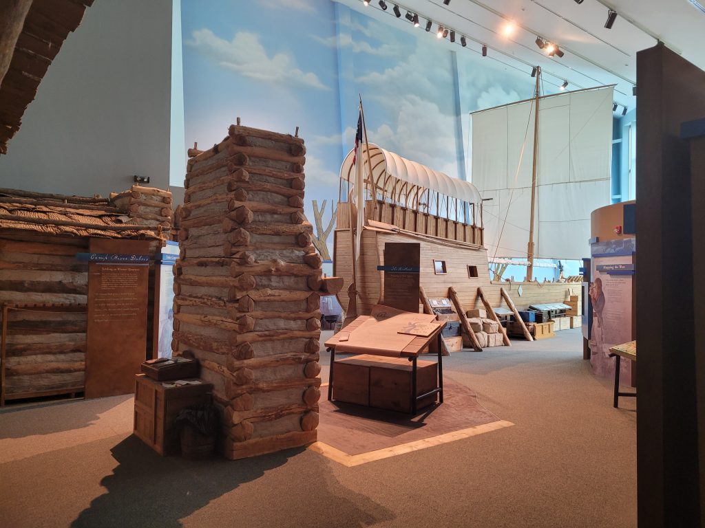
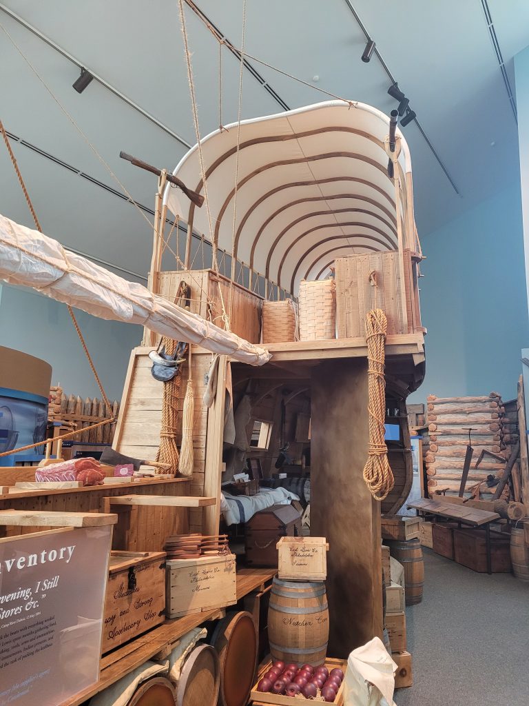
Walking into the exhibit space at the Lewis and Clark State Historic Site evokes images of a child’s imagination or a still image from an early 2000’s TV program. Bright blues and three-dimensional arrays cascade along a wall dedicated to the lives of Lewis and Clark, with a bronze statue serving as the focal point for the entrance. After walking through a section relaying the trade artifacts, outlining the various tribes interacted with, and the general goals of the early explorers of America, one is greeted by a tremendous spectacle: half of a wooden vessel parked in the center of a hall of wooden items. This is a model of the boat used by Lewis and Clark on their expedition to the Pacific.

View of the boat from the entrance to the area.

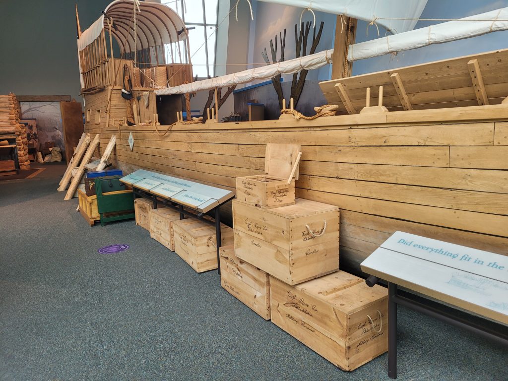
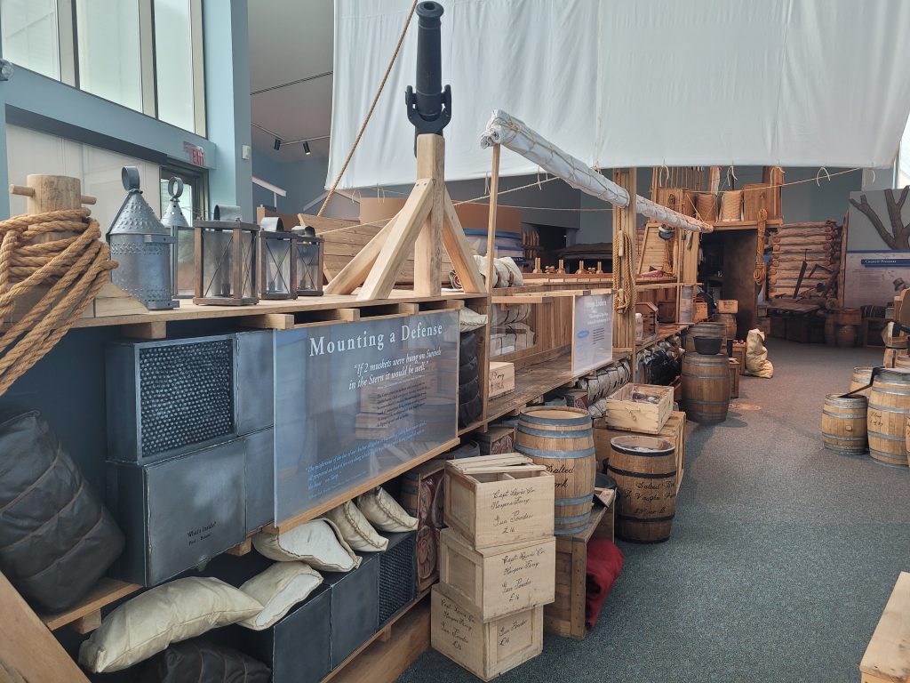
This model spans most of the area it resides in, along with filling about a quarter of the horizontal space available. This ship is bisected as well, allowing one to see the inside of the ship and how certain items and provisions would be stored. For example, there are sections of bisected barrels that show the inside containing salted pork, trade items, and even alcohol that would have served to keep the crew alive. As one traverses from the back of the boat towards the front, on their left is the exterior of the boat if they walked down the right side of the boat from the back, with further panels and items expanding upon the tools, lifestyle, and future of the unit. If one were to walk on the left, they would be informed about various aspects of woodworking, trade, and the scientific discoveries made by the Lewis and Clark group during their adventure.

Right side of the boat showing how the cargo would fit inside the hull.
The left side of the ship which features cutaway barrels and descriptions of the provisions within.

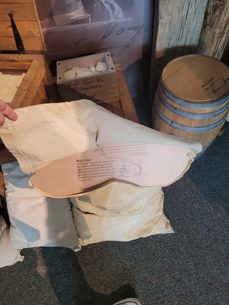
This exhibit showed many different facets of the expedition, but it also showed light upon lesser-known facts of the crew and adventure, such as how the language was translated from English all the way to the specific tribal language spoken where they traveled. In addition, this exhibit was heavily interactive with various stamp stations which would engage children to find various objects or trace certain lines on a map, but it also had interactive physical elements, such as a flap on a cloth bag that would give information within.

Picture of interactive cloth bag with information on the importance of maple sugar.

This exhibit featured an extensive use of three-dimensional learning aids with an appropriate amount of text for both children and adults. However, this exhibit did not have any sort of reading aids for those that may be visually impaired. This museum did feature a comprehensive design for those that are wheelchair-bound or mobility impaired, as the floor plan was open, flat, and featured ramps that lead from lower to higher areas. In addition to this, there was a linear mapping for the exhibit, which went from a timeline and introduction to essential information, then an optional movie, and then the final major exhibit: the boat. After this was a small closing section that discussed the aftermath of the expedition and a small display case that had an accompanying legend of the items.

View of the main cabin in the back of the ship.

Overall, this museum is one that is easily accessible, child friendly, and also stimulating with its array of displays and physical items. There may have been a slight slant in the story-telling, as it is a historic site dedicated to Lewis and Clark, but it also allowed some smaller details that usually aren’t highlighted to shine. This boat exhibit is one of the most exciting I’ve seen and it is still an enjoyable experience, regardless of age or knowledge.

Bibliography 

African: 

Berzock, Kathleen Bickford. “Water or Palm Wine Container.” Art Institute of Chicago. Accessed on July 21, 2022. https://www.artic.edu/artworks /18 56 74/water-or-palm-wine-container 

Karp, Ivan. Explorations in African Systems of Thought. Washington, D.C.: Smithsonian Institution Press, 1987. https://archive.org/details/exploration sinaf00karp  

“Women Potters in Burkina Faso.” Development Workhop. Accessed on July 21, 2022. https://www.dwf.org/en/content/women-potters-burkina-faso 

Greco-Roman: 

Braun, Thomas, et al. “Greece, ancient.” Grove Art Online. 2003; Accessed 5 Jul. 2022. https://www.oxfordartonline.com/groveart/view/10.1093/gao/9781884446054.001.0001/oao-9781884446054-e-7000034254

De Groot, Jean. “Theatricality in Pottery Design and Machines.” In Politics and Performance in Western Greece: Essays on the Hellenic Heritage of Sicily and Southern Italy, edited by Heather L. Reid, Davide Tanasi, and Susi Kimbell, 2:111–30. Parnassos Press – Fonte Aretusa, 2017. https://doi.org/10.2307/j.ctvbj7grj.10

Hall, Edith H. “Greek and Italian Pottery.” Bulletin of the Pennsylvania Museum 4, no. 16 (1906): 53–57. https://doi.org/10.2307/3793411.  

Mastronuzzi, Giovanni, and Paolo Ciuchini. “Offerings and Rituals in a Messapian Holy Place: Vaste, Piazza Dante (Puglia, Southern Italy).” World Archaeology 43, no. 4 (2011): 676–701. http://www.jstor.org/stable/23210491

McManis, Amanda. “Perfume Vessels in South-East Italy: A comparative analysis of Perfume Vessels in Greek and Indigenous Italian Burials from the 6th to 4th Centuries B.C.” Master’s thesis, University of Sydney, 2013. 

Monsieur, Patrick. (2007). Amphora Burials and Burials with Amphorae: On the Reuse of Amphorae in the Northern Necropolis of Potentia (Porto Recanati, Marche). Theoretical Roman Archaeology Journal. 133. 10.16995/TRAC2006_133_149. 

Paterson, Jeremy. “‘Salvation from the Sea’: Amphorae and Trade in the Roman West.” The Journal of Roman Studies 72 (1982): 146–57. https://doi.org/10.2307/299120

Tanner, Jeremy. “Nature, Culture and the Body in Classical Greek Religious Art.” World Archaeology 33, no. 2 (2001): 257–76. http://www.jstor.org/stable/827902

Mississippian: 

Baires, Sarah E. “The role of water in the emergence of the pre‐Columbian Native American City Cahokia.” Wiley Interdisciplinary Reviews: Water 2, no. 5 (2015): 489-503.  

Belknap, Lori. “Educate Cahokia Mounds.” Cahokia Mounds, September 6, 2021. https://cahokiamounds.org/.  

Friberg, Christina M. “Cosmic Negotiations: Cahokian Religion and Ramey Incised Pottery in the Northern Hinterland.” Taylor & Francis, February 25, 2017. https://www.tandfonline.com/doi/full/10.1080/0734578X.2017.1378986

Holmes, William H. “Mississippi Valley.” Ancient Pottery of the Mississippi Valley by William H. Holmes, 2012. https://scienceviews.com/ebooks/AncientPottery/index.html

South America: 

Belaunde, Luisa Elvira, Sara Welsh Colaianni, and Sara Walsh Colaianni. “CHAPTER 7: ‘KENÉ’: SHIPIBO-CONIBO DESIGN.” Fieldiana. Anthropology, no. 45 (2016): 81–92. http://www.jstor.org/stable/44744612

Brown, Mary. THE EMERGENCE OF THE BIRD IN ANDEAN PARACAS ART, c.900 BCE – 200 CE. PhD diss. The City University of New York, 2016. https://academicworks.cuny.edu/cgi/viewcontent.cgi? article=2621&context=gc_etds 

Dohmen, Renate. Encounters Beyond the Gallery: Relational Aesthetics and Cultural Difference (International Library of Modern and Contemporary Art). London: I.B. Tauris, 2016. 

Rodriguez, Martin. “Moche Culture and Art.” About Peru History. August 2, 2019. http://about-peru-history.com/moche-culture-and-art/ 

Roe, Peter G. “Infinity of Nations.” Art and History in the Collections of the National Museum of the American Indian. Accessed on July 21, 2022. https://americanindian.si.edu/exhibitions/infinityofnations/amazon/239608 .html 

Roe, Peter G. The Cosmic Zygote: Cosmology in the Amazon Basin. New Jersey: Rutger’s University Press, 1982.  

Scher, Sarahh. “Introduction to the Chimú culture.” Khan Academy. Accessed on July 21, 2022. https://www.khanacademy.org/humanities/art-americas/south -america-early/chim-culture/a/introduction-to-the-chim-culture 

South America at SLAM: Vessels, Vessels, and More Vessels!

I had never been to the St. Louis Art Museum and had my partner come along on July 11th. As we walked up to the building, I was in awe of the magnitude and of its view overlooking a large body of water with fountains, known as ‘Art Hill’. Once I walked in, I continued to absorb the atmosphere. Once I was handed the map, I was focused on going to the Ancient Egyptians exhibit on the third floor. However, I found myself wondering the vast rooms and the seemingly, never-ending hallways of art. As I did, I caught a room full of ceramic vessels. I thought it fitting and smiled to myself as I entered a well lit and modestly presented room of South American ceramic vessels.

Photo taken by Morgan Lindner

I noticed right away that the bases and stands were all uniform. They were also the same throughout the museum and I appreciated that continuity. The vessels varied in sizes but the exhibit showed them with like sizes in the vitrines. The use of differing sized stands was a successful method to engage more interest in the exhibit while sharing a vitrine.

The room was well utilized and held many vessels. The pedestals were solid, creating a sense of a fuller room. The walls were scarce with information, with there being only one map with regional information about the ancient Andes. The panel of information included different societies such as the Paracas to the Inka. However I saw that other exhibits at SLAM had information adhered directly to the wall, versus being displayed on a panel. I noticed that difference immediately and wished that this room had more color and engaging material.

Photo taken by Morgan Lindner

This vitrine held vessels that were more colorful in their design. It also utilized differing stands while sharing an exhibit space. The labels were standard, using a generic and common font and typeface. I understand that these are expertly done, they just didn’t feel as interesting as they could have been. I did not feel an emotional connection to any of the vessels, besides having prior knowledge about them in our current class. The ceramics were intriguing and colorful. Having these vessels from different societies located in the Andes helped the public understand cultural differences in artistry, but also the similarities in their creation.

Photo taken by Morgan Lindner

The vitrine pictured above encased two similar vessels but placed them in a staggering manner, instead of aligning them. This made it more interesting to the viewer. Even though they were similar objects sharing a vitrine, they were still able to separate them. Focusing on the Wari vessel, the label reads as an expert created the label. However this being most likely true, to a 12 year old, this label would have been quickly passed. Children and some adults will not understand the words used in this label, especially if one is not knowledgable in this region’s culture. I did pass several children, all varying in age, and thought the art museum to be a boring place for them. I hate having that thought when I am a lover of all museums. To be a child and not be able to touch Roman or modern sculptures must be challenging and frustrating. SLAM did offer coloring and drawing for children in one of their larger rooms on the main floor. This was a great way to engage with children and try and foster a positive museum experience for them while they are young.

This exhibit contributed to my current knowledge of ceramics, by expanding the information on the small labels. They were interesting to read and kept my attention. The different colored vessels along with the Andean artistry told a story of their culture. Very bold and expressive. I had not seen South American vessels of that nature and appreciated the inclusion of them in this exhibit.

There is something for everyone at SLAM and you do not have to be an expert to have an appreciation for the arts. The labels for the South American exhibit read professionally which may be challenging for some. I did like how they read because I felt that the museum did their job as being a place for education. A critique I have for the exhibit is to include more color on the walls, or pictures to make the space more inviting for people to walk through. One enjoyment I can give praise to is the use of the space, they filled is appropriately and creatively. There were private tours full of conversation, groups of families talking about paintings, and laughter. That is the result any museum should strive for.

At Home Hauntings: Spirit Boards within the Soul Asylum

Dave Nunnally, curator. Spirit Boards, Located at The Soul Asylum. Alton, IL. Permanent Exhibit. Items courtesy of the Erskine Collection.

Reminiscent of the smell and feeling of entering the unusual storage room at your grandparent’s house, The Soul Asylum, advertised as a “curiosity museum” located in Alton, IL presents various oddities, curiosities, and haunted histories for visitors. Recently procured and renovated in March of 2022 by curator Dave Nunnally, the site boasts a wide variety of subject matter from Ouija Boards to serial killers, devices meant for torture to local history within Alton, including their own oddity, Robert Pershing Wadlow. The Soul Asylum and its Spirit Boards exhibit show visitors that the United States’ culture and history also contains spiritual novelties, stories of hauntings, haunted objects, and “odd” people and occurrences; the interest in this kind of subject matter has pervaded into today’s society but originally arose and spread from capitalist ventures to make money.

Spirit Boards within their display cases. Photo taken by Emily Eckles.

Titled Spirit Boards, this exhibit provides visitors with a brief history of Ouija/spirit boards within the US, and its connection to spiritualism. According to the labels within the exhibit, the first Ouija boards were produced by the Kennard Novelty Company in 1890 and 1891. While at first appearing to be simply a history of the occult, this exhibit explains the direct connection that Ouija boards have with patents along with capitalists, industrialists, and spiritualists. The rise of the occult and Ouija boards was because of widespread interest in these items, not simply misbehaving children and teens. The most fascinating aspect of this exhibit is how invested Americans were with spiritualism, it connects Mary Todd Lincoln to the rise of this phenomena in the US using séances and attempts to speak to the dead. The exhibit claims spirit board use coincides with the rise of telegraph (1844) and telephonic (1876) systems, and the desire for immediate communication.

The design, font, color, and planchettes used through the evolution of the Ouija board are laid out in a somewhat chronological order through the shelves of this exhibits two display cases. While most of the case is filled with Ouija boards and their coordinating labels, miscellaneous items that are not related, and arguably detract from the overall exhibit, are also present in the display cases. One such item is a first edition copy of The Exorcist. This lack of cohesion and strange inclusion makes little sense in this portion of the museum.

The entrance to the Soul Asylum is guarded by two iron gates, after paying a fee of $8.00 to enter, visitors are open to explore the large rectangular room and all of its exhibits. Immediately to the right of the entrance is a table adorned with a Ouija board and a planchette for guests to commune in front of the Spirit Boards exhibit. Following the same wall is an exhibit on serial killers, then a large portion of the room is dedicated to torture devices. Be aware, some of this content is not suitable for children. To the left of the entrance are two church pews and a few exhibitions of Alton’s haunted history. There is also an exhibit with a focus on Robert Wadlow, Alton’s “gentle giant.”

Interactive Ouija Board for visitor use. Photo by Emily Eckles.
Entrance to the Soul Asylum. Photo by Emily Eckles.

Spirit Boards subject matter is interesting, and the items used for display within the cases show just the wide variety and popularity they had within the US. It connects these items curious usage with a rich and complicated history that is compelling to read. However, this exhibit is shoved within two cases with various items and imagery that do not belong, and do not fit into the story that is being presented. Item labels are also curling or bent because they do not have the proper mounting within the cases. The spacing of the actual Ouija boards, planchettes, and images would be beneficial, as well as the removal of unnecessary objects.

Close-up photograph of the right display case. Photo by Emily Eckles.

Visited on June 26th, 2022, this exhibit provided an interesting detour to my visit to downtown Alton. Located among other shops that also have peculiar natures to them, it fit in and allowed visitors to peruse a variety of items and subjects that are not typical in a more conventional museum. Seeing the historical connections, especially the popularity and cultural place that spirit boards had within the US was fascinating because there is not widespread knowledge about them now other than information related to horror-media. This museum, and the Spirit Boards exhibit, connect a more haunted history with the quaint town of Alton. Strange and unusual history is in fact a part of American culture and US (and world) history itself. This exhibit is well worth $8.00, so bring the family to try out the replica guillotine and stocks, and say hello to Katze, the 51-year-old taxidermized cat who greets visitors at the museum entrance.

Katze the cat taxidermized in 1980 greets visitors to the museum. Photo by Emily Eckles.
« Older posts