Hokusai: Mad about Painting
The Asian studies section of the Smithsonian Institute presents a digital exhibit of Japanese artist Katsushika Hokusai (1760-1849), which is a rendering of their physical exhibit. The physical exhibit is held in the Freer Gallery, since it was Charles Lang Freer who collected most of Hokusai’s art, realizing its potential long before other collectors. In honor of Freer’s death in 1919, the gallery is hosting a year-long exhibition of Hokusai and his artwork. The collection was curated by Frank Feltens. Generous support for this exhibit and the museum’s Japanese art program is provided by the Mitsubishi Corporation.
Methodology
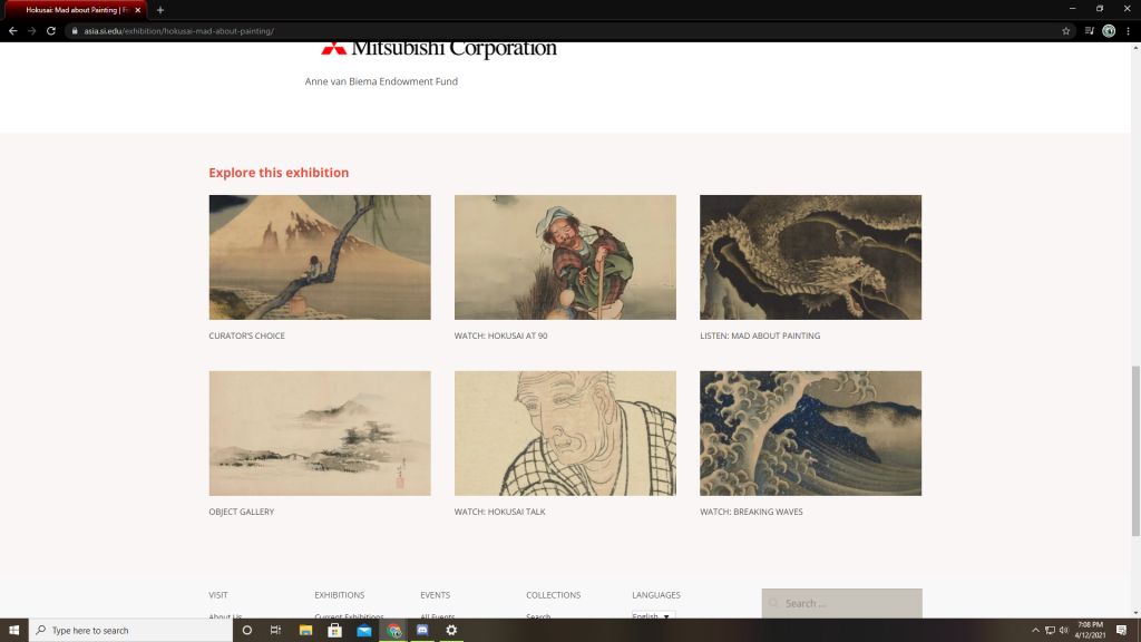
Here we can see the format of the digital exhibit. Each image has a small description of what awaits the viewer and pulls them to that page. Once on the selected page the viewer is free to click on the images, video, or audio that awaits them. They may either use the back arrow in their browser or follow the arrows back to the “Hokusai: Mad about Painting” home page.
The accessibility of the site was rather easy, as I mentioned above the viewer can either use links at the top of the page to return to the home-page or may use the back arrow of their web-browser. This does, however, slow down the exhibit and ruin its flow, since it prevents the viewer from moving in a linear fashion. After each page is viewed, the viewer must return to the home-page in order to access the next page. The exhibit itself is not technically linear, the viewer may choose to go in any order they like of the six pages, but they are forced to always return to the home-page. This should be adjusted to fit the flow and style of the material being displayed.
Design
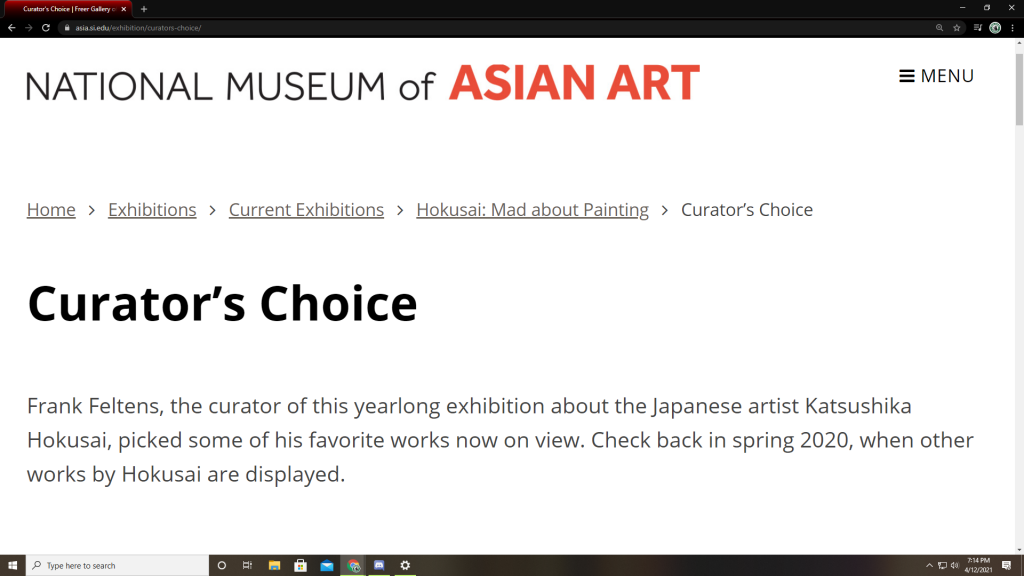
Of the seven pages that the exhibit used, only two contained many images of Hokusai’s artwork (Curator’s Choice and Object Gallery). There were three pages which all had videos of varying lengths discussing different pieces (with the video on Hokusai Talk being the longest and the most in depth of his work/the real exhibit), and one clip discussing Hokusai’s work on a podcast.
The text used throughout the exhibit was plain, thin lettered black against a white background. The exception to this rule is found in the Object Gallery where the names of the pieces are in a larger, red font with smaller, black font beneath the piece describing it. The rule of thumb on the design of this site must have been to use as little text as possible. When videos or images could suffice, words were left out of the equation. In my opinion this allows the viewer to more fully enjoy the work of Hokusai without being bogged down by too much text.
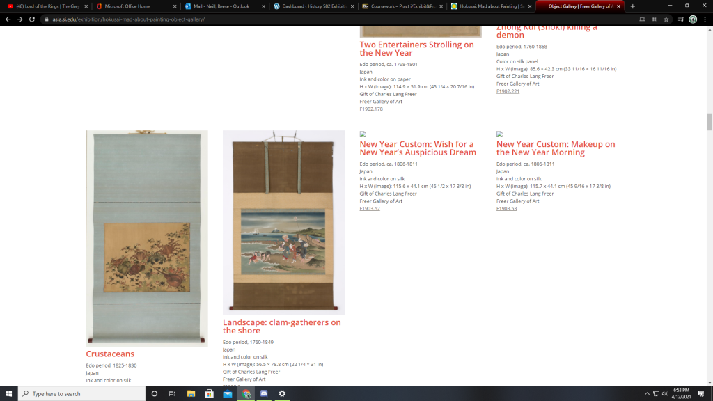
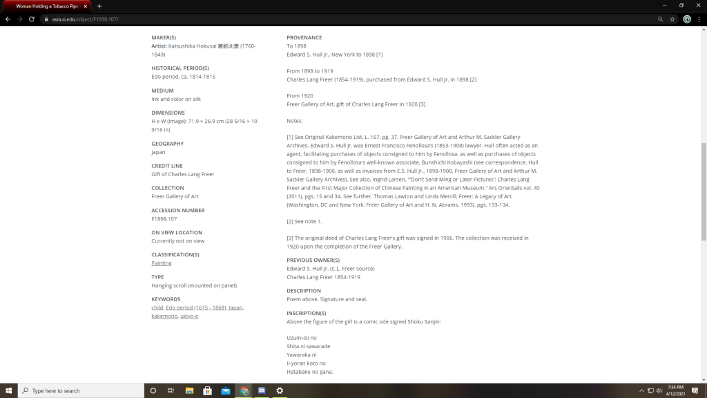
Many of the images do not have narrative descriptions and only use text to describe the dimensions and materials being used in the piece. When you click on any given image more metada is displayed beneath a higher definition version of the image (as seen below).
It would have been nice to see short, narrative captions inside the gallery view and then see ALL of the metadata when the viewer went to the image’s page. This is a personal preference and does not, in my opinion, weaken the structure of the exhibit, only its style in presentation.
Content
The exhibition is clearly about Katsushika Hokusai’s paintings and sketchings and the desire to shed light on his less-known, yet equally astounding, works. The exhibit talks and audio specifically seek to argue that as Hokusai aged he became more and more enraptured with painting and his desire to paint everything he saw grew until his final days. He was, as the title suggests, “Mad about Painting.” The target audience for this exhibit is primarily mature audiences who would be willing to listen to longer videos about his work and those who have the time and patience to appreciate what Hokusai was able to accomplish, even in his old age.
Hokusai was famous for his print “Great Wave off the coast of Kanagawa,” and yet this exhibit seeks to persuade the viewer that he was a much more accomplished artist than the man who created that one piece. This exhibit provides a necessary service in highlighting the life and work of a man who has been so long associated with only one piece, and wrongly so. Hokusai was a masterful painter who created the most beautiful paintings, arguably, in all of the Edo period and even into the nineteenth century. To tie this man’s great work and even his life to the existence of one piece is foolishness. Again I say, this exhibit provides a necessary service in proving, not through words, but through the very brushstrokes of Hokusai himself, that one image does not define the life of any artist.
Descending Dragon 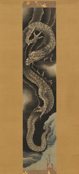
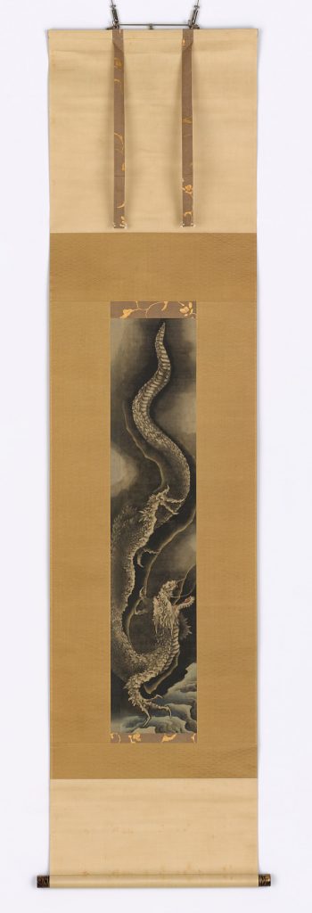
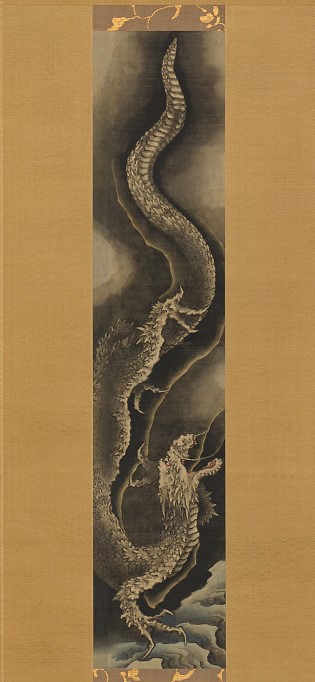
Ascending Dragon 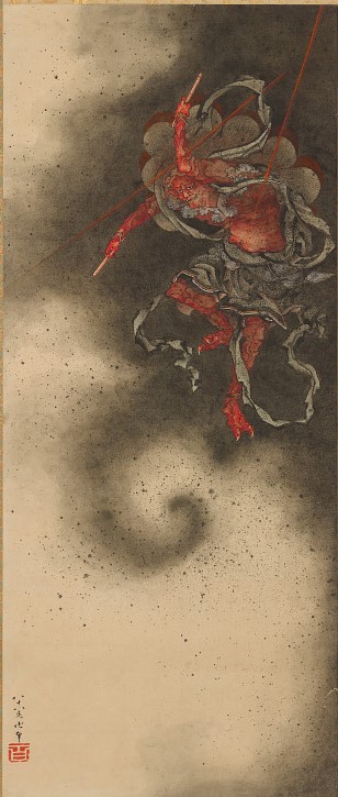
Thunder God