A Course Focused on Museum Exhibitions

Author: Abigail Goodman

“A Moment Alone in the Shade:” Walking the Grounds of Mount Vernon

https://virtualtour.mountvernon.org/

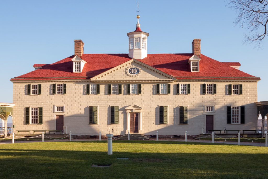
Mount Vernon was the plantation and estate belonging to the first President of the United States, George Washington. It is also the place where he is buried, alongside his wife Martha and 20 other Washington family members. Mount Vernon was originally named “Little Hunting Creek Plantation” and was owned by John Washington, whose son Lawrence inherited the estate upon his passing. Lawrence Washington then passed the estate down to his daughter, Mildred. Mildred’s brother, Augustine, George Washington’s father, bought the estate in 1726 and built the main portion of the plantation house. In 1740, Augustine passed the estate to his eldest son Lawrence, George Washington’s older half-brother, who renamed the plantation Mount Vernon, after English naval officer Admiral Edward Vernon. Future President George Washington only inherited the plantation after his brother Lawrence (and his two heirs, his daughter, Sarah, and his wife, Ann) passed away. George Washington is responsible for the grand additions to the plantation, including an upper and lower garden, a greenhouse, and a botanical garden.

According to their website, “Mount Vernon is owned and maintained in trust for the people of the United States by the Mount Vernon Ladies’ Association of the Union, a private, non-profit organization.” If you click the photo to the right of this text box, a new tab will open and you will be directed to the official website for Mount Vernon.

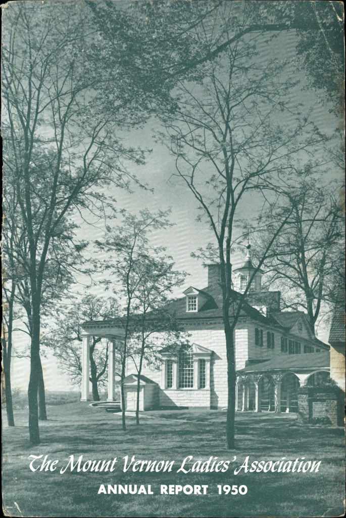
The Mount Vernon Ladies’ Association of the Union is dedicated to the preservation of Mount Vernon so that the legacy of George Washington may continue for generations to come. The virtual tour of Mount Vernon allows people from all over the United States to “walk” the grounds of George Washington’s estate. From the novice to the enthusiast to the professor, this virtual tour is designed so that everyone can take something away and learn something valuable. I would argue that tours of historic estates such as Mount Vernon are some of the most essential elements of history education. They allow the visitor to analyze a time period from a different perspective which is so incredibly important. When it comes to the colonial period, people always talk about the Founding Fathers and the Constitutional Convention and the American Revolution/Revolutionary War. Those are all incredibly large topics that help the learner look at the time period with a wide lens. Touring an estate helps the learner look at the time period through the much smaller lens of the daily life of the people who operated the estate. Mount Vernon’s tour is a wonderful resource, especially for educators. This tour of Mount Vernon has been masterfully executed in terms of making the language accessible and allowing the viewer to learn about early United States history in a new way: through examining the way in which people lived their daily lives as opposed to only looking at large events.

“Knowledge is in every country the surest basis of public happiness.”

George Washington, first annual address | friday, january 08, 1970

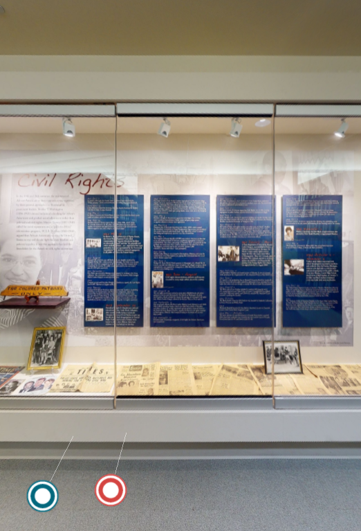
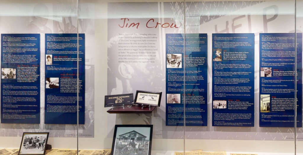
When discussing the history of the United States, it is difficult, if not impossible, to find a period of time that was not affected by the enslavement of human beings, racism, or both. The Founding Fathers, despite their monumental efforts towards “freeing” the Americans from British rule, were not without fault. People tend to forget that the Founding Fathers were also enslavers. The text on the tour of Mount Vernon is strictly educational/informational, but the tone does change slightly when referencing the enslaved people on the estate. The language used does draw more attention to the inequity and the subpar conditions experienced by those who were enslaved by George Washington and his wife Martha, but it is not supporting or promoting a certain angle. It’s incredibly easy to put the Founding Fathers on a pedestal because of what they did for this country, but it’s equally as important to humanize them by openly discussing their flaws and their misgivings.

This edited photo of John Trumbull’s famous painting has a red dot over the face of every Founding Father that participated in enslavement.

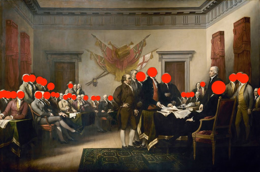
Above photos courtesy of Arlen Parsa [@arlenparsa on Twitter], from who these images originated.

This edited photo of the same painting has a yellow dot over the face of every Founding Father who later freed those they enslaved.

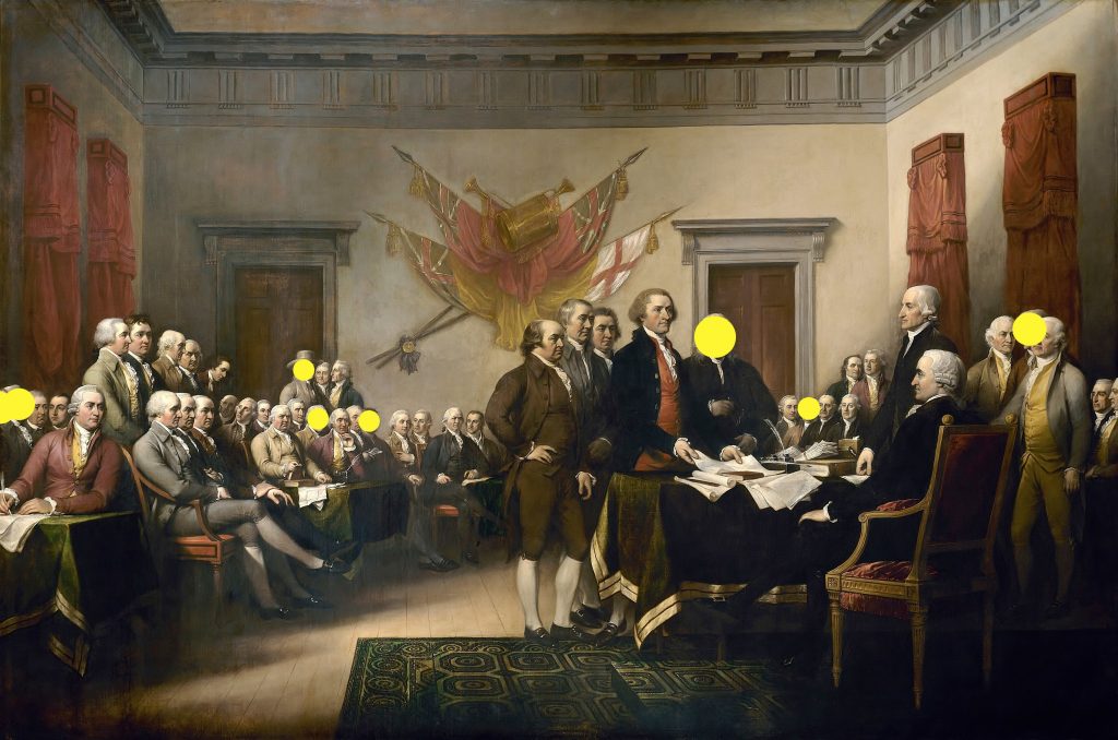
See the “To Learn More” section at the end of this post for links to articles concerning these images.

“When only one side of a story is heard and often repeated, the human mind becomes impressed with it insensibly.”

George Washington, letter to edmund pendleton | Thursday, january 22, 1795

Let’s Take A Tour

This is the West Front of the Mount Vernon estate, which serves as the beginning of the virtual tour.

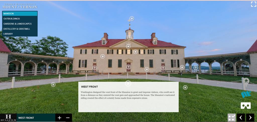
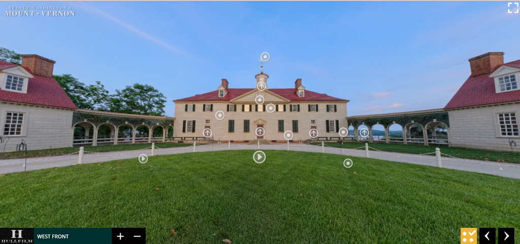
The virtual tour of Mount Vernon is a panoramic, self-guided walkthrough experience. The image above is the first thing that you will see once the tour has launched. There are not any visible directions on how to navigate the site; the viewer is left to figure it out on their own. The menu in the top left corner allows you to choose what area of Mount Vernon you would like to explore. If you hover your cursor over one of the options, i.e. “Mansion,” it will expand to the right and you will have another list of options to choose from. In the bottom left corner there is a box that tells you what area of the estate you are currently viewing (i.e. “West Front,” in reference to the above image). The + (plus) and – (minus) buttons allow you to zoom in and out of the image. You can also use the ones on your keyboard. The white text box at the bottom of the screen offers the viewer a description of the area they are currently viewing. If you click on the text box, it will disappear, but if you want to view it again, all you have to do is click on the yellow box with the three (3) dots and the checkmark that is to the right of the text box. (If the box is grey, you will have to click on it to turn it yellow, then click it again to get the text box to return.) This box gives the viewer the option to show or hide the tour interface.

The box will be grey if the tour interface is being shown, meaning that the menu of areas to explore is visible, along with the VR option and estate map .
The box will be yellow if the tour interface is being hidden, meaning that the menu of areas to explore is hidden, along with the VR option and estate map.

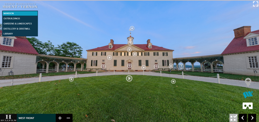
When the tour interface is being shown, there are a few extra options that the viewer has. The left and right arrows in the bottom right corner enable the viewer to take a more guided tour of the estate, as the website will direct you to the next viewable area without you having to choose. (If you are just starting the tour, you still can choose the “previous location,” even if you haven’t viewed any other areas. The tour is on a loop.) The icon above the arrows that looks like a pair of goggles enables a VR (virtual reality) experience. It gives the illusion that you are actually walking through Mount Vernon. I do not think that this feature is incredibly necessary as the tour itself is already immersive. The blue map above the goggles opens the estate map, which is an artistic depiction of an aerial view of the estate. You can only choose to visit seven (7) sections of the estate from the map: Leadership Hall, Reception Hall, the Rare Books Suite, the Document Room, the Reading Room, and the Library Front and Rear.

The little landmark icon with the star in it gives the viewer the option to view or hide the “points of interest.” These are the white dots, arrows, and “play” icons encircled in white that are scattered across the screen. If you click on one of the arrows, you will be taken to another part of the estate. For example, if you are looking at the West Front and you click on the far left arrow, you will be taken to the “New Room.” It’s a way of helping guide the viewer to different areas of the estate without having to consistently navigate the menu.

If you click the “play” icon, a video like the one above will pop up. A lot of the videos available on the tour are people dressed in period costume.
If you click the “dot” icon, a window like the one above will pop up. These are informational tidbits about different aspects of the section you are viewing.

As the tour is panoramic, you can rotate the image on the screen in a complete circle. All you need to do is press the left or right arrow keys on your keyboard. You can also press the up and down arrow keys on your keyboard to shift the view towards the ceiling/sky or the floor/ground. The visual is always really clear, so there is little-to-no lag time when spinning around. The only problem that I could see with this is that the screen moves really fast, which can make people dizzy (me!), and it makes it almost impossible to re-center back to the original angle. Once you get the hang of it, the site is easy to navigate, but it could take a few minutes to adjust to how fast the screen moves.

The virtual tour of Mount Vernon is filled with historical artifacts and reproductions of historical artifacts that would have been present when George Washington owned the estate. These artifacts range from teacups and saucers to paintings to furniture and beyond. Different artifacts will have different stories, so the amount of text that accompanies each one will vary. Each artifact (or reproduction) and its text offers a look into what life was like on the Mount Vernon estate. When looking at an artifact and its description, the background is black and the text is white, which makes it easier to read. The virtual tour of Mount Vernon is a wonderful way to bring the colonial period to life.

This is a short video demonstration of how the tour operates. While recording, I did make sure to not rotate the screen too quickly!

To Learn More

https://www.youtube.com/user/HistoricMountVernon

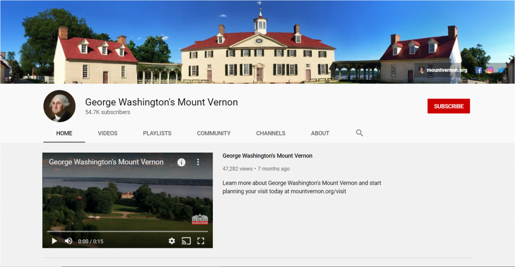
The link above will redirect you to the YouTube Channel for Mount Vernon that is managed by the Mount Vernon Ladies’ Association of the Union (the same group who is responsible for the upkeep of the Mount Vernon estate). If you click one of the small icons below the link, you will be redirected to one of their three (3) social media accounts.

https://www.politifact.com/factchecks/2019/sep/10/arlen-parsa/evidence-shows-most-47-men-famous-declaration-inde/

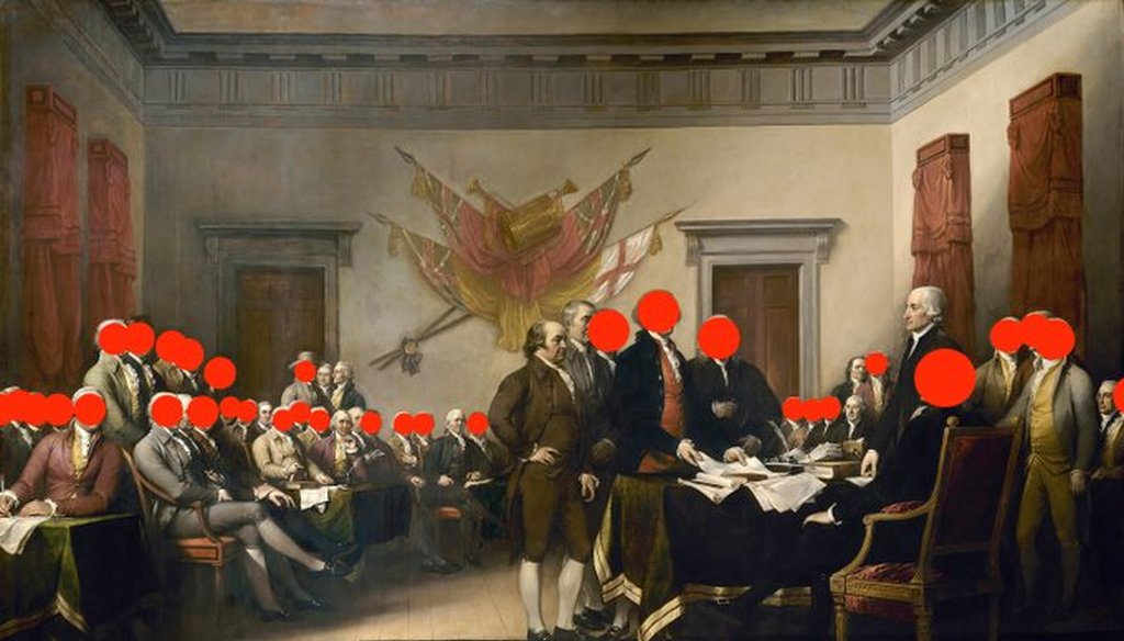
The link above will redirect you to PolitiFact, a website managed by the Poynter Institute. The particular article linked discusses Arlen Parsa’s Twitter post regarding John Trumbull’s famous painting, “Declaration of Independence.” The tweet in question is below. (If you click on it, you will be redirected to the tweet on the Twitter website.) The staff for PolitiFact researched each of the signatories of the Declaration of Independence to determine whether or not they enslaved people. The Poynter Institute for Media Studies is a non-profit journalism and research school in Florida. A link to the spreadsheet that was used to organize their research is as follows: https://docs.google.com/spreadsheets/d/1Tq3u2XkluveKhJXAFJNfPq8uaxMnJ3ylM1cXecYrB-Q/edit#gid=0

“The Museum of the World:” An Anthropological Adventure

Link to the British Museum website
https://www.britishmuseum.org/
Link to the Virtual Exhibit
https://britishmuseum.withgoogle.com/

The British Museum, located in London, England has one of the most comprehensive collections in the world due to how expansive the British Empire was. Founded in 1753, the British Museum has amassed a collection of approximately eight million pieces (artifacts) through centuries of colonialism and acquisition. The Museum of the World is an interactive exhibit experience that allows the visitor to travel through time and traverse the globe without rebuilding a DeLorean à la Doc Brown and Marty McFly. The British Museum has partnered with the Google Cultural Institute to bring us this exhibit using “the most advanced WebGL (Web Graphics Library) technology available.”

As the website loads, the screen transforms from a slate grey with a few colorful spots, to having countless colorful spots (as seen on the right), symbolizing the emergence of civilizations and, ultimately, more anthropological artifacts.
The Museum of the World exhibit can also be reached through the Google Art and Culture website:
https://experiments.withgoogle.com/the-museum-of-the-world

The British Museum and Prompting Discussion

The Museum of the World is dedicated to introducing the public to some of the most fascinating objects from prehistory to the present day, spanning from the year 2,000,000 BC to 2000 AD. The British Museum website states that the institution is “driven by an insatiable curiosity for the world, a deep belief in objects as reliable witnesses and documents of human history, sound research, as well as the desire to expand and share knowledge.” This exhibit contains approximately 320 different artifacts discovered across the globe in Africa, the Americas, Asia, Europe, and Oceania.

This video from the American Museum of Natural History visually displays the growth of human population through time.

Get the Conversation Going

Communication is KEY!

This exhibit is incredibly accessible online, engaging, and exceptionally informative, so the target audience could really be comprised of anyone interested in prehistoric anthropological history. Though, this exhibit could be a wonderful teaching tool if used as an introduction to world history or anthropology. The content is relayed in a way that is strictly educational, thereby imparting no bias upon the reader. It utilizes an anthropological approach when discussing the artifacts and teaching the visitor about them. I argue that this is one of the main reasons this exhibit is so important. By talking about the artifacts in an anthropological way, the reader is not only learning about the objects themselves, they are learning how to talk about the objects, which opens a channel for communication that enhances societal understanding and brings people together.

“Talking is always a good idea. There’s no harm in keeping lines of communication open.”

Brian reynolds myers, american journalist & associate professor of international studies

How To Speak Anthropology: A New Language

Anthropology is defined as “the study of human societies and cultures and their development.” When discussing historical artifacts in an anthropological manner, a lot of focus will be placed on where the object was found, what it is made of, and what its potential purpose was based on the societies & cultures that occupied (or controlled) the area.

Visitors to this exhibition are going to see objects that they have never seen before and learn about those objects in a way that they might be unfamiliar with. The Museum of the World exhibit challenges the visitor to think in a new way and to understand the function of an object relative to its placement on the globe. This is exactly what makes this exhibit so important. When it comes to museum exhibits that display prehistorical objects and objects dated back through the BC, the visitors develop a new way of understanding the history of humans. New experiences, be they physical, emotional, or intellectual, are vital to the advancement of society’s shared knowledge.

Taking It Back in Time Like Huey Lewis

A screenshot of what the exhibit screen looks like when you first see it.

The virtual tour of this exhibition is unlike any other that I have seen before. It’s set up like a timeline that you can scroll through. You can either use the disc on the mouse, the touchpad on your keyboard, or the two arrows located on the far left side of the screen (as well as the up and down arrows on your keyboard). You can move backwards along the timeline (towards 2,000,000 BC) by rotating the disc on your mouse or dragging your fingers on the touchpad in a downward motion. You can move forwards along the timeline (towards AD 2000) by rotating the disc on your mouse or dragging your fingers on the touchpad in an upward motion. While you can use the two arrows on the far left side of the screen, the website is set up so the timeline is incredibly responsive to motion, which means the screen will shift the entire time your cursor is moving. I found this to be rather frustrating, but use whatever method works best for you. (If you have a touchscreen computer, just dragging your fingers along the screen works really well.)

Once you get the hang of moving along the timeline and manipulating the screen, the exhibit is incredibly easy to navigate. It is a self-guided exploration of the linear timeline of the history of human stuff. The timeline is divided into five (5) different categories (listed from left to right): Africa, Americas, Asia, Europe, Oceania. You can explore the timeline by looking at all of the sections together, or combing through them one-by-one.

Geographical AreaColorNumber of Artifacts
AfricaYellow58
AmericasOrange31
AsiaGreen114
EuropeBlue87
OceaniaPurple30
A list of the different geographical sections you can view, along with their respective colors and an approximate number of how many artifacts each section contains (give or take a few).

If you’d like, you can also view the artifacts according to five (5) specific themes: Art and Design, Living and Dying, Power and Identity, Religion and Belief, Trade and Conflict. You can choose those themes on the far right side of the screen. If you click “Power and Identity,” the artifacts that you can choose from will reduce and you will only see artifacts that relate to that theme. In order to reset the timeline to full visibility (where all the artifacts are available for viewing), all you have to do is click the little eyeball shape above the list of themes.

This is what a portion of the timeline will look like if you click “Power and Identity.”
This is what the same portion of the timeline will look like if you click “Trade and Conflict.”

The virtual tour of the timeline works well and accomplishes what it needs to accomplish, but it does take a minute or two to get used to it and figure out the different “settings” you can create. As this is a setup that I was unfamiliar with, it took me a while to understand how it functioned. There are only two things that I would suggest improvements for: The first being how sensitive the background of the timeline is, and the second being the spacing between artifacts (those colored dots that I will mention in the next section).

Let’s Talk Design

This is a short video of what The Museum of the World exploratory timeline looks like just moving through it without looking at any of the artifacts. The layout is really unique to a virtual tour, yet it may seem familiar if you’ve played a bit of Guitar Hero in your day. Each colored dot (yellow, orange, green, blue, and purple) represents a different artifact. The dots are all separated by the geographical area in which they were found, which is also designated by color. As you can see in the video, there are certain points on the timeline where there are several colored dots in one spot, which does make it difficult to pick a specific one (as they are all close together).

An example of an artifact shown in the exhibit.

The exhibit does show various kind of artifacts, from tools to artwork to metalwork to items used for the dead (coffins & urns). If you click on one of the colored dots, a small preview of the item will pop up with the option to “Find Out More.” Once you click that, a small screen will pop up that looks like the one above. If you click on the image of the artifact, it will expand so you can get a better look at it, but you cannot manipulate the image to see it at a different angle. Next to the image is a description. The information available varies based on the artifact. For example, the information for the Holcombe Mirror (the artifact above) is more detailed than the information for the Bronze Belt Hook (the green dot between 200 and 300 BC). Each artifact has an audio clip where you can hear a curator from the British Museum talk about the artifact. The audio clip gives you different (more) information than the text box does, but this is a problem when it comes to accessibility. There is not a transcript of the audio clip, so if you can’t hear the audio clip, you’re missing out on interesting bits of information. In addition, you can also see where the artifact was found on a map. As this exhibition was made in partnership with Google, the map available is a Google satellite map. Underneath the map, you can be directed to artifacts that are related to the one you are currently looking at.

This is a short video of everything stated in the above paragraph regarding viewing the artifacts in the exhibit.

That’s All, Folks!

Overall, I think that this kind of exhibition/highlight reel of artifacts is really cool! It is a different format than most people are probably used to, which is what makes it stand apart. I do not think that this type of exhibit would work for every institution (i.e. a museum dedicated to the Civil War), but I think this type of format could be used as an extra feature on the website for various institutions. I have always found that putting things on a timeline better helps spatial comprehension, making it easier to process the information presented.

If you would like to go on different tours of the British Museum using Google Street View, click the link that follows: https://artsandculture.google.com/partner/the-british-museum

“Understanding Jim Crow:” The Functionality of Racist Memorabilia

https://my.matterport.com/show/?m=X9ou6MvycZU&help=1

Ferris State University in Big Rapids, Michigan has a museum exhibition entitled “The Jim Crow Museum of Racist Memorabilia” that is now online for people of all ages in all locations to explore and enjoy. This exhibition, curated by Dr. David Pilgrim, is dedicated to the display of historical items from the era of Jim Crow to “teach tolerance and promote social justice” within this volatile socio-political climate.

Dr. David Pilgrim, the creator and curator of The Jim Crow Museum of Racist Memorabilia, on how he established this institution and its broader implications within our society.

The mission of the exhibition is to “use objects of intolerance to teach tolerance and promote social justice.” This exhibition contains over 10,000 pieces that envelope the visitor in the history, samplings of which are placed in traveling exhibitions such as “Hateful Things,” which has also been made available for online viewing. The fact that this exhibit is incredibly accessible online, engaging, and exceptionally informative demonstrates that the target audience is actually quite broad! This exhibit is geared towards anyone who wants to learn about the Jim Crow Era and the impact that it had on American society, as one of their mission objectives is to “serve as an educational resource.” Moreover, they allow the visitor to visualize what life was like under Jim Crow segregation by surrounding them with historical items, not allowing them to escape their presence until the end of the exhibition, which is rather metaphorical.

When addressing topics like racism in America, it can be quite difficult to have a conversation that is completely devoid of bias, whether it be “good” or “bad.” In the case of this exhibition, I believe the bias towards social justice and antiracism is absolutely necessary, or else it would defeat the purpose of it.

This is just a small fraction of all the items visible on the virtual tour of this museum exhibition.

The exhibit is so expansive and so full of artifacts that it sheds more light on just how encapsulating Jim Crow was, how it was present in every aspect of life. Everyone sees the signs on the bathrooms and above the water fountains in their high school textbook, but due to the sheer number of artifacts, the viewer may see things they have never seen before (or that evoke memories if they were alive during this time period). It is a thought-provoking, emotional experience to “walk” through the exhibit and see these things.

Segregation was made illegal in 1964 and Black people were given the right to vote in 1965. As a society, we must realize and remember that we are not so far removed from the era of Jim Crow. Black people still face heavy oppression, systemic and regional racism, disenfranchisement, and disproportionate amounts of violence. We have to do better and we must make great strides to be better. This is why this exhibition is so important – in order to transform our future, we must examine the pitfalls and failures of our past.

I argue that we need more museum exhibitions like this one that force people to confront past narratives that might make them uncomfortable. It is my belief that if you are studying history and there is not a single point along the timeline that makes you angry or uncomfortable, you need to take a look inward, take a swim in Lake You, and think about your privilege.

Our ignorance of history causes us to slander our own times.”

Gustave flaubert, novelist

Let’s Take A Tour

The virtual tour of this exhibition offers the visitor a panoramic, self-guided walkthrough. When you first visit the link for the exhibit, you are given directions on how to tour the exhibit – the up and down arrows on your keyboard will move you forwards and backwards, the left and right arrows will rotate you either left or right, and the plus and minus keys will enable you to zoom in or out. You do have the option to scroll through, but it is a little clunkier that way. It is much easier to just use the keyboard; it is much smoother in terms of visuals, as everything is less blurry when you move.

Instructions on how to operate the virtual tour

Once you get the hang of using the arrows on your keyboard, the exhibition is incredibly easy to navigate. Although, it is also rather easy to get turned around/”lost.” To remedy this, there is a “play” button in the bottom left corner that will take you back to the beginning of the virtual tour that you can pause any time and start maneuvering on your own again. There is also an option to view the “dollhouse,” which is a 3-D layout of the exhibition that you can click into if you lose your place. The exhibit is self-directed, but you can use the aforementioned layout maps if you would like to follow a set path, as there are some areas in which you can choose the direction you go, like a fork in the road. The virtual tour works well and accomplishes what it needs to accomplish, but it does take a minute or two to get used to it if you are unfamiliar with this type of online exhibit.


This video is a tour of The Jim Crow Museum of Racist Memorabilia hosted by its curator, Dr. David Pilgrim. It is not a tour of the entire exhibit. In this video, Dr. Pilgrim discusses some of the major themes that occur throughout the exhibit.

Let’s Talk Design

This is the second display that you will see once you begin the virtual tour. As you can see, there are a handful of objects and text behind them . If you click on the red “target,” a timeline of slavery in America will pop up that you can expand to full screen and check out. If you click on the blue “target,” a video will pop up that you can expand to full screen. This video is a narration of all the text behind the artifacts (since you cannot read the text if you zoom in – it gets really blurry).

If one does want to utilize the red timeline pop-ups, one does have to start at the beginning of the exhibit, as each pop-up is a different section of the timeline. (This is only seen in the first few displays.) The blue narration targets are specific to each display and are seen throughout the entire exhibition. This is incredibly helpful, as the text always adds something special to the exhibit. As you proceed through the exhibit, the number of artifacts in each display increases and the amount of text decreases, but there is still a small amount of text in each display to tie everything together and elaborate on the theme of the display. The hallway leading into the main hall (as mentioned below) is well-captioned and every bit of text supplied is absolutely necessary in telling the story of Jim Crow in America.

The hallway display has a light paint color and a light carpet color.
The main hall display has a dark paint color and a darker carpet color.

The first part of the exhibit takes you down a hallway, then you move through a set of double doors into the main hall of the exhibit. The wall color changes from a light beige/white to a navy blue and the carpeting changes from a light beige to a grey, which allows the more colorful artifacts to pop and have more attention drawn to them, as the lighting plays off of the darker wall and flooring. The text is either displayed on a white, blue, or red background, and is always a contrasting color and in a large enough size so that it is easy to read (in person).

Thousands of the artifacts that are on display at The Jim Crow Museum of Racist Memorabilia were donated by Dr. David Pilgrim in the 1990s. The exhibit uses a variety of different artifacts that include but are not limited to the following: photographs, signage, dolls and statues, Halloween masks, and children’s toys.

“I wanted to create an actual racism facility to have people focused on this specific topic, in terms of our history.” – Dr. David Pilgrim

If you’re visiting the exhibit through the Ferris State University website, the virtual tour could be a little tricky to find if you do not know what you are looking for. Once you make it to the website for The Jim Crow Museum of Racist Memorabilia, the tour is very easy to find.

If you wanted to schedule a virtual tour with a guide, you would click the red text that says “virtual tour options.”

Overall, I think that this exhibit is incredible. The sheer number of artifacts that it contains is its greatest strength and its greatest weakness. It allows for people to see items that they may have never seen or heard of before, thereby drawing attention to how Jim Crow racism was applied to every aspect of society. There are over 10,000 artifacts just in this exhibition that overwhelm the viewer as they enter the main hall, which mirrors how overwhelming Jim Crow racism was and how it enveloped every single person, no matter their race. Although, this does have its disadvantages. It is absolutely impossible to see all of the items in a single viewing. There is simply too much information to be processed at one time. An improvement that I would suggest would be to decrease the number of artifacts on display and increase the number of traveling exhibits to draw more attention to this museum exhibition. Although, since this collection of artifacts is the brainchild of Dr. David Pilgrim, I am reticent to say anything negative (though I could not say anything more negative than I already have).

To Learn More

If you would like to learn more about Dr. David Pilgrim and his collection of Jim Crow artifacts, you can check out his books Understanding Jim Crow: Using Racist Memorabilia to Teach Tolerance and Promote Social Justice and Watermelons, Nooses, and Straight Razors: Stories from the Jim Crow Museum

Below I have linked another article and video, as well as a pdf version of an interview with Dr. David Pilgrim, if you would like to check them out!

Interview-with-Dr.-David-Pilgrim