For this review, I decided to shy away from the smaller, more local exhibits and shift my focus to the nationally recognized St. Louis Art Museum, with the goal of examining exhibit design from the perspective of a large institution, that has access to more resources and capabilities. Ultimately, I decided to conduct my examination on the Ancient American Arts exhibit on the lower floor of the museum.
I visited the art museum on Sunday, March 24th, and upon entry, decided to ask the guides for some of their favorite exhibits. They were extremely friendly and helpful in pointing out their favorites on the lower level, mentioning the Ancient American exhibit, and giving me a map to explore the museum.
As I walked down to the lower level, I was immediately confused as to which direction I should go to reach the exhibit. The rooms of various exhibits are numbered on the map, but in person, those numbers are very lightly labeled on the inside of doorways and are easily missed if don’t look for them. However, I soon realized that the room numbers were not necessary to find the exhibit. As I neared the end of the Oceanic Art exhibit, I had noticed that the paint on the walls had shifted to a deep blue, and after a quick glance at the museum map, I was pleasantly surprised to find that the wall paint corresponded with the map color of the exhibit.
This color coding allowed each exhibit to sharply contrast the other connecting exhibits, making it nearly impossible to not realize when you had moved from one regional exhibit to the next.
The Ancient American Art exhibit was split into four distinct rooms, two smaller, square shaped rooms (Rooms 111 & 112), and two longer rectangular rooms that ran parallel to one another (Rooms 113 & 114).
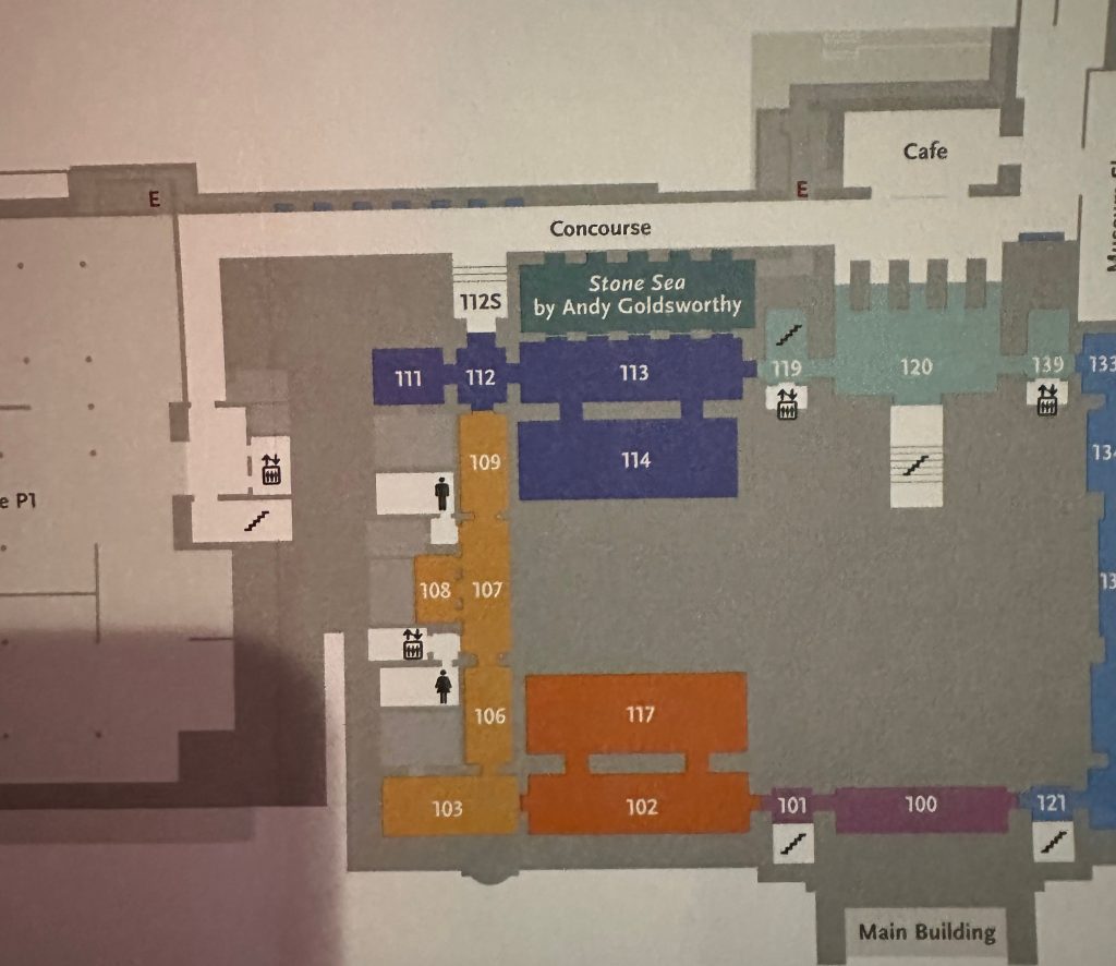
While there is no “entrance” to the exhibit, the information that you will see changes depending on whether you enter from the Oceanic Art exhibit to the south , or from the Islamic Art exhibit to the East.
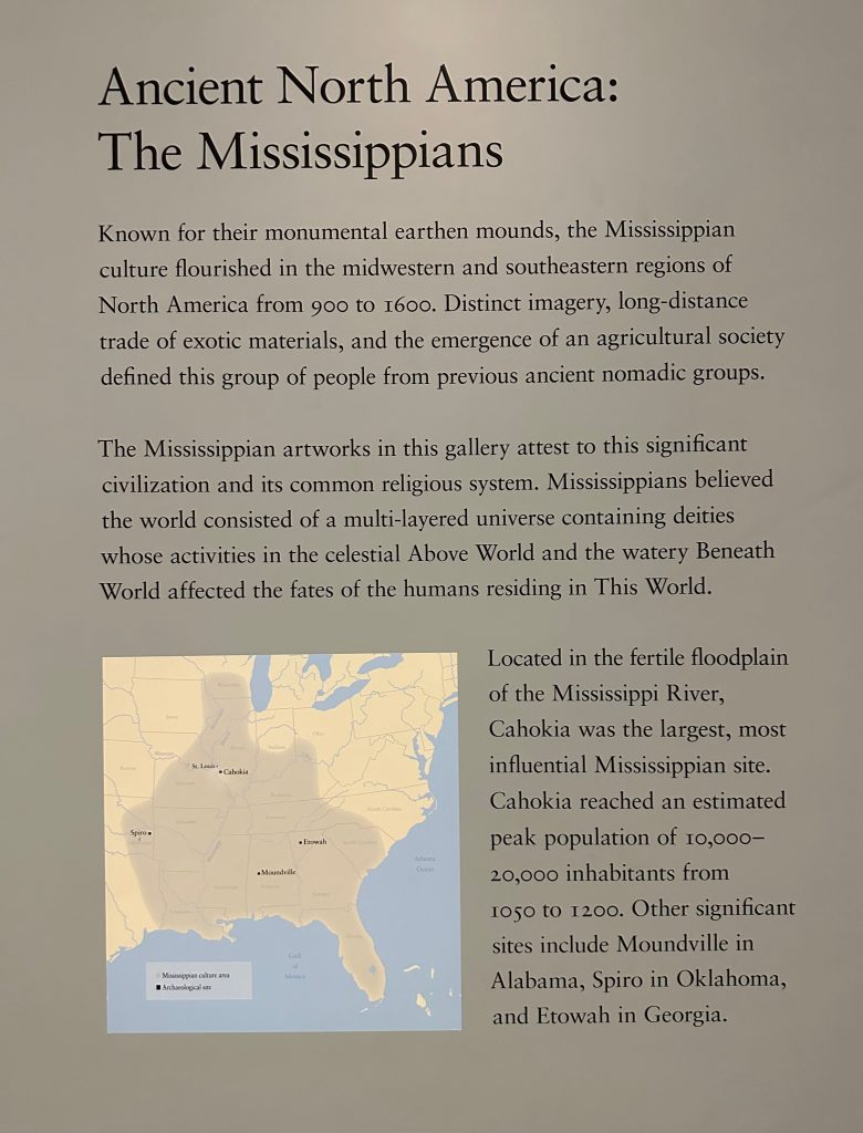
If you enter into room 113 coming from the Islamic Art exhibit, you are immediately met with the art of North America, including the Mississippian culture, American Southwest culture group, and the Mesoamerican culture group. This theme expands heavily into the parallel room (114) that delves even deeper into Mesoamerican culture, likely due to the abundance of artifacts from this region.
Even though I have a bachelors degree in anthropology, I never felt like this exhibit was more accessible to me because I have that prior knowledge. Since the exhibit was ethnographic and not fine-art, it was filled with informational maps along the walls of each room. Each of these maps provided just enough summary information to indoctrinate visitors into the history of these regions. Preventing confusion, but also creating artificial barriers between sub-regions in the exhibit, allowing anyone to identify where one section ends and another begins.
However, not every informational poster was placed in the most ideal position. For example, in room 111, I was immediately met with many display cases, and hidden behind, along the back wall was the informational poster, notifying visitors that this room was dedicated to the Andes mountain region. While it is a minor complaint, I do think that relocating a few of these posters would easily allow visitors to visually organize the exhibit space based on region.
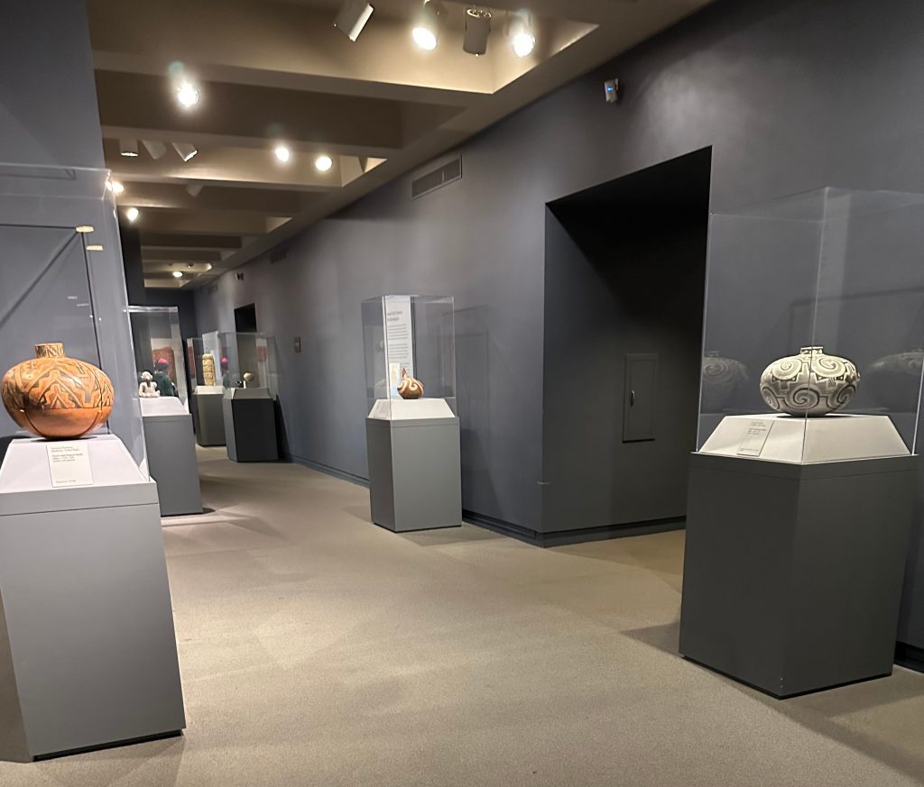
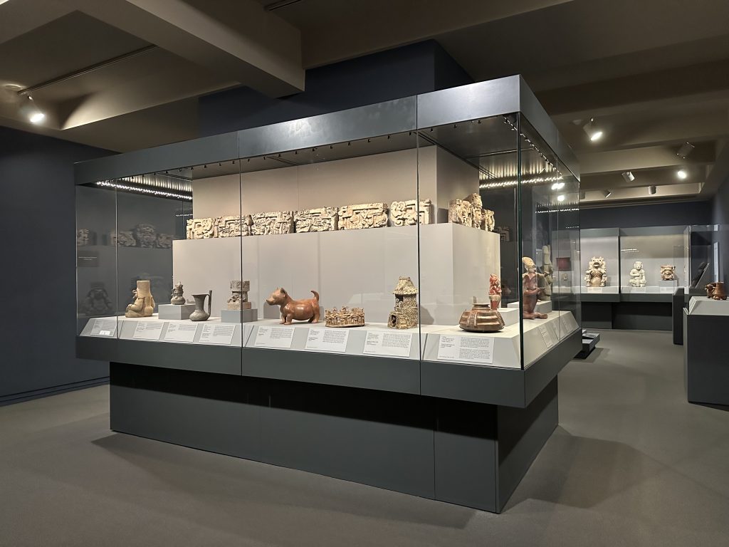
Which brings me to the most prominent aspect of the exhibit, the spacing. This is where I believe the exhibit really shines, all of the display cases are so well positioned that the room never felt cramped and I never felt overwhelmed with information. There is also a consistent alternation between multi-artifact display cases and single-artifact display cases. With every multi-artifact display being positioned in either the middle of the room, allowing for a 4-sided display, or being positioned along the wall of a room, giving multiple visitors plenty of space to examine comfortably without encroaching on anyone else.
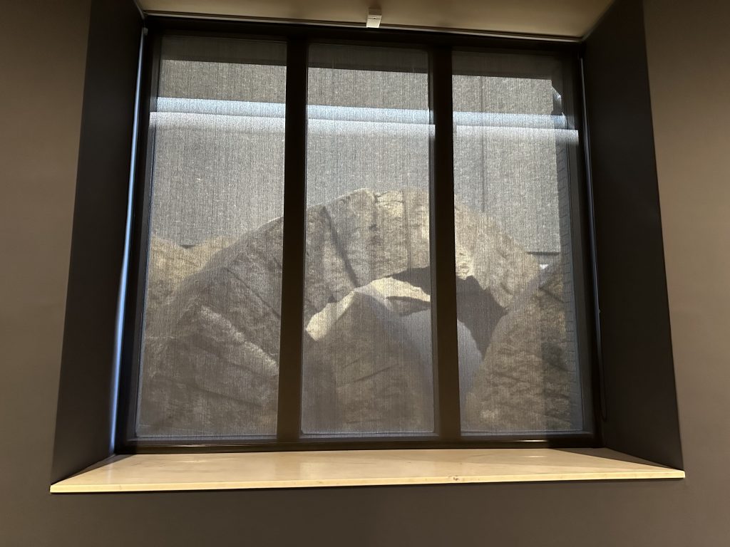
Each part of the exhibit felt as if it had a distinct purpose, the color palette identified the exhibit, the spacing provided a comfortable experience, and even the bordering art (non-Ancient American) added to the experience. Along the long wall of room 113 there are multiple windows facing this massive artwork, titled, “The Stone Sea” by Andy Goldsworthy. Which expertly adds to the atmosphere of the room, while viewing Olmec stonework, you can look up and see these massive stone archways peering through shaded windows. Allowing the visitor to feel encapsulated in the deep blue walls, giving more shadowed presence to the stone arches. Almost transporting visitors into the ruins of an ancient city, providing this feeling of inquisitiveness yet also calming.
Leave a Reply