The Louis Sullivan Architectural Ornament Collection at Lovejoy Library uses pieces of building ornaments to aid in our understanding of Sullivan’s stylistic periods. Effectively using space, size and local context, the exhibit is able to clearly communicate to the audience the story of Sullivan’s works and his connection Edwardsville, Illinois. However, though the exhibit succeeds in educating the visitors on the styles of Sullivan, the over all narrative of Sullivan’s story would benefit from the inclusion of how race and class impacted his life. On February 8th, I chose to visit the Louis H. Sullivan exhibit located in Lovejoy library at Southern Illinois University Edwardsville. Detailing the life and creative periods of a well-known designer of architectural ornaments, Louis Sullivan, the exhibit uses pieces of building ornaments from 1880 to 1923 to chronologically illustrate the evolution of Sullivan’s work. Starting with Sullivan attending architecture school and finishing with the preservation of Sullivan’s pieces by students and other individuals in the 1950s, the main purpose of the entire exhibit is to demonstrate the importance of creative architecture and the preservation of historical building materials.
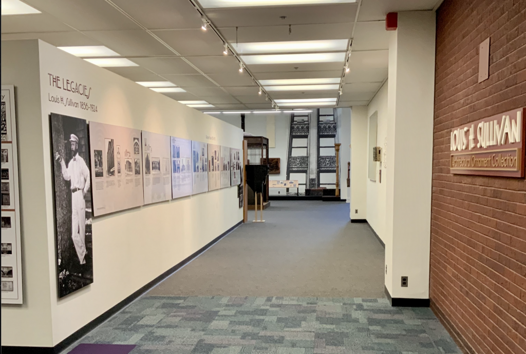
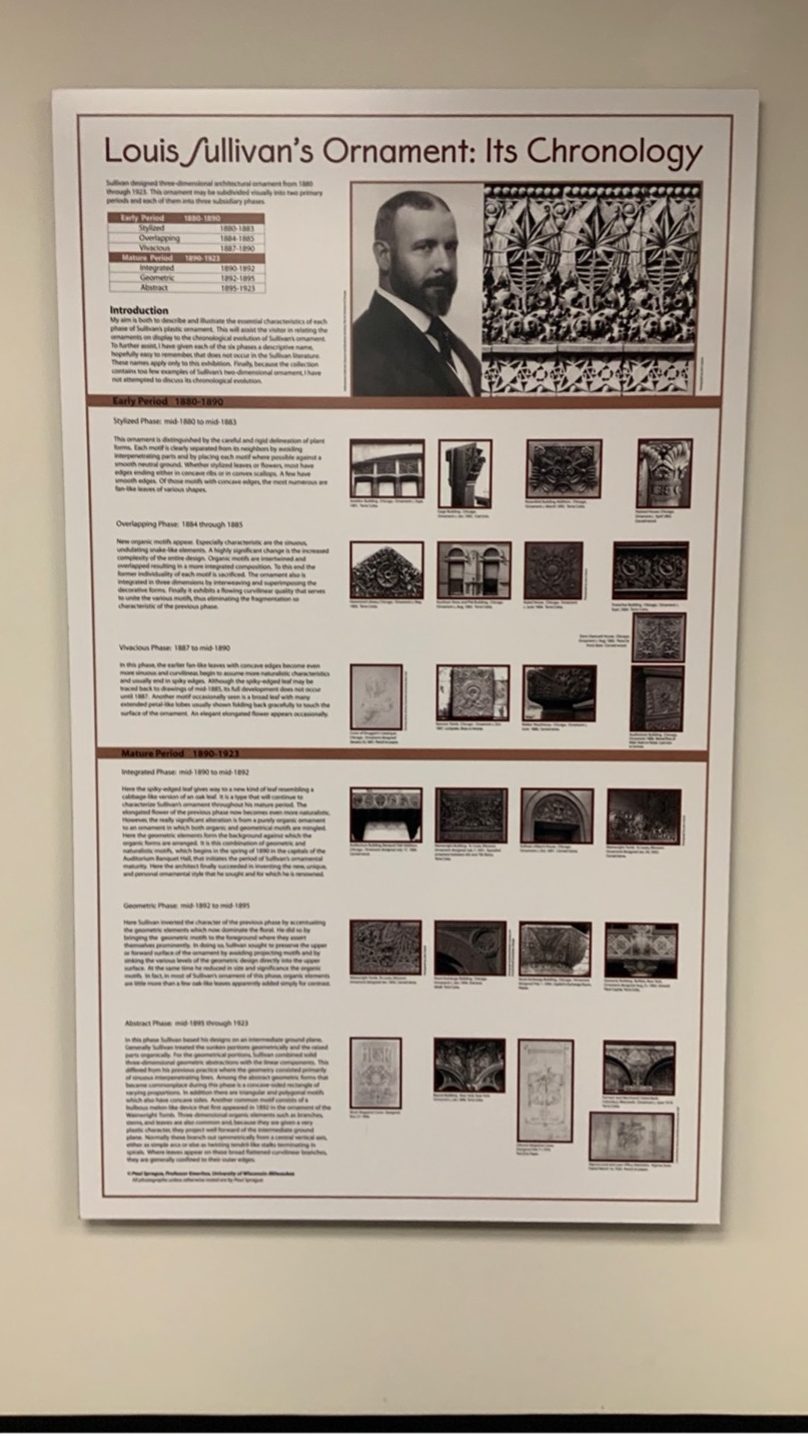
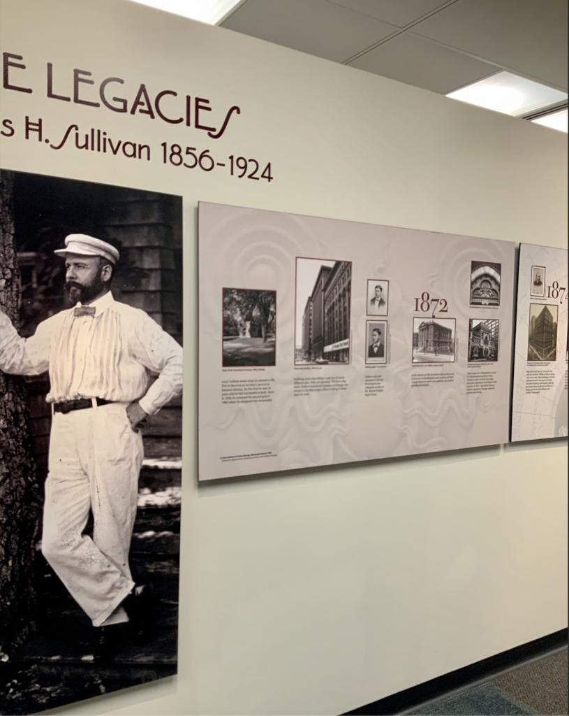
Upon entering the exhibit, we are immediately presented with a long hallway and a large wall of text organized into a chronological timeline of both Sullivan’s life and the preservation efforts taken well after Sullivan’s death in the 1950s. It should also be noted that the images of a large building and pieces of building material at the end of the hallway drew me into the exhibit. In addition, a large plaque that breaks up Sullivan’s styles into artistic periods is placed at the entrance of the exhibit. The area is well lit and almost feels as though the visitor is invited in to the exhibit as the hallway leads into larger room filled with large pieces of Sullivan’s work.
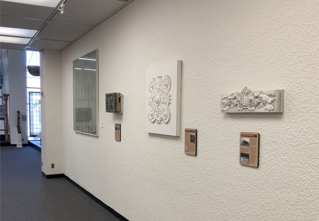
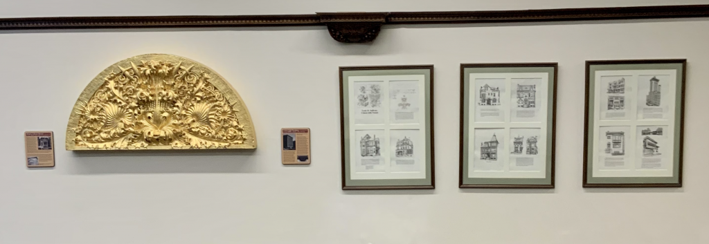
After following the long corridor, the visitors are led to a square enclosed space. Various stone pieces from Sullivan’s building projects line the walls and an elevator assembly designed by Sullivan sits as the focal point of the room. The viewer’s attention is immediately drawn to the larger items hanging from the wall and the elevator car at the center of the room. The natural flow of the exhibit indicated that the guests were to follow the plaques along the right side of the wall. However, the exhibit also did not present itself as only linear, rather the guests also have option of walking through the exhibit in whatever order they choose to do so. The big idea of the exhibit was continued throughout with the use of information on the plaques provided. Each of the plaques corresponds to a decorative piece on display. On it, the signs provide details about where the piece came from, who owned the building and how the piece represents changes in Sullivan’s artistic style. After walking along side the hanging ornaments on the wall, we are presented with a white wall with three posters and an ornament . The end of the exhibit is indicated by the open area of the seating in the library.
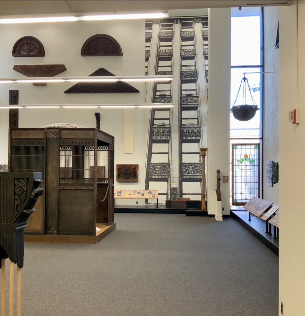
The exhibit of the Louis Sullivan collection at SIUE does an excellent job in telling the story of the evolution of Sullivan’s architectural style and integrates how such information connects to Edwardsville and the college itself. The signage seen at the front of the exhibit serves as an overview of the display and clearly outlines the transitions in design by Sullivan. The author breaks down the changes in design through periods for the purpose of the exhibit. By grouping the designs into distinct groups, the message of the exhibit and general understanding of the differences in decoration was clearly communicated to the guests. In addition to the periodization of Sullivan’s pieces, the timeline placed in the long hallway also effectively engaged the audience. Rather than placing a text heavy timeline at the center of the exhibit, the guests can slowly make their way down the hallway and focus on the information provided. As result of the placement of the wall of text, the information does not have to compete for attention with the larger pieces of the display.
Another excellent use of space can be seen in the main area of the display. It is clear that the curators of the exhibit wanted to take advantage of the space they were given and as a result, were able to hang large ornaments from the wall and place other artifacts in order to create a natural flow of traffic. The placement of the elevator assembly in center of the room was a great strategic move made by the curators to emulate the feeling of actually experiencing a standing building designed by Sullivan. The curators also chose to display stained glass pieces with functionality in mind by hanging them on the windows of the library. Because of the insightful use of space, the guest is given a better since of size and functionality of the ornaments as well as gain a better understanding of how such pieces were seen with the buildings they belonged to.
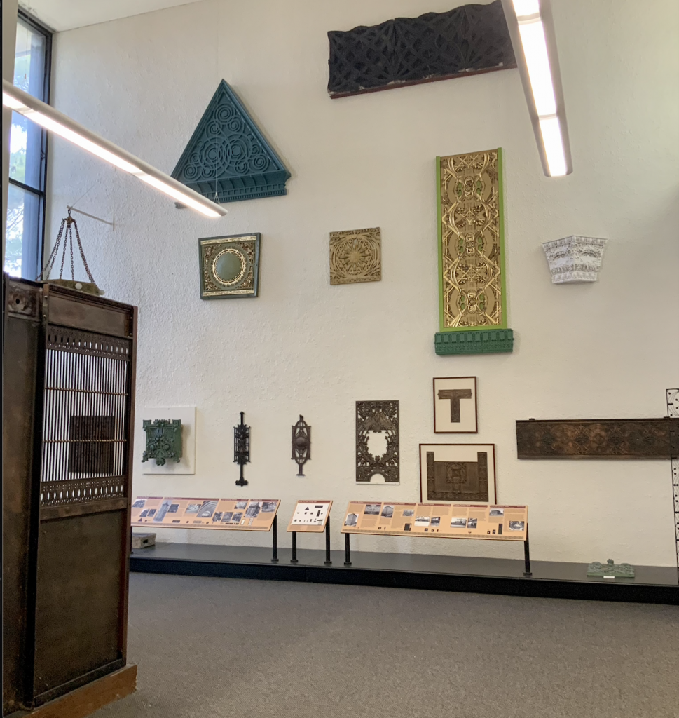
In the context of the narrative presented, the signs succeeded in communicating basic information common in architectural and art history, the explicit changes in style throughout Sullivan’s career and the story of how such pieces were saved from demolition. Based on the text heavy signs and the use of architectural terms throughout the intended audience seems to focus more on adults rather than children. Though the museum exhibit in Lovejoy Library succeeds in telling the brief story of the evolution of Sullivan’s work and uses the space given to its advantage, the organization of the signs and artifacts and the overall narrative content could be improved. The signs do not correspond to the ornaments displayed throughout the exhibit. I had great difficulty finding the pieces on the map provided and what object were hanging on the wall. In addition to the placement of the artifacts, there was also a wall of diagrams that seemed to be ignored on the other side of the exhibit. Due to the white wall, white frame and white documents presented on the wall, this wall of framed images could be easily ignored by visitors.
In terms of historical narrative, the entire display would benefit from examining Sullivan’s architectural influence and its relations with race and class. During the period that Sullivan made most of his works, decorative homes and ornamental fixtures were characteristic of the white, upper-class patrons that Sullivan served. The exhibit itself does not confront this information. In fact, as a historian, I felt as though the dynamics of class and race were always implied but never addressed. Though it is true that the display does have examples of Sullivan’s designs in more “economical” structures (such as banks and government buildings), the information provided imply that such economical buildings were not as valued or seen as architecturally beautiful.
Overall the Louis Sullivan Collection at Lovejoy Library succeeds in drawing the visitors in through the exhibits effective use of large artifacts, space and linear story telling. Though the display communicates the story of Louis Sullivan and his connection to area, the display could still improve on the organization of the artifacts mounted on the walls and their corresponding labels and a revamping of visuals of the final wall within the exhibit. The narrative is cohesive and serves to provide guests without prior knowledge with basic information on the subject. Collectively, the exhibit offers insight to the local architectural history as well as educate others on the stylistic periods of Sullivan’s work.
Leave a Reply