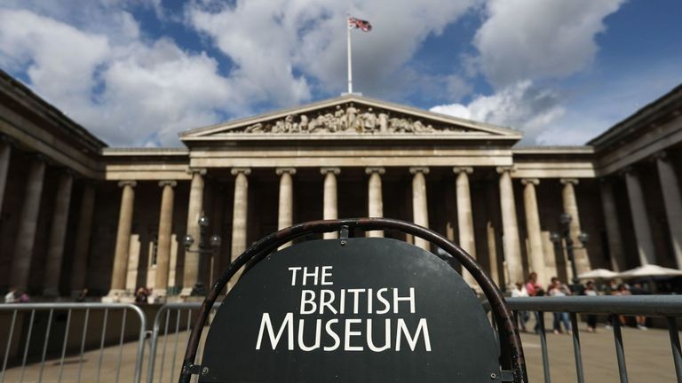
https://www.britishmuseum.org/
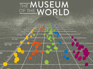
https://britishmuseum.withgoogle.com/
The British Museum, located in London, England has one of the most comprehensive collections in the world due to how expansive the British Empire was. Founded in 1753, the British Museum has amassed a collection of approximately eight million pieces (artifacts) through centuries of colonialism and acquisition. The Museum of the World is an interactive exhibit experience that allows the visitor to travel through time and traverse the globe without rebuilding a DeLorean à la Doc Brown and Marty McFly. The British Museum has partnered with the Google Cultural Institute to bring us this exhibit using “the most advanced WebGL (Web Graphics Library) technology available.”
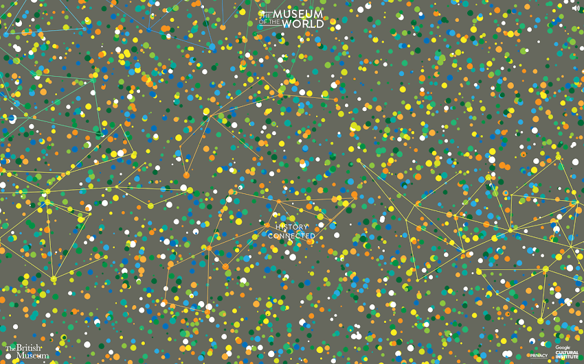
https://experiments.withgoogle.com/the-museum-of-the-world
The British Museum and Prompting Discussion
The Museum of the World is dedicated to introducing the public to some of the most fascinating objects from prehistory to the present day, spanning from the year 2,000,000 BC to 2000 AD. The British Museum website states that the institution is “driven by an insatiable curiosity for the world, a deep belief in objects as reliable witnesses and documents of human history, sound research, as well as the desire to expand and share knowledge.” This exhibit contains approximately 320 different artifacts discovered across the globe in Africa, the Americas, Asia, Europe, and Oceania.
Get the Conversation Going

This exhibit is incredibly accessible online, engaging, and exceptionally informative, so the target audience could really be comprised of anyone interested in prehistoric anthropological history. Though, this exhibit could be a wonderful teaching tool if used as an introduction to world history or anthropology. The content is relayed in a way that is strictly educational, thereby imparting no bias upon the reader. It utilizes an anthropological approach when discussing the artifacts and teaching the visitor about them. I argue that this is one of the main reasons this exhibit is so important. By talking about the artifacts in an anthropological way, the reader is not only learning about the objects themselves, they are learning how to talk about the objects, which opens a channel for communication that enhances societal understanding and brings people together.
“Talking is always a good idea. There’s no harm in keeping lines of communication open.”
Brian reynolds myers, american journalist & associate professor of international studies
How To Speak Anthropology: A New Language
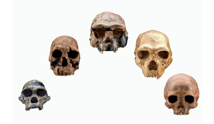
Anthropology is defined as “the study of human societies and cultures and their development.” When discussing historical artifacts in an anthropological manner, a lot of focus will be placed on where the object was found, what it is made of, and what its potential purpose was based on the societies & cultures that occupied (or controlled) the area.
Visitors to this exhibition are going to see objects that they have never seen before and learn about those objects in a way that they might be unfamiliar with. The Museum of the World exhibit challenges the visitor to think in a new way and to understand the function of an object relative to its placement on the globe. This is exactly what makes this exhibit so important. When it comes to museum exhibits that display prehistorical objects and objects dated back through the BC, the visitors develop a new way of understanding the history of humans. New experiences, be they physical, emotional, or intellectual, are vital to the advancement of society’s shared knowledge.
Taking It Back in Time Like Huey Lewis
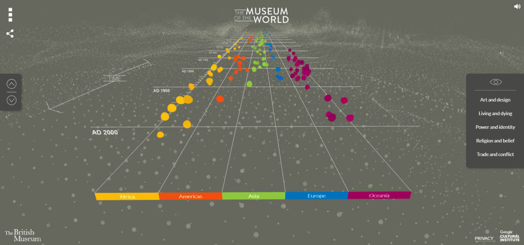
The virtual tour of this exhibition is unlike any other that I have seen before. It’s set up like a timeline that you can scroll through. You can either use the disc on the mouse, the touchpad on your keyboard, or the two arrows located on the far left side of the screen (as well as the up and down arrows on your keyboard). You can move backwards along the timeline (towards 2,000,000 BC) by rotating the disc on your mouse or dragging your fingers on the touchpad in a downward motion. You can move forwards along the timeline (towards AD 2000) by rotating the disc on your mouse or dragging your fingers on the touchpad in an upward motion. While you can use the two arrows on the far left side of the screen, the website is set up so the timeline is incredibly responsive to motion, which means the screen will shift the entire time your cursor is moving. I found this to be rather frustrating, but use whatever method works best for you. (If you have a touchscreen computer, just dragging your fingers along the screen works really well.)
Once you get the hang of moving along the timeline and manipulating the screen, the exhibit is incredibly easy to navigate. It is a self-guided exploration of the linear timeline of the history of human stuff. The timeline is divided into five (5) different categories (listed from left to right): Africa, Americas, Asia, Europe, Oceania. You can explore the timeline by looking at all of the sections together, or combing through them one-by-one.
| Geographical Area | Color | Number of Artifacts |
|---|---|---|
| Africa | Yellow | 58 |
| Americas | Orange | 31 |
| Asia | Green | 114 |
| Europe | Blue | 87 |
| Oceania | Purple | 30 |
If you’d like, you can also view the artifacts according to five (5) specific themes: Art and Design, Living and Dying, Power and Identity, Religion and Belief, Trade and Conflict. You can choose those themes on the far right side of the screen. If you click “Power and Identity,” the artifacts that you can choose from will reduce and you will only see artifacts that relate to that theme. In order to reset the timeline to full visibility (where all the artifacts are available for viewing), all you have to do is click the little eyeball shape above the list of themes.
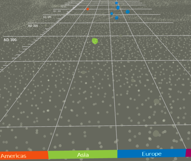
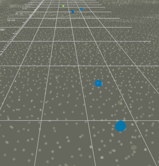
The virtual tour of the timeline works well and accomplishes what it needs to accomplish, but it does take a minute or two to get used to it and figure out the different “settings” you can create. As this is a setup that I was unfamiliar with, it took me a while to understand how it functioned. There are only two things that I would suggest improvements for: The first being how sensitive the background of the timeline is, and the second being the spacing between artifacts (those colored dots that I will mention in the next section).
Let’s Talk Design
This is a short video of what The Museum of the World exploratory timeline looks like just moving through it without looking at any of the artifacts. The layout is really unique to a virtual tour, yet it may seem familiar if you’ve played a bit of Guitar Hero in your day. Each colored dot (yellow, orange, green, blue, and purple) represents a different artifact. The dots are all separated by the geographical area in which they were found, which is also designated by color. As you can see in the video, there are certain points on the timeline where there are several colored dots in one spot, which does make it difficult to pick a specific one (as they are all close together).
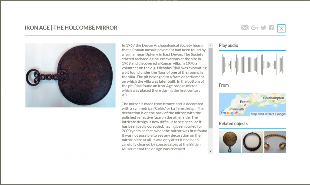
The exhibit does show various kind of artifacts, from tools to artwork to metalwork to items used for the dead (coffins & urns). If you click on one of the colored dots, a small preview of the item will pop up with the option to “Find Out More.” Once you click that, a small screen will pop up that looks like the one above. If you click on the image of the artifact, it will expand so you can get a better look at it, but you cannot manipulate the image to see it at a different angle. Next to the image is a description. The information available varies based on the artifact. For example, the information for the Holcombe Mirror (the artifact above) is more detailed than the information for the Bronze Belt Hook (the green dot between 200 and 300 BC). Each artifact has an audio clip where you can hear a curator from the British Museum talk about the artifact. The audio clip gives you different (more) information than the text box does, but this is a problem when it comes to accessibility. There is not a transcript of the audio clip, so if you can’t hear the audio clip, you’re missing out on interesting bits of information. In addition, you can also see where the artifact was found on a map. As this exhibition was made in partnership with Google, the map available is a Google satellite map. Underneath the map, you can be directed to artifacts that are related to the one you are currently looking at.
That’s All, Folks!
Overall, I think that this kind of exhibition/highlight reel of artifacts is really cool! It is a different format than most people are probably used to, which is what makes it stand apart. I do not think that this type of exhibit would work for every institution (i.e. a museum dedicated to the Civil War), but I think this type of format could be used as an extra feature on the website for various institutions. I have always found that putting things on a timeline better helps spatial comprehension, making it easier to process the information presented.
Leave a Reply