SURVERY PROCESS REFLECTION
The creation of our surveys was a very iterative process requiring great amounts of patience and meticulous refining. Gathering thoughtful and thorough answers from our survey’s participants proved to be quite challenging. It appeared that we had recieved a whopping thirty-three responses but after further investigation, we only had 11 complete responses. More than half of the respondants didn’t finish the survey but instead only paritally completed it. Thankfully, the 11 responses provided us with adequate amounts of insight.
The overarching goal of the survey questions was to gain an understanding of how the current employees at MOBOT perceive the lack of African American representation and knowledge within the herbarium. To get a scope of this we asked questions such as ” What barriers do you perceive in intergrating AA knowledge into the garden?” and ” How well do you think the gardens currently represent AA knowledge and contributions?” Our responses varied slightly but primarily the answers consisted of similar perspectives.
My group also thought it was important to define specifically what we mean by African American knowledge so that their was minimal confusion. We defined it as ” the collective experiences, history, culture, and contributions of people of African descent in America.”
FOCUS GROUP REFLECTION
This was the second step in the process of collecting our data. A well-executed focus group should “help you understand how a particular trait or identity shapes responses to your research question, see how ideas and opinions are formed and shaped through conversation, and allow participants to collaboratively work through a problem.” All three of these criteria were not just met but exceeded. I found that the focus groups were a lot more informative, honest, and in-depth compared to the surveys. I feel like this was because they had no other choice but to sit down and think of a response whereas with a survey you can just exit out of it. There is a fresher, more intense version of accountability imposed onto the participants in a focus group setting which produced more authentic answers.
The way the groups were set up was also really neat as well. The timer being in place to regulate the rotation of the employees was perfectly executed. It allowed us to get a well-rounded set of responses and ideas. We learned about new people who could be potential resources in the future such as Matthew Norman (the rosarian) and Daria Mckelvy. One of the participants highlighted the fact that MOBOT has all of the names of the donors and botanists but not the names of the slaves who helped build it and that stood out to me. I liked that she was able to comfortably highlight the hypocrisy in that. Another thing that stood out to me was a question that Nicole Smith asked. She asked us ” What medium or tool would be most effective for telling the stories and what are our goals as CODES students in telling these stories? ” and I was stumped at that moment. I think the answer to this question is something that we are currently trying to configure.
Attached here is the audio from the focus groups :
Morgan and John focus group.m4a
DATA CLEANING AND VISUALIZING REFLECTION
Data cleaning is the process of identifying and correcting errors, inconsistencies, and inaccuracies in a data set to improve its quality and reliability for analysis. These steps can include identification of errors, correcting inconsistencies, and handling potential outliers. Data cleaning is a crucial step in the data analysis process as it helps improve the accuracy and reliability of analytical results, leading to more informed decision-making. This process was the most tedious when it came to transcribing the audio from the focus groups to ensure that everything properly corroborated.
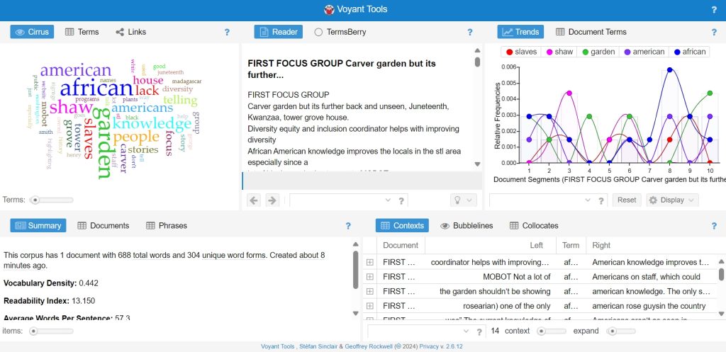
Similarly, data visualization is the graphical representation of data and information using visual elements such as charts, graphs, and maps. The primary goal of data visualization is to communicate complex data in a clear and concise manner, making it easier for users to understand patterns, trends, and insights within the data. Me and my group members were able to achieve this through a site called Voyant. Voyant is a text analysis and visualization platform that identifies word frequency. It also provides options such as bubble lines, word trees, and scatter plots, to explore textual data in different ways. Attached below is the result of our engagement with Voyant.
Leave a Reply